Link Button
Introduction
The Link Button module in Builderius is a fundamental element used to create links on your website or application. As a semantic container, the Link Button module represents a link to another web page, resource, or location within the same page. With the Link Button module, you can easily link to external content, navigate to different sections within the same page, or provide call-to-action links to enhance user interaction. Link Button module is an inline-element much like the Text module with the “Transform into link?” toggle option enabled by default.
When you insert the Link Button module into the canvas, it automatically generates an <a> HTML tag. The Link URL field is a required field for anchors and it will produce a “href” html attribute that has to contain a valid link. Link Button module accepts child elements, and can be a child element itself. You can additionally modify the behavior of the anchor links with custom attributes feature, where you can add “target”, “role”, “aria-*” and many others.
Standard Module Settings
The Link Button module shares standard settings with other Builderius modules, making it easy to adapt and use across your designs. Once you learn how to use Link Button you know how to use other modules as well. These settings are divided into two main sections: Data Settings and CSS Settings. Let's explore each in detail.
Data Settings
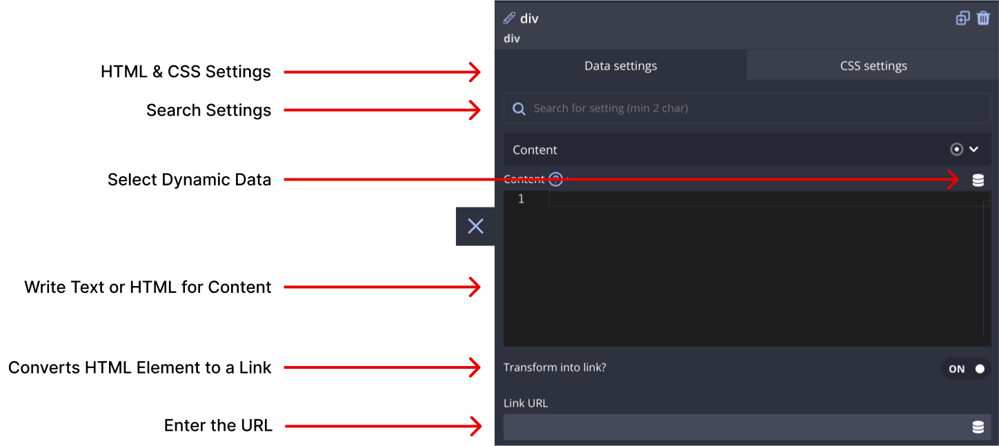
Content
The Content section allows you to define the textual content to be displayed inside the Link Button module. You can enter simple static text, utilize HTML markup (with autocomplete), and use dynamic data template tags to display information from the WordPress database, JSON, or other data source. Remember, you can nest child modules within this module to create complex content structures.
Transform this into a link
This toggle allows you to convert almost any module into a link element. However on the Link Button module it is enabled by default. When enabled, you can manually specify a URL or use dynamic data to generate the link. Please note that de-activating this option will replace the <a> HTML tag with the appropriate <span> or Text Element module.
Link URL
The URL setting (available only if “Transform this into a link” is turned on) allows you to write a valid URL to be opened when the user clicks the anchor element. This is the required field for any <a> element to be valid.
HTML Tag
The HTML Tag setting (available only if Transform this into a link is turned off) empowers you to select an HTML tag from the provided drop-down list or create a custom HTML element by entering any string of letters (follow the syntax rules).
HTML Attributes
In this section, you can add various attributes to the module's HTML code. These attributes enable you to label or modify the behavior of the module. There are three types of attributes you can work with:
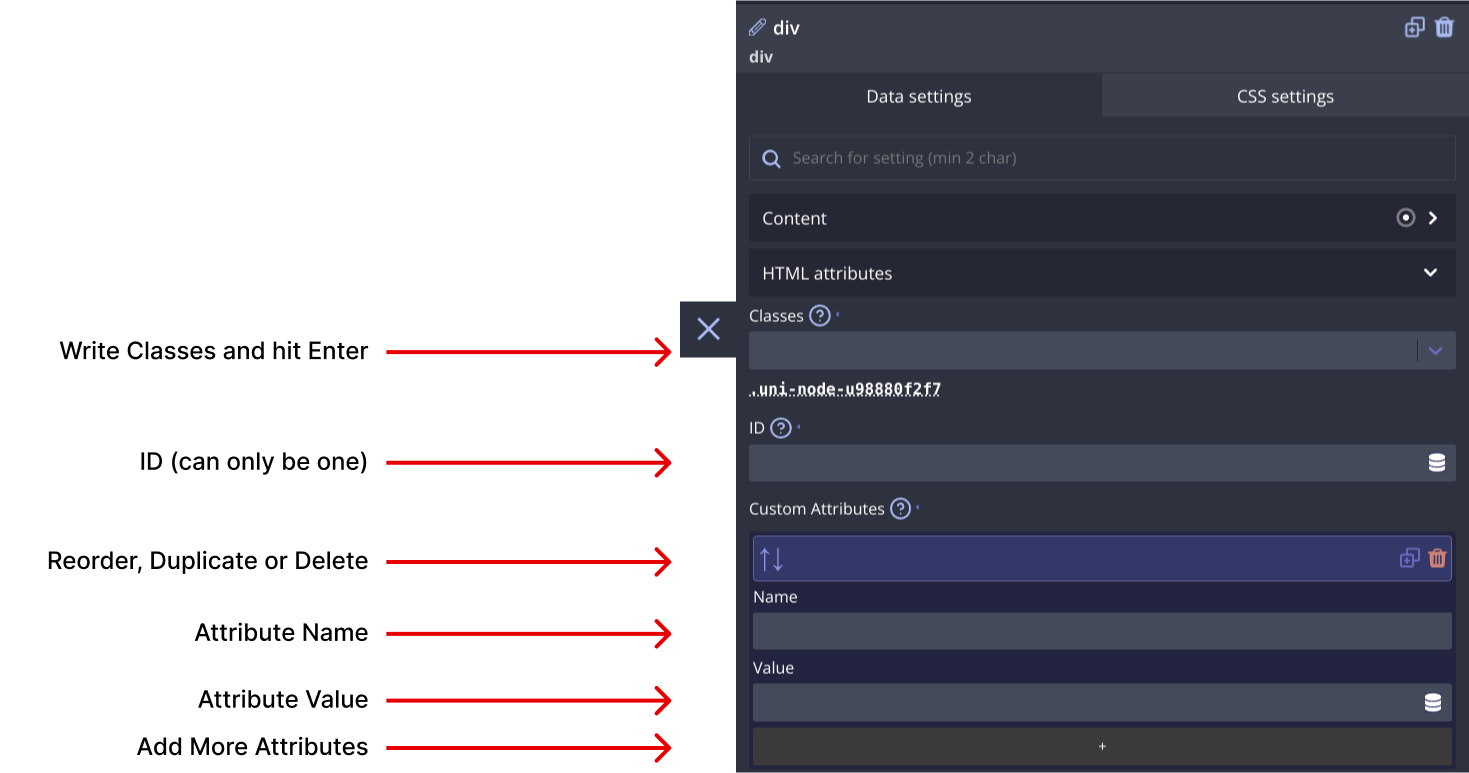
Classes
Add multiple classes to apply styles (e.g., color, size, spacing) to multiple modules simultaneously.
ID
Assign a unique ID name to identify this module distinctively. IDs are commonly used for in-page linking or establishing relationships between different modules on the page.
Custom Attributes
Create custom attributes, such as aria- type attributes for screen reader accessibility or data- type attributes to extend module functionality. You can define both the attribute name and its value.
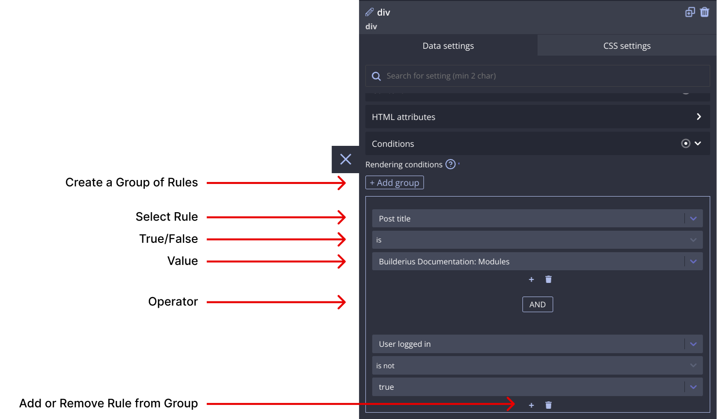
Conditions
The Conditions section allows you to set server-side conditions for displaying the Link Button module. These conditions are processed before the page is generated, meaning that if the conditions are not met, the module will not appear on the page. Conditions are a powerful way to customize what content appears based on various factors. For more information on conditions, refer to our documentation on conditions.
CSS Settings
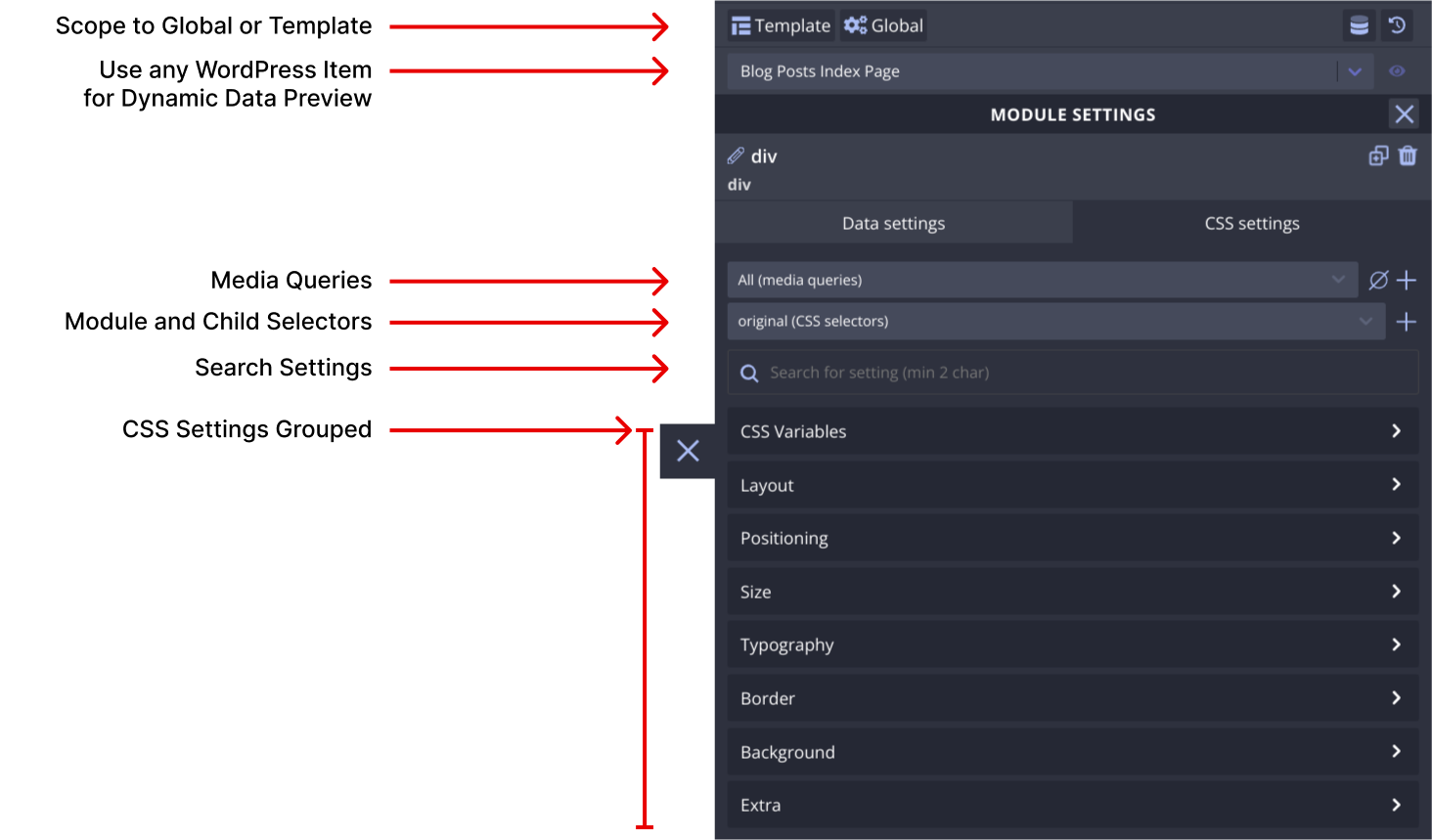
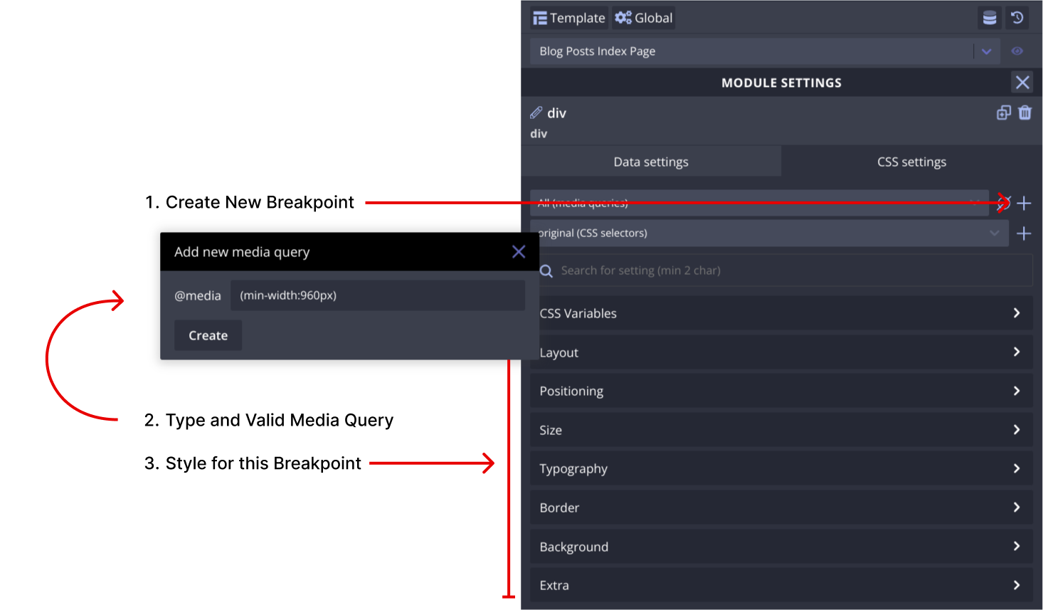
Creating media queries
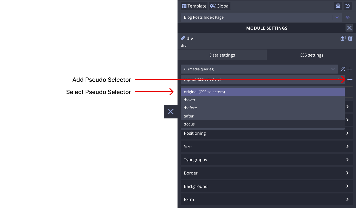
Creating pseudo CSS selectors
Creating custom CSS selectors
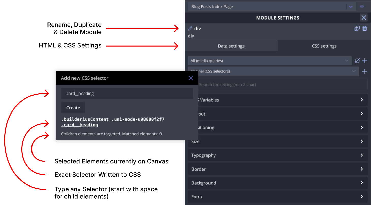
The CSS Settings area provides extensive control over the design and styling of the Link Button module. You can craft the appearance of the module using various CSS methods. The CSS Settings are organized under several subsections:
CSS Variables
Create CSS variables to ensure consistent styles across the Link Button module and its submodules. Various types of CSS variables are supported, including integer, number, color, image, percentage, length, angle, time, and any value.
Creating CSS Variables
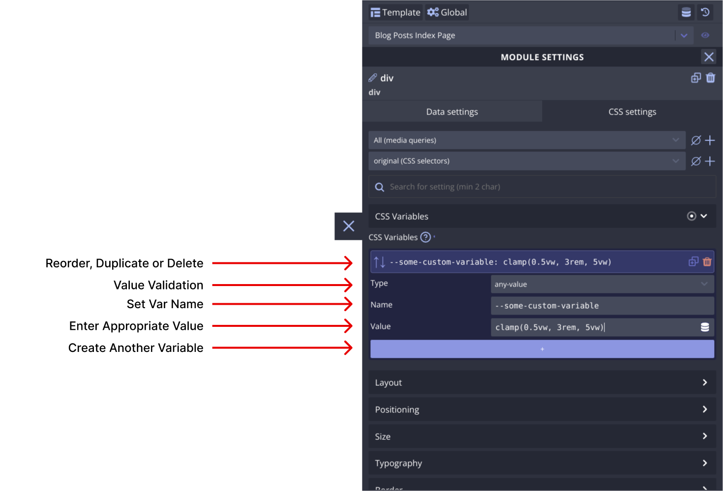
Using CSS Variables
Layout
Control the module's layout using CSS methods such as flexbox and grid, among others.
Positioning
Adjust the positioning of the module using position methods like fixed, absolute, relative, and more.
Size
Manage the size and spacing of the Link Button module to achieve the desired visual effect.
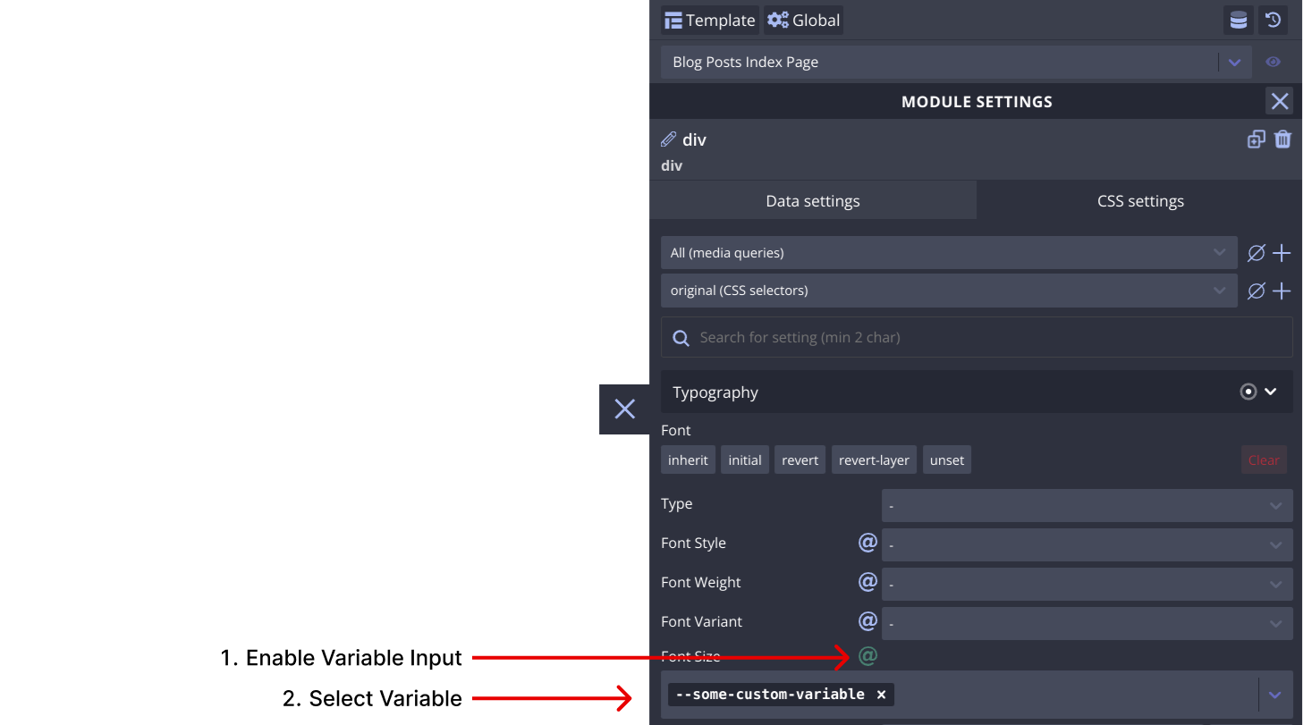
Typography
Control the presentation of text within the module using typographic CSS properties like font-size, line-height, letter-spacing and more.
Border
Design borders and outlines to enhance the module's appearance.
Background
Apply color, gradients, or images to the module's background as per design needs.
Extra
Additional settings can be found here, offering more customization options.
Examples and Use Cases
To better understand the potential of the Link Button module, let's explore some practical examples and use cases. These examples will showcase how you can utilize this module to create various elements for your website or application.
Video coming soon
Additional Resources
For more in-depth information the Link Button module, refer to the following resources:
- Link Button specification (MDN)
- A Complete Guide to Links and Buttons (CSS Tricks)
- Semantics in HTML (MDN)
- Using ARIA: Roles, states and properties (MDN)
- A complete guide to data attributes (CSS Tricks)
Conclusion
Congratulations! You've learned about the Link Button module and its essential settings in Builderius. Armed with this knowledge, you can now create any kind of html element to enhance your website or application. Experiment, explore, and unleash your creativity with the Link Button module!