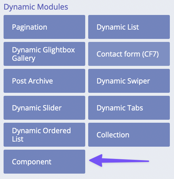
Components
Components available in PRO version only.
Components management
Components functionality is our implementation of component-based approach in web development. Components are global re-usable layouts/sections/parts of templates. Components may consist of other components too, therefore they can be nested!
The table of components is an ultimate overview over all components created in the builder.
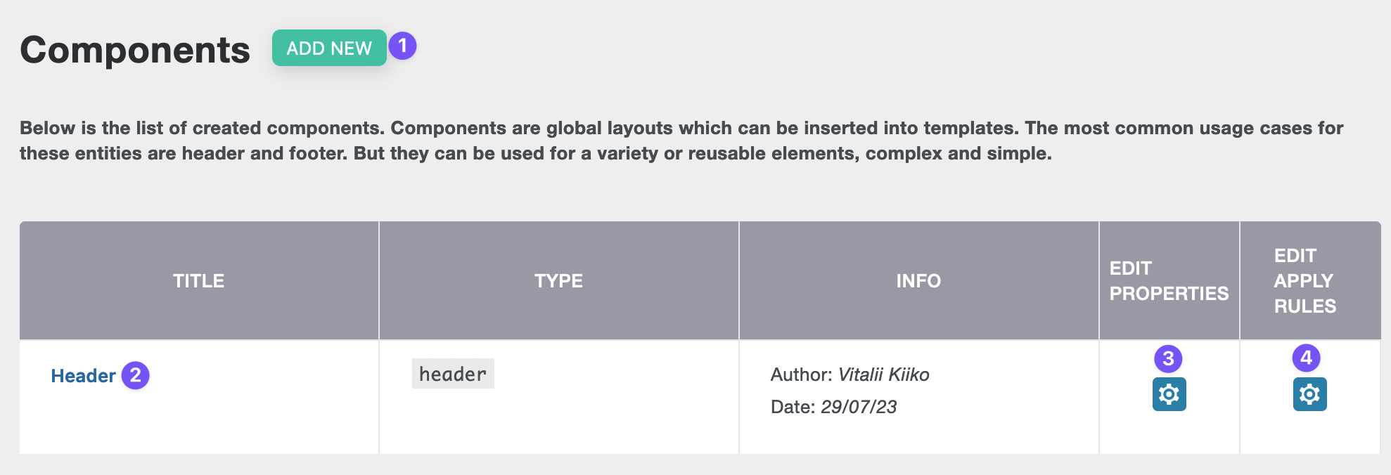
- Add new component.
- Edit component.
- Edit properties.
- Edit apply rules.
Setting up a component
Adding a new component
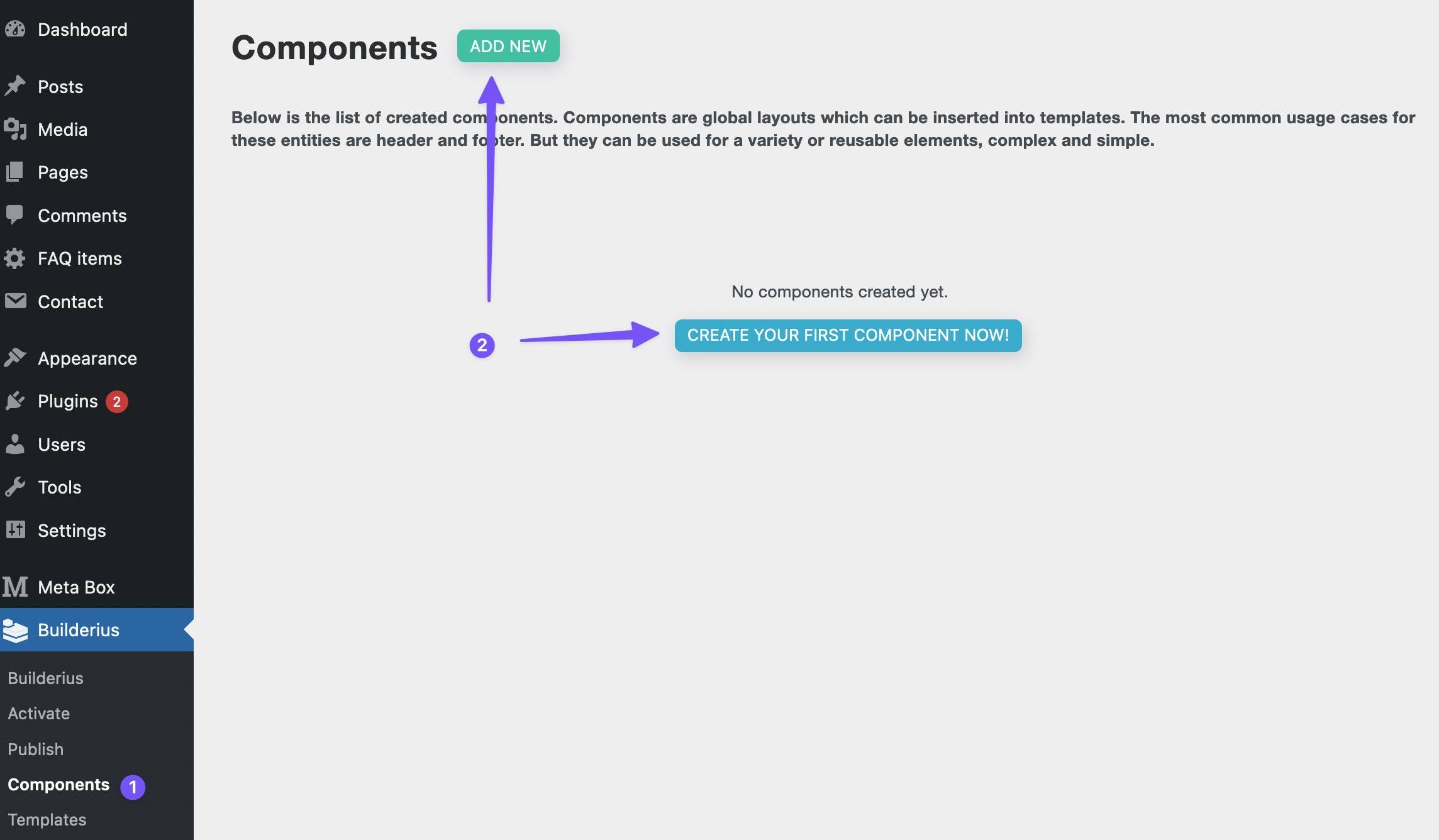
In order to create a new component we go to Components page (1), then click on "Add new" button (2).
This will open a modal window with a two-step form wizard:
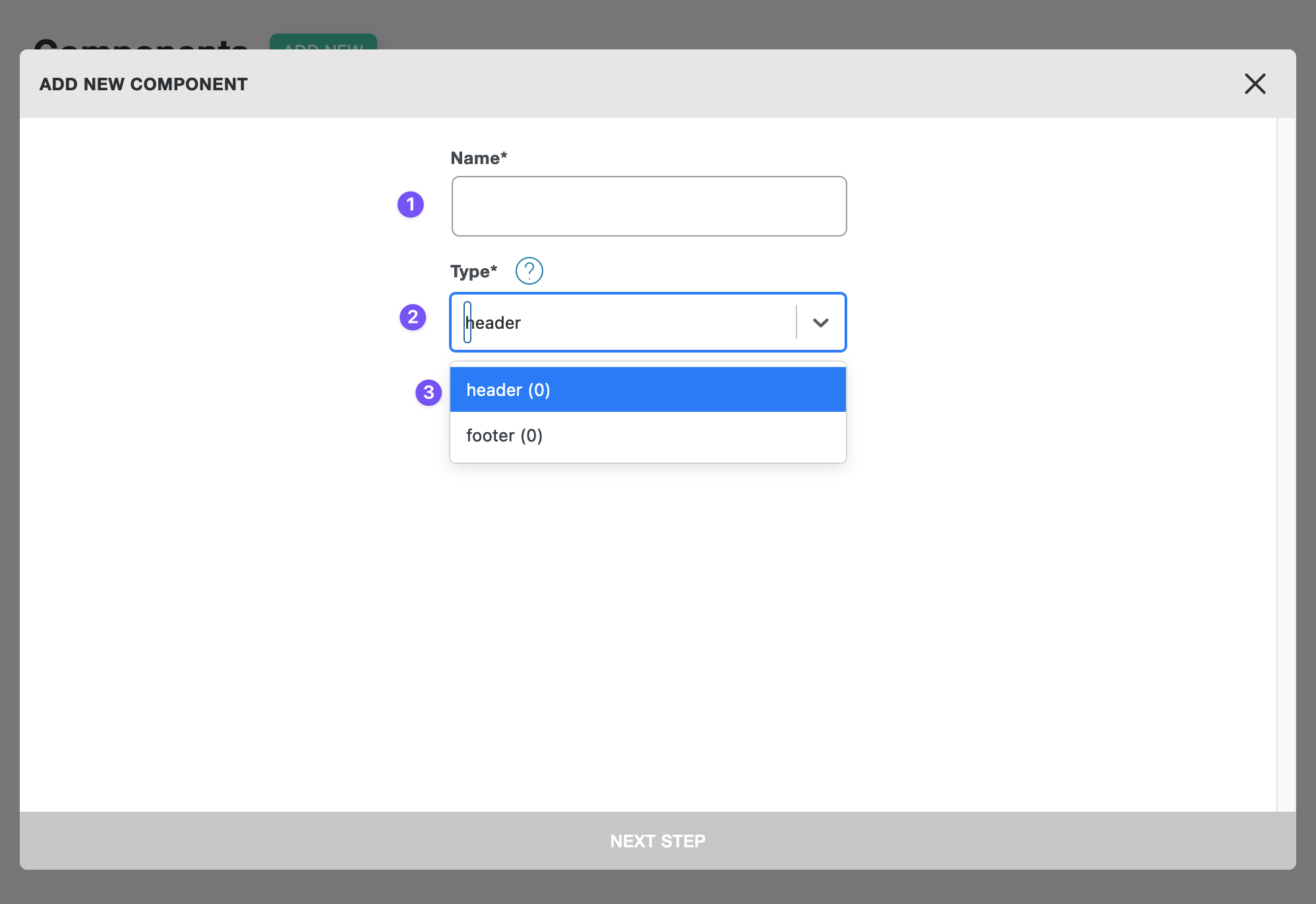
- Add a name
- Choose a desired type of the new component
- "Type" field is the one where you can choose an existing type or create a new one
Component type defines a place where this component will be shown. Think of this like an area or placeholder name where each specific component will be displayed. More on this in the next topic on this page.
The next step is dedicated to Apply rules - the conditions for displaying the component for specific pages:
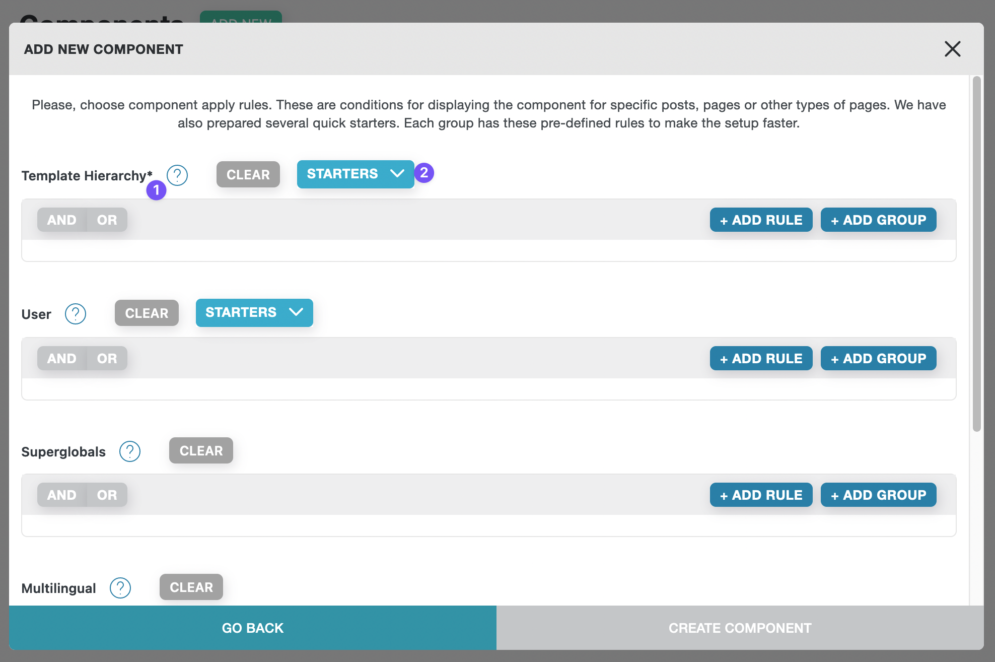
All apply rules are organized by groups. The first group - template hierarchy is a required to be filled in. Other group are optional. Many groups have starters for a fast and easy selection of apply rules.
- Template hierarchy group
- Starters dropdown
After the "Apply rules" are defined, click on "CREATE COMPONENT" button.
Defining apply rules
Defining apply rules for template parts is the same process as for Templates.
Using components in templates
Nested components: it is possible to use component in another component!
There are several rules/notes about the usage of components:
- We can use as many as we want components within a single template.
- We can use the same component more than once within a single template.
- It is not possible to edit component's modules from the template's builder mode
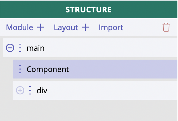
In order to add a component to the template we have to use Component module:
Component module looks a bit different in the structure, it has its own background color to be easily spotted:
Component module has just two settings:
- Component type
- Rendering condition
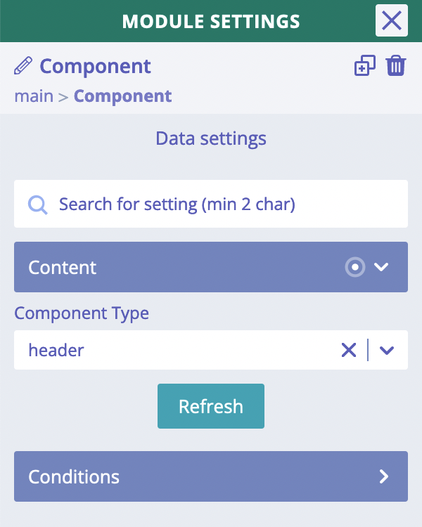
The most important one is Component Type where we should choose a specific type of components, so that one
of the components assigned to this type will be displayed in place of Component module.
It is not possible to directly choose and display SPECIFIC component by its name!
This is an important to know that it is not possible to choose a specific component by defining its name or some ID.
There are three properties which impact which component exactly will be shown in place of Component module:
- type
- priority
- apply rules
Component modules
The component can have as many modules as we need, there is no limit for that. Just like for template. There is also no limitation of how many root modules can be added inside the component. We can have 1 or, for instance, 5 root (main parent) modules and then any number of children.
There is no additional wrapper for components!
By using component inside template we do not add any additional wrapper around modules of the component. So, for instance, if we have component with one root Generic Block module and HTML element tag chosen to "footer", then inside the template where such component is used we will see that Generic Block module and nothing more around it.
Component settings and their inheritance
One of the specifics of components is that their "Component settings" do not contain any CSS related settings. There is only "Data settings" tab. Why? Because there is nothing to attach those CSS settings to. We have already mentioned in the previous chapter that there is no additional wrapper added for component when it is added in the template.
Let's review the existing settings and how they are being inherited by template where component is used:
Responsive strategy.
Responsive strategy of component is ignored inside a template. Responsive strategy of the template will be used instead.
Data variables.
Data variables of component are not available for editing or displaying inside a template.
Dynamic data
Dynamic data from a component will be merged with and might be overridden by dynamic data from a template where such component is being used.
It happens when the same root level key us being used. Example: component is using [[wp.post.title]] dynamic data
inside one of its modules, but the template also has some dynamic data within wp.post.title, so the dynamic data from
the template will be actually outputted.
Overriding dynamic data from a template increases re-usability of components!
In the current version of implementation we do not have controls or fields attached to component, where we can write different texts or images. This will be added in one of the future versions.
JS/CSS libraries.
The libraries from component are enqueued automatically inside a template.
Custom JS/CSS.
Both custom JS and CSS are enqueued automatically inside a template.
String translations.
These records are merged with string translation records in template. Basically, the same strings are overwritten by the ones which come from template.