Using editor
Builderius visual editor is the tool where we create a template and instantly preview the changes. The whole editor consists of two parts: the builder panel and the builder content window.
The builder panel
The builder panel is inside the template and may overlap the content of the template. We do not use an iframe for the builder content, so its size equals to the size of the window.
Main panel actions
Let's review the two lines of the builder panel actions.
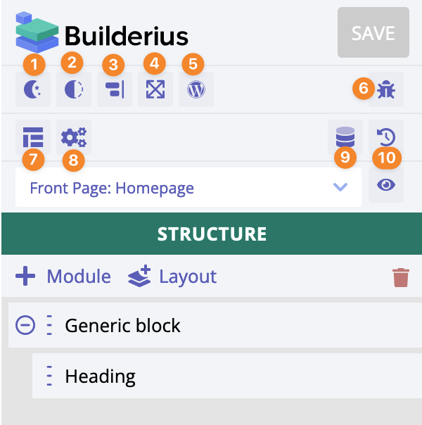
- Switch between day/night mode
- Switch between full opaque/semi transparent mode
- Move the panel left/right
- Make the panel wider/narrower
- Open WP admin dashboard, more specifically the Templates admin page
- Open Inspector window
- Open Template settings panel page
- Open "Global settings" panel page
- Open Dynamic data modal window
- Open Revisions panel page
Save/preview actions
Now let's review actions related to the saving and previewing the changes made in the builder.
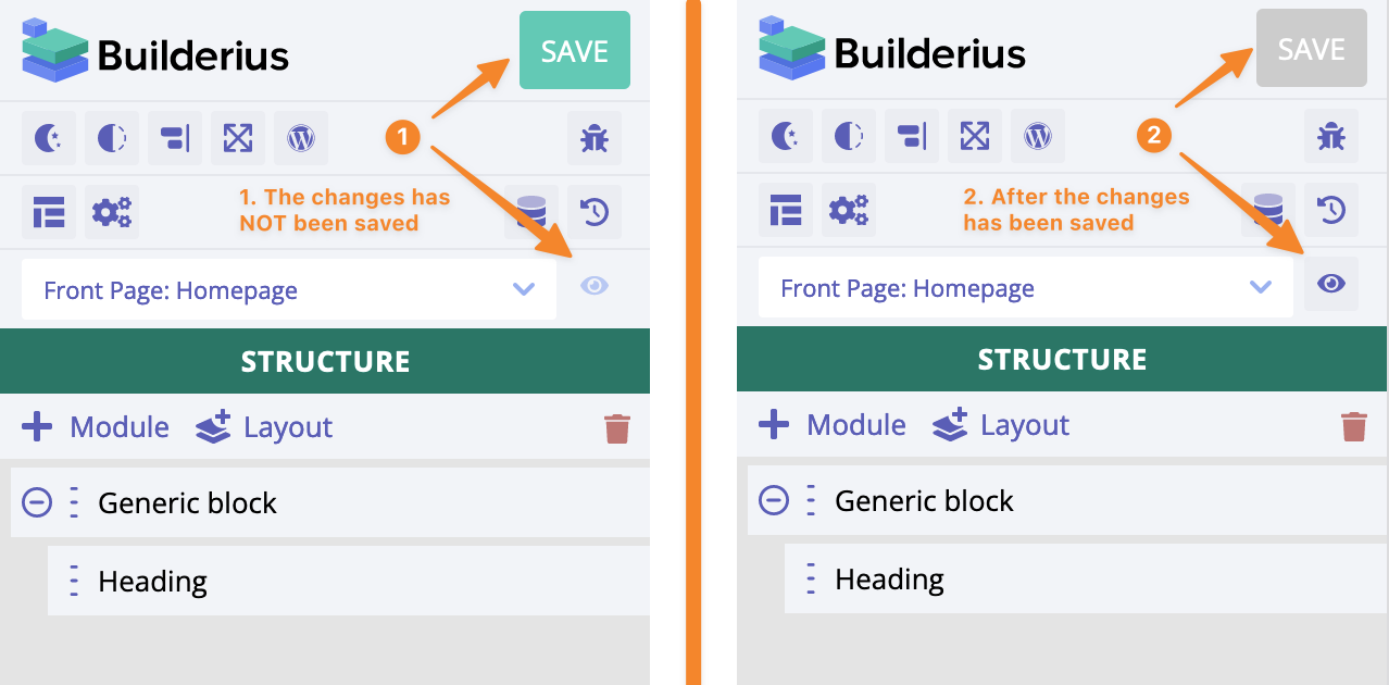
- The green "Save" button means there are changes which are not saved yet; the "eye" icon is semitransparent, it is disabled
- The grey "Save" button means all the changes has been saved; the "eye" icon is active, we can preview the template on the front end
On the left of the "eye" icon there is a dropdown with all template applicants available. Changing the applicant instantly reloads the dynamic data and also JS/CSS assets in the builder mode. It is very useful when we need the preview of the template inside the builder mode. Basically, most of the time this is what we ever need. The preview inside the builder mode is precise!
Adding a module
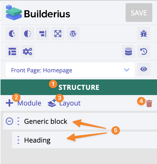
- The name of the panel page
- "Add module" icon
- "Add layout" icon
- "Clear" icon - it removes all the modules from the structure
- Just an example of two modules added
This animated GIF shows how we add modules in Builderius, it shows exactly how it works:
- Open the builder panel
- Click on
+ Moduleto open "Adding modules" panel page - Click on the specific item from the list to add it to the page
Module's settings
Opening module's settings
There are two methods to open module's settings:
- Click on the module name in the module's tree
- Click on
Settingscontext menu of the structure item; this is how it works 👇
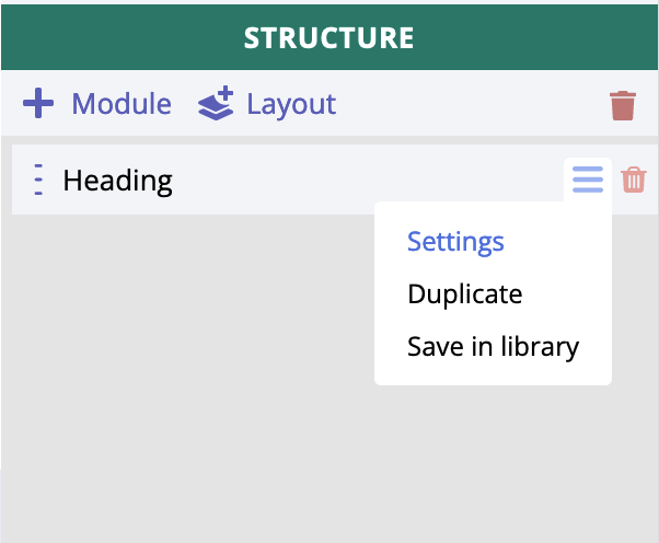
- Hover over the structure item.
- Hover over the
hamburgericon. - Click on
Settingsmenu item to openModule's settingspanel page
Module's settings overview
All the module's settings are divided between "Data" and "CSS" tabs. Module's content setting (if available), also custom id/class and custom HTML attributes are under the "Data" tab. Under "CSS" tab there are the rest of the available settings (all CSS related).
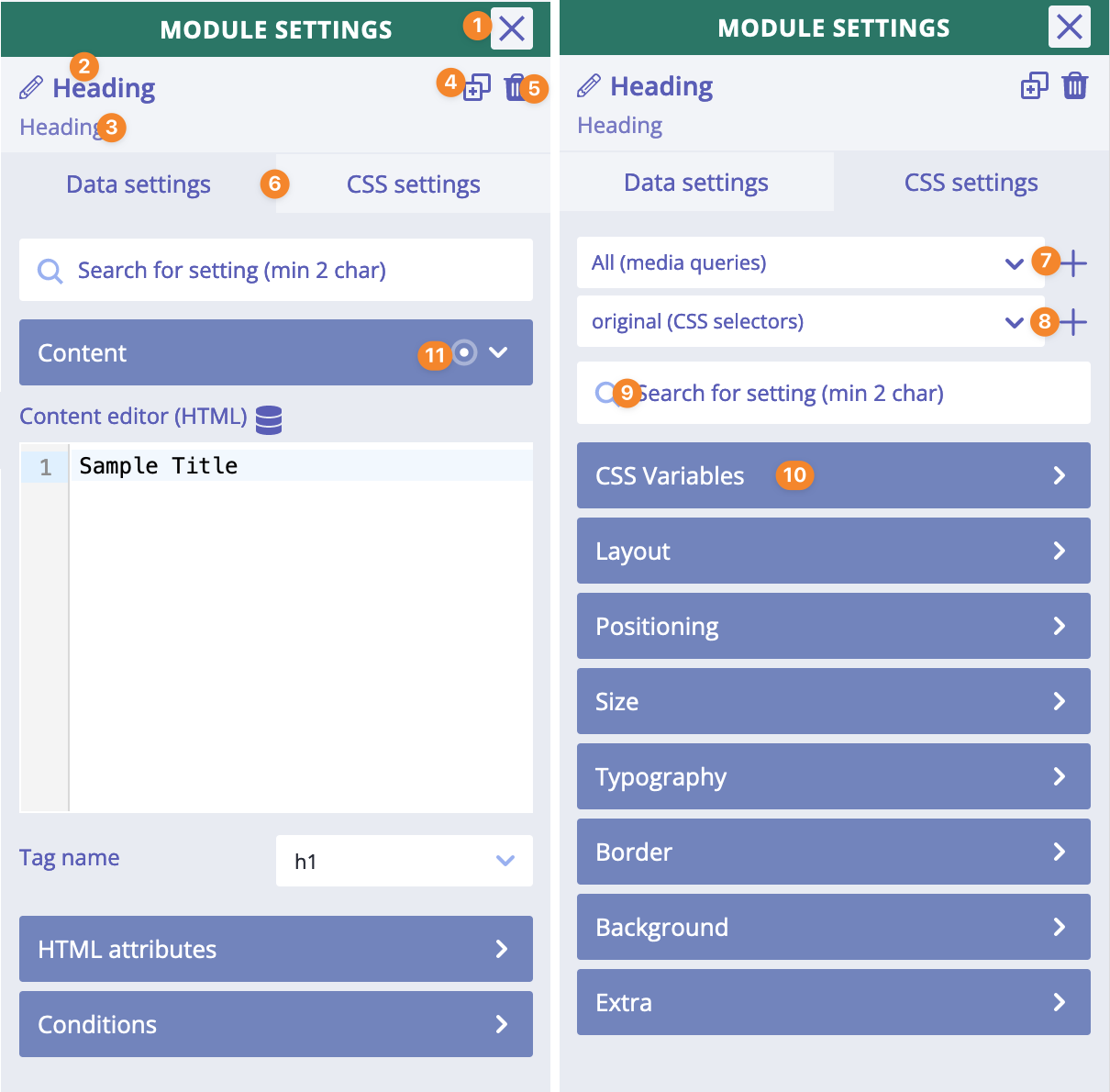
- "Close" icon - closes modules settings
- Module label (click on it to edit; click outside to finish editing)
- Parent modules "breadcrumbs"; a quick way to navigate to the one of parent modules
- "Duplicate" icon - duplicates this module
- "Delete" icon - deletes this module
- Data/CSS settings tabs
- Select media query selector or create a new one
- Select a CSS selector or create new one
- Quick search for settings within the current tab
- Settings' category
Re-ordering modules
We can sort modules:
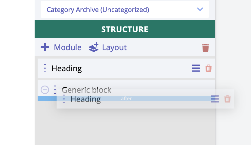
And we can move modules and make them nested:
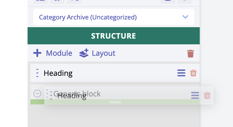
These operations are drag and drop actions. Hover over the three vertical dots icon, hold the left mouse button and start dragging the item inside the structure.
Adding a layout
- Click on
+ Layoutto open "Adding layouts" panel page. - Click on
Open Librarybutton. - Click on specific layout thumbnail to select it and then click on
Insertbutton to add this layout to the panel tree.
The builder content
This is the major area of the editor. It contains all the modules added with all their content. We interact with these elements in real time by selecting them, moving and/or changing their settings inside the builder panel.
The builder content is a blank canvas, and we are free to create whatever we like and in the way we like it.
How does it work in general?
Each module of the builder creates one HTML tag. Adding modules is like writing HTML code manually but in visual way by clicking, dragging and changing some settings.
For instance, if we add Heading module we will instantly see an example of <h1> tag added with a simple content (since it is an inline element).
Another example would be adding a Form module that represents <form> HTML tag. It is a typical block element, it does not have any content inside. Builderius does not add any paddings or similar to make this element somehow visible visually. Why? Because this is not how it usually works when we write HTML tags manually.
The place of the builder content in the HTML page
Builderius adds one div tag that serves as a parent (or root) HTML tag for all modules we create inside the builder. It looks like this on the front end (of course, there will be some WP specific classes for the body tag and the div tag):
<body>
    <div class="builderiusContent">
        <-- our HTML content is rendered here -->
    </div>
</body>
It looks like this in the builder mode (of course, there will be some WP specific classes for the body tag and the div tag):
<body>
    <div id="builderiusBuilder" class="builderiusContent">
        <-- our HTML content is rendered here -->
    </div>
</body>
We designed the builder to work in that way, so it is always the same HTML structure of the page both in the builder mode and in the front end. A site builder user has complete control of what their builds, and confidence in the fact that the page appears the same after the template is published.
Automatic unique classes modules
Each module has a special class that looks like this: uni-node-1234567. This is a special automatically
generated class. Styles created for a specific module will be applied under class based CSS selector that
includes this unique module's class.
For instance, if we add module Heading and set its color to be white, this is what CSS will be generated "under the hood":
.builderiusContent .uni-node-1234567 {
    color: #ffffff;
}
Unlike other visual builders, we do not use unique IDs for styling. Why? Because CSS selectors based on IDs are very specific (read more about CSS specificity) and it would be hard to apply component based development approach in such case.
JS event when DOM is ready
In the builder mode, we use a special event that signals that DOM content is ready - all HTML is set - so arbitrary custom JS code can be applied/executed. Why we use such additional event? Becasue we want to give users a possibility to apply and re-apply their custom JS code without page reload.
How it works?
Typically, we would write some custom JS code and execute it on DOMContentLoaded event or similar:
function muCustomFunction() {
    // some code
}

document.addEventListener('readystatechange', () => {
    if (document.readyState === 'complete') {
        console.log("DOM fully loaded and parsed");
        muCustomFunction();
    }
});
// OR we can use this:
document.addEventListener("DOMContentLoaded", (event) => {
    console.log("DOM fully loaded and parsed");
    muCustomFunction();
});

// Add this event to execute function in the builder mode without page reload:
document.addEventListener('DOMBuilderContentLoaded', () => {
    muCustomFunction();
});
In the example above we are using an additional event listener for DOMBuilderContentLoaded event.
This event will be fired in the builder mode when:
- applicant has been changed;
- dynamic data has been updated;
After any of these actions, our custom JS code will be applied again without page reload!