Dynamic Gallery
Introduction
This module allows displaying images in a fancy JS lightbox gallery. Also it can display iframes, inline content and videos with optional autoplay for YouTube, Vimeo and even self hosted videos.
Usage
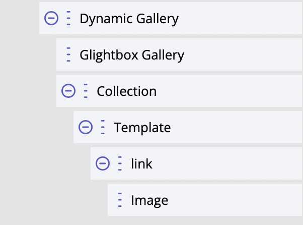
"Dynamic Gallery" module is available in the list of modules. We can add it anytime. This is a composite module, which means it comes with demo static content and it consists of a "Glightbox" module and Collection with a template that consists of an anchor and Image module inside.
How it works
The script of "Glightbox" module, when added to the page, searches for anchors with class glightbox and
images inside them and listens to clicks on such anchors. If such an element is clicked,
the script opens a lightbox modal window. Setting href of the anchor element must contain an
URL to the larger/full image, while the Image module inside the anchor usually shows a small image,
like thumbnail. This is its basic and default usage that does not require any configurations.
Anchors with images are being generated by Collection. So, Glightbox module has "CSS selector for Collection"
setting for providing a CSS selector to target a Collection module on the page. In our example, the value
of this setting is .dynamicGalleryCollection and class dynamicGalleryCollection has been added to
Collection module.
It is also possible to define a custom CSS selector that will trigger opening of the lightbox modal
window. This can be done via data-open-selector HTML attribute. This can be used in case
we want to trigger opening the lightbox by clicking on the button or some arbitrary anchor
element. In this case we would want to specify elements - also anchors - with images.
This can be done via Content setting (for Glightbox module) that accepts a JSON object.
An example of such settings:
{
"selector":"[data-gallery='myGal']"
}
In this case all anchors with the attribute “data-gallery” and value “myGal” will be targeted. By using several Gallery modules and providing their Glightbox modules with a custom selector each we can create several separate galleries on the same page!
Styling
Not available through Glightbox module. Only custom CSS in template/global scope.
For developers / API
The "heart" of the functionality is Glightbox module.
- HTML tag name:
<builderius-glightbox> - Implements 3rd-party script: Glightbox 3.2.0
- Allowed children modules: none
- Available since:
0.9.7 PRO
The following attributes and events/methods are available for Glightbox module specifically.
Attributes
data-open-selector
This attribute expects a string with a CSS selector. The default open selector is: ‘.glightbox’.
data-settings
This attribute expects a stringified JSON object of settings. The full list of available options is here: https://github.com/biati-digital/glightbox#lightbox-options
data-subscribe-selector
This attribute expects a string with a CSS selector for Collection module, so that Glightbox will be listening to the changes inside the Collection and will be re-initiated automatically whenever the content of the Collection is getting changed.
Events
ready (scope: element)
builderius-glightbox-ready (scope: window)
This event is getting fired every time the component is being initiated/re-initiated. It also passes some data:
{ el }
Where el is the reference to the HTML element.
Methods
reInit
This method resets and initiates the component.