Menu Toggle
Introduction
Menu Toggle module is a specialized toggle module designed to work with Menu Builder module.
Usage
Menu Toggle module has two settings: "Attribute "aria-controls"" and "Icon style".
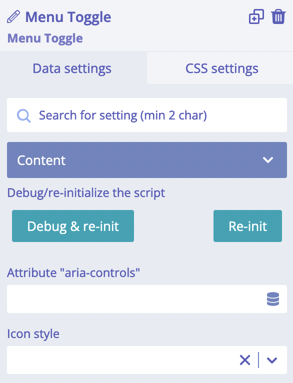
"Icon style" setting allows choosing alternative icon animation. It is a pure styling setting. "Attribute "aria-controls"" setting is important for accessibility. Its value must be the same as ID of a navigation wrapper.
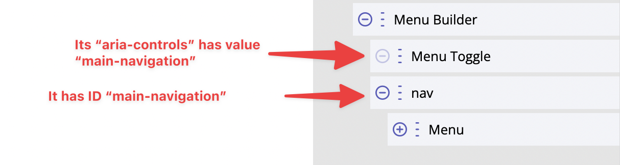
The best example of Menu Toggle usage is in Menu Builder module, so let's add it to the page to see how it works. Structure and "aria-controls" setup:
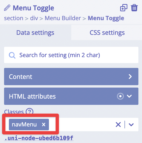
Also Menu Builder module has "Toggle element CSS selector" which has value .navMenu. Exactly this class
has our Menu Toggle. This is how Menu Toggle work with Menu Builder:
Setting a custom icon
We use Template module to set custom icons for Menu Toggle. This is an example of the structure (it is the same as for Toggle module):
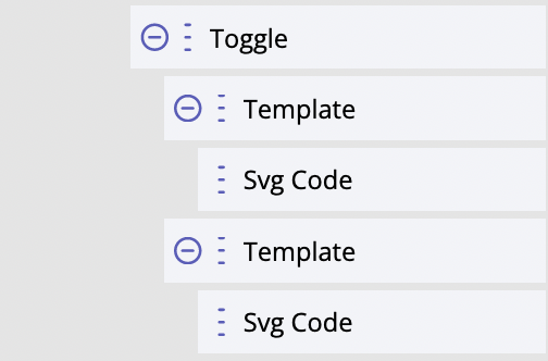
One of these Template modules has HTML attribute "data-tmpl" with value "open", and another Template has the same attribute but with value "close". Inside each of these Templates we have put different SVG icons.
Styling
Menu Toggle module styles - the most commonly used ones - can be quickly adjusted by using these CSS variables:
--bldr-menu-toggle-icon-color: #000;
--bldr-menu-toggle-thickness: 2px;
--bldr-menu-toggle-outline: 2px solid #4141e0;
Other parts could be styled by using CSS selectors.
For developers / API
Internally, Menu Toggle uses a <button> HTML element for accessibility. This button element receives
proper aria-* attributes upon interaction with Menu Toggle. It also receives class is-active when
Menu Toggle is clicked (therefore its internal state set to true).
- HTML tag name:
<builderius-menu-toggle> - Implements 3rd-party script: none
- Allowed children modules: Template
- Available since:
0.12.0 PRO
Since <builderius-menu-toggle> is a custom HTML element, its default behavior is equal to
inline element, not block; it can be changed any time with display CSS property.
API
Attributes
data-action
It must be equal to on of these: "toggle", "open", "close". Default: "toggle".
data-style
One of the names of icons styles. The full list of possible styles:
'3dx', '3dx-r', '3dy', '3dy-r', '3dxy', '3dxy-r', 'arrow', 'arrow-r',
'arrowalt', 'arrowalt-r', 'arrowturn', 'arrowturn-r', 'collapse', 'collapse-r', 'boring',
'elastic', 'elastic-r', 'emphatic', 'emphatic-r', 'slider', 'slider-r', 'spin', 'spin-r', 'minus',
'spring', 'spring-r', 'stand', 'stand-r', 'vortex', 'vortex-r', 'squeeze'
Events
ready (scope: element)
builderius-menu-toggle-ready (scope: window)
This event is getting fired every time the component is being initiated/re-initiated. It also passes some data:
{ el }
Where el is the reference to the HTML element
updated (scope: element)
builderius-menu-toggle-updated (scope: window)
When the internal state of the module has been changed. It also passes some data:
{ el, isActive }
Where el is the reference to the HTML element. isActive is a boolean value that indicates whether the module
is in active mode (has class is-active) or inactive.
Methods
reInit
This method resets and initiates the component.