Slider (Thumbnail Slider)
Introduction
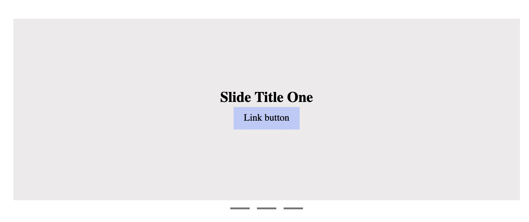
This module allows creating a fancy slider/carousel. Our Slider module is an implementation if Swiffy Slider. Please, check the demo to show the possibilities: swiffy slider demo.
Usage
Open list of modules and search for "slider", then add Slider module.
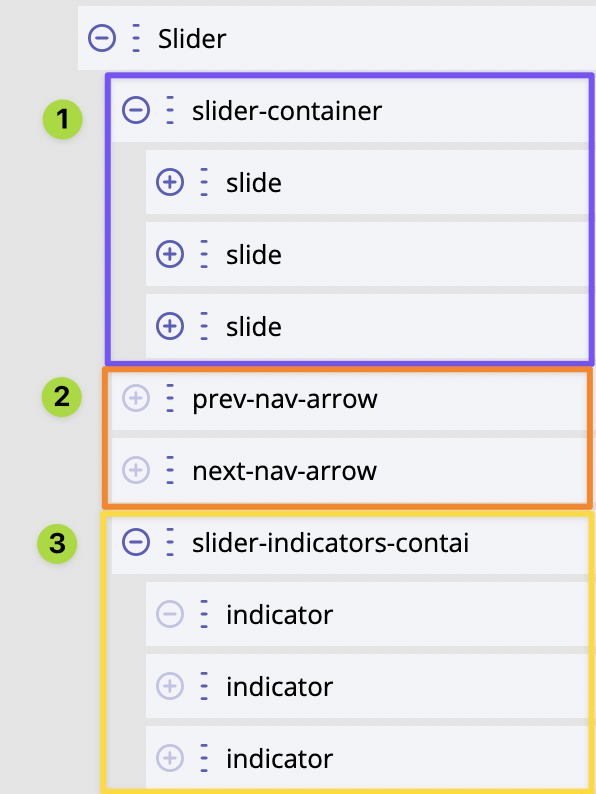
It is a composite module, which means it is ready-made and comes with an initial structure:
1) container for slides and slides (children module); the container must have class slider-container;
2) slider navigations - previous and next arrows; these modules must have class slider-nav and additionally
the next arrow module must have class slider-nav-next;
3) slider indicators - container and children modules as each indicator; this container must have class
slider-indicators.
Module Slider wraps all three of these structure items:
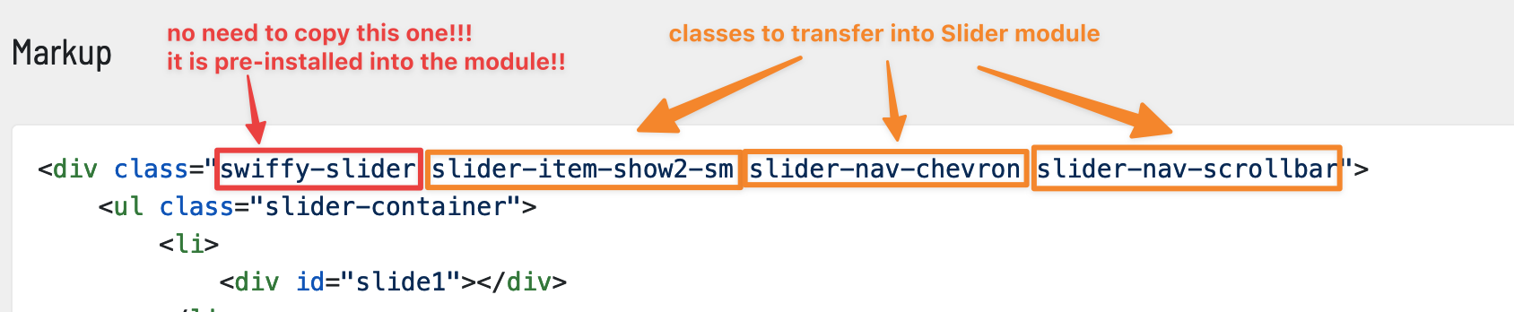
Each slide can have a different markup. There is no limits how slides can be structured and styled. Since Slider implements swiffy slider, so it is controlled in the same way - by using CSS classes. There is a special configurator for swiffy slider that we can use to quickly test how it could work, then copy over classes used:
Slider with thumbnails
We have module "Thumbnail Slider" which is a variant of Slider module. The difference is that it is adapted to display thumbnails instead of regular button-like indicators:
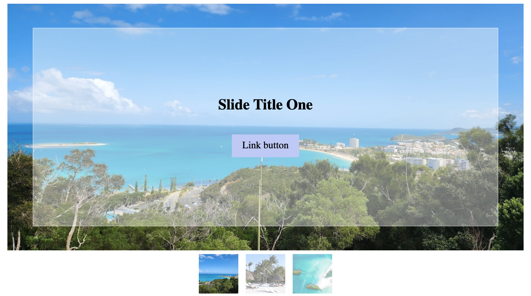
We can add it and inspect how it is made in the details. Basically, the difference is indicators are images
instead of buttons. Buttons do not turn into images automatically! We made them as images by using Picture
module. Also module "slider-indicators-container" has an additional class thumbnails.
Styling
We can style each slider separately by using their CSS related settings or by using CSS selectors on the slider container module. Virtually anything!
For developers / API
The "heart" of this functionality is an interactive module "Slider". The module creates <builderius-slider>
custom HTML element.
- HTML tag name:
<builderius-slider> - Implements 3rd-party script: Swiffy Slider
v.1.6.0 - Allowed children modules: any
- Available since:
0.10.0 PRO
This is the possible final HTML structure:
<builderius-slider>
  <ul class="slider-container">
      <li><img src="..."></li>
      <li><img src="..."></li>
      <li><img src="..."></li>
  </ul>

  <button type="button" class="slider-nav"></button>
  <button type="button" class="slider-nav slider-nav-next"></button>

  <div class="slider-indicators">
      <button class="active"></button>
      <button></button>
      <button></button>
  </div>
</div>
Please, compare it with the structure shown above on one of the screenshots. Each HTML element here is accurately one module in the structure shown above.
API
Attributes
data-settings
This attribute accepts a stringified JSON object. This is the way of providing swiper.js API compatible config.
Events
ready (scope: element)
builderius-slider-ready (scope: window)
This event is getting fired every time the component is being initiated/re-initiated. It also passes some data:
{ el }
Where el is the reference to the HTML element
slided (scope: element)
builderius-slider-slided (scope: window)
This event is getting fired every time the component is being initiated/re-initiated. It also passes some data:
{ el, isNext }
Where el is the reference to the HTML element. isNext is a bool value that indicates whether the next or the
previous slide will be shown.
slided-to (scope: element)
builderius-slider-slided-to (scope: window)
This event is getting fired every time the component is being initiated/re-initiated. It also passes some data:
{ el, slideIndex }
Where el is the reference to the HTML element. slideIndex is the index of the slide we slided to.
Methods
reInit
This method resets and initiates the component.