Menu Builder
Introduction
Menu Builder module is a ready to use and accessible navigation menu composite module.
Usage
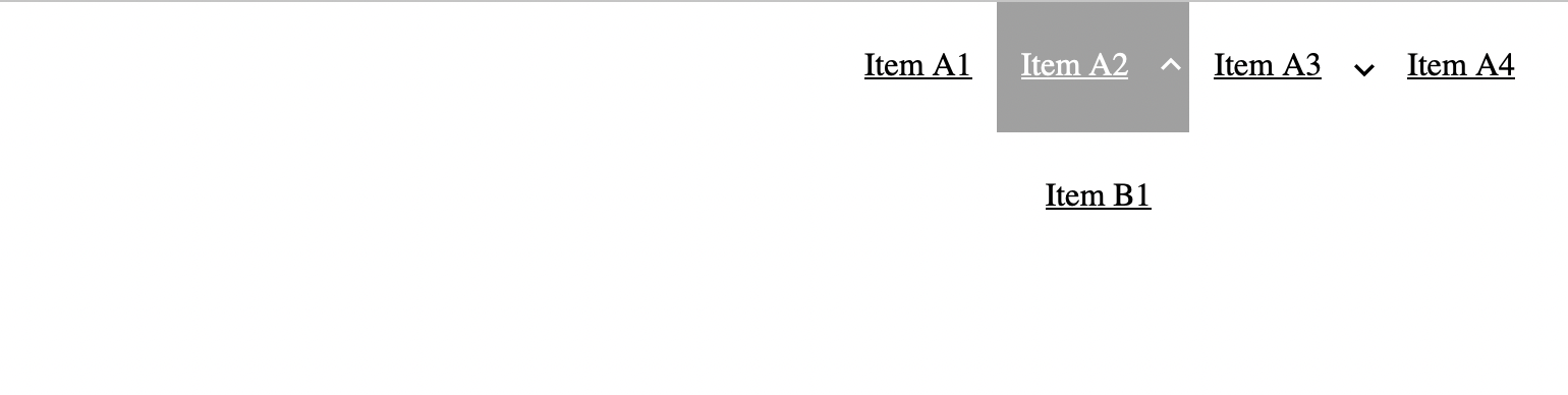
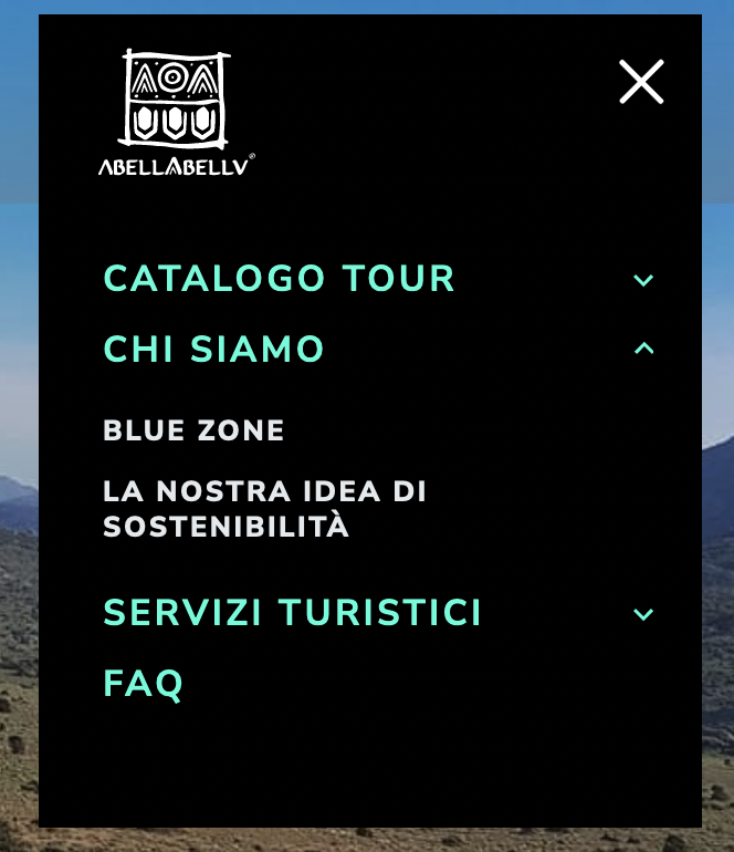
Menu Builder module can be used straight away as a navigation menu. It comes with demo data and looks like this:
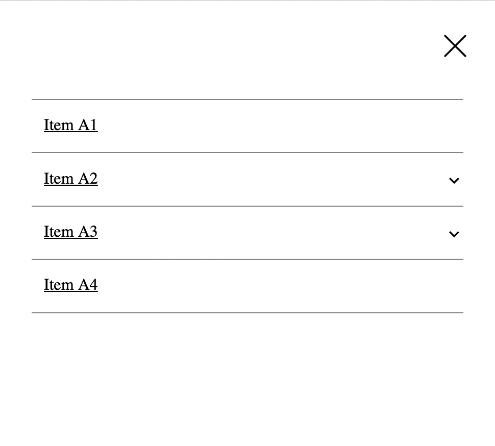
And the mobile version is this:
In order to display our real WordPress menu, we should locate "Menu" module (this is Dynamic List module) and open its settings:
Then we do this:
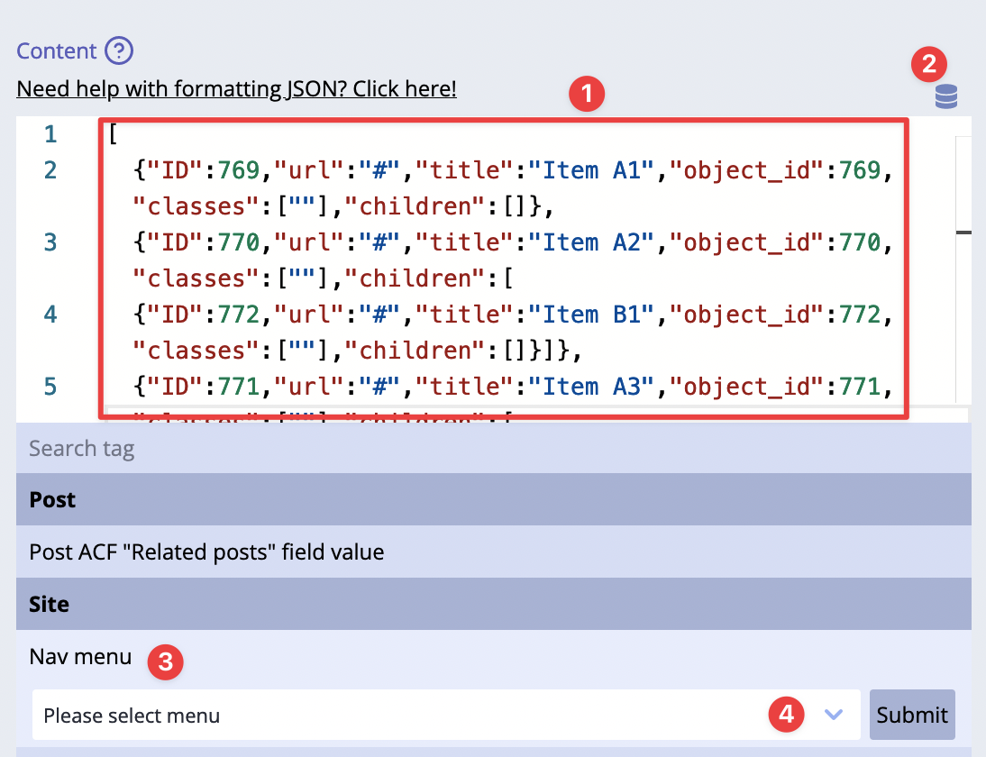
1) Remove the demo content 2) Click on Dynamic Tags icon 3) Locate Nav Menu dynamic tag 4) Choose a menu from the list of menus (they must be created in advance in admin area!) and click submit
Done!
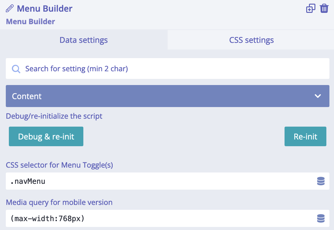
Settings
There are two settings available for Menu Builder module:
- "CSS selector for Menu Toggle(s)" - it must be a valid CSS selector for those Menu Toggles which will be opening mobile version of the menu;
- "Media query for mobile version" - a valid media query, like
(max-width:768px); acts like a breakpoint to switch between desktop/mobile version of the menu;
Example: we want to change the default behaviour and trigger the mobile version of the menu when browser window
is less than 600px. For that we use "Media query for mobile version" setting and set value (max-width:600px).
Now, the Menu Toggle will be shown at 600px and less. When Menu Builder has been switched to mobile version,
it receives an additional class is-mobile. We can use it for styling of the mobile version of the menu.
When teh mobile version of Menu Builder has been opened,
it receives an additional class is-expanded. We can use it for styling of the mobile version of the menu.
Customization of Menu Builder
This module is called Menu Builder because it can be customized and have different styles. Some quick examples:

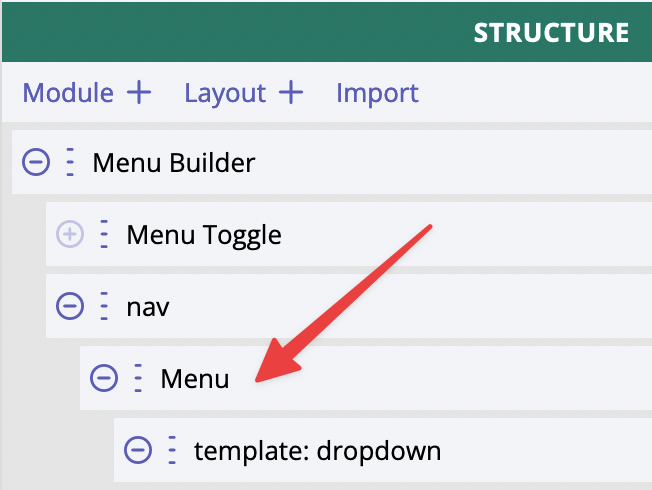
The first part of customisation is related to the structure of menu's list items. It is possible to add icons (by using SVG modules, for instance) or DIVs or anything basically, then styles it as needed. This is the full structure of Menu Builder composite module:
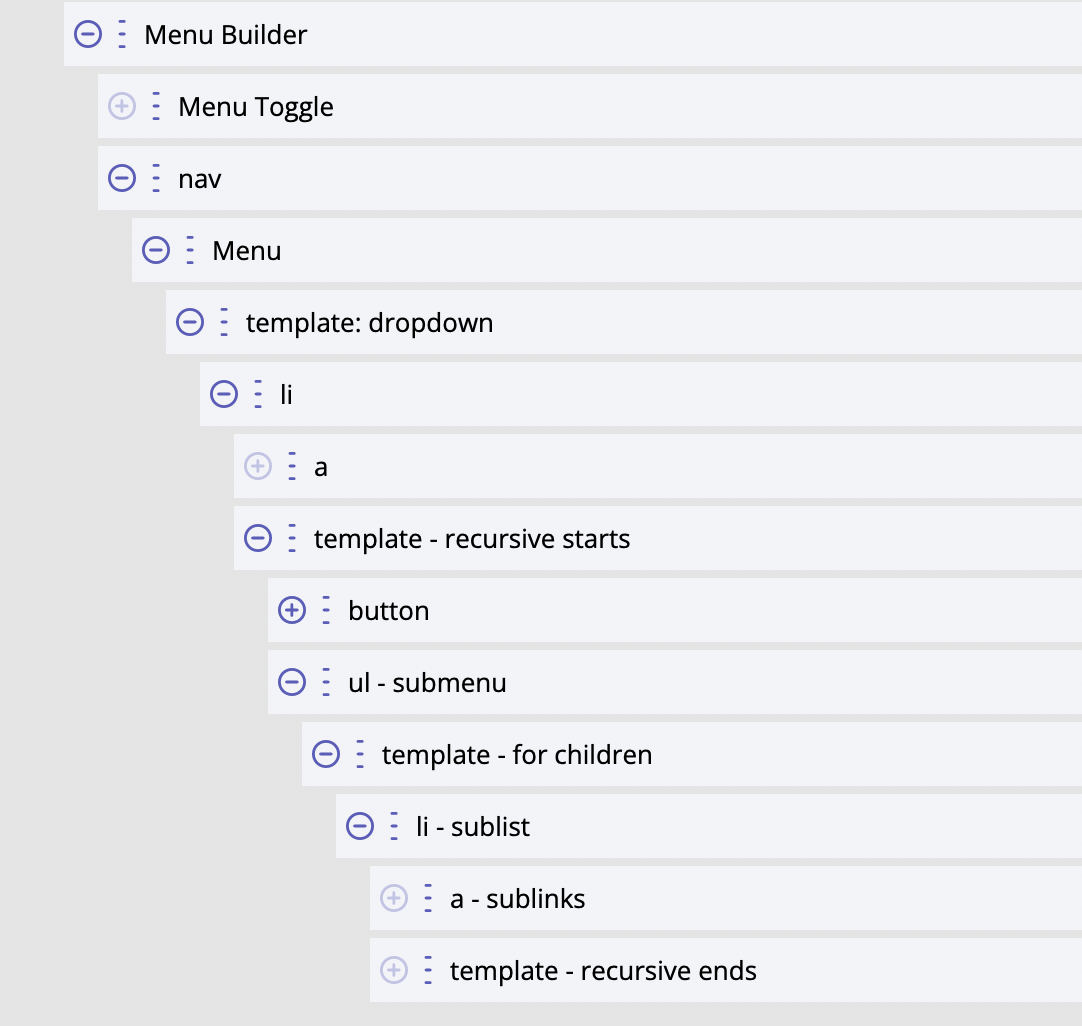
Templating works the same way as it does for Dynamic List since Menu Builder is using Dynamic List for displaying menu items. We would suggest study how Dynamic List template works, so then it will be easier to use Menu Builder.
The second part of customisation is related to styling the menu and using Menu Toggle for switching between mobile and desktop versions of the menu. This is implemented internally, we do not have to think about writing any JS code, it just works.
Styling
Menu Builder module styles - the most commonly used ones - can be quickly adjusted by using these CSS variables:
--bldr-menu-alignment: flex-end;
--bldr-menu-bg-color: white;
--bldr-menu-txt-color: black;
--bldr-nav-menu-height: 4rem;
--bldr-nav-item-padding: 0.75rem;
--bldr-nav-item-width: auto;
--bldr-sub-menu-width: 200px;
Using CSS variables gives a lot of benefits and makes it easy to customise basic things. Example: by default
CSS variable --bldr-menu-alignment has value "flex-end" which makes the menu items align right of the
block/screen. What if we need to quickly align it left because this is how it should be according to the design?
Easy! We set "flex-start" as a value for CSS variable --bldr-menu-alignment and done!
Other parts could be styled by using additional custom CSS variables and CSS selectors. There are some CSS selectors already created, we can find them in "Menu Builder", "Menu", "li" modules (these are labels of the modules, please check the screenshot of the full structure shown previously on this page).
For developers / API
- HTML tag name:
<builderius-menu-builder> - Implements 3rd-party script: none
- Allowed children modules: Template
- Available since:
0.12.0 PRO
Since <builderius-menu-builder> is a custom HTML element, its default behavior is equal to
inline element, not block; it can be changed any time with display CSS property.
API
Attributes
data-toggle-selector
It must be a CSS selector for Menu Toggle module(s).
data-mobile-mq
Expects a valid CSS media query value.
Events
ready (scope: element)
builderius-menu-builder-ready (scope: window)
This event is getting fired every time the component is being initiated/re-initiated. It also passes some data:
{ el }
Where el is the reference to the HTML element
updated (scope: element)
builderius-menu-builder-updated (scope: window)
This event is getting fired every time the mobile menu is getting opened/closed. It also passes some data:
{ el, isExpanded }
Where el is the reference to the HTML element. isExpanded is a bool value that indicates whether the
mobile menu is opened or not.
Methods
reInit
This method resets and initiates the component.