Tabs
Introduction
This module allows creating functional and extremely flexible tabs (tabbed content). Tabs module has two additional modes: "accordion" and "multi-step form".
Usage
For the basic usage we need the Tabs module plus any number of modules which will act as tab
and panel elements. There must be an even number of tabs and panels, each of them will be paired.
Such elements could be any modules! However, we suggest using the Button module for tab elements.
It is focusable, therefore implements some accessibility "out of the box". The rest - more specifically
aria attributes - will be added by the Tabs module automatically.
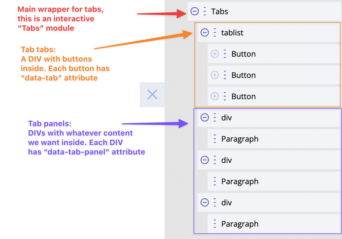
Each tab element must have a custom HTML attribute data-taband a unique numeric value (like '1' etc).
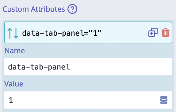
Each panel element must have a custom HTML attribute data-tab-paneland a unique numeric value (like '1' etc).
Each tab and panel are connected by their numbers, so that, for instance, the tab with number '3'
reveals the panel with number '3' and so on.
An active tab and panel items both have class active added to them.
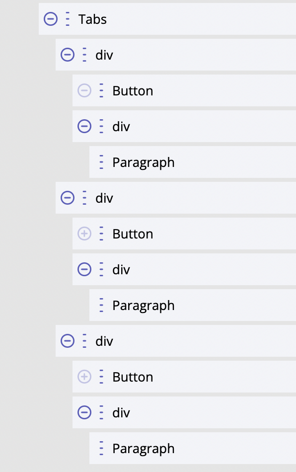
There is no specific layout that must be followed to achieve tabs functionality. Actually, it is quite the opposite here. We have complete freedom over layout, it can be anything we need. This is an example of alternative layout:
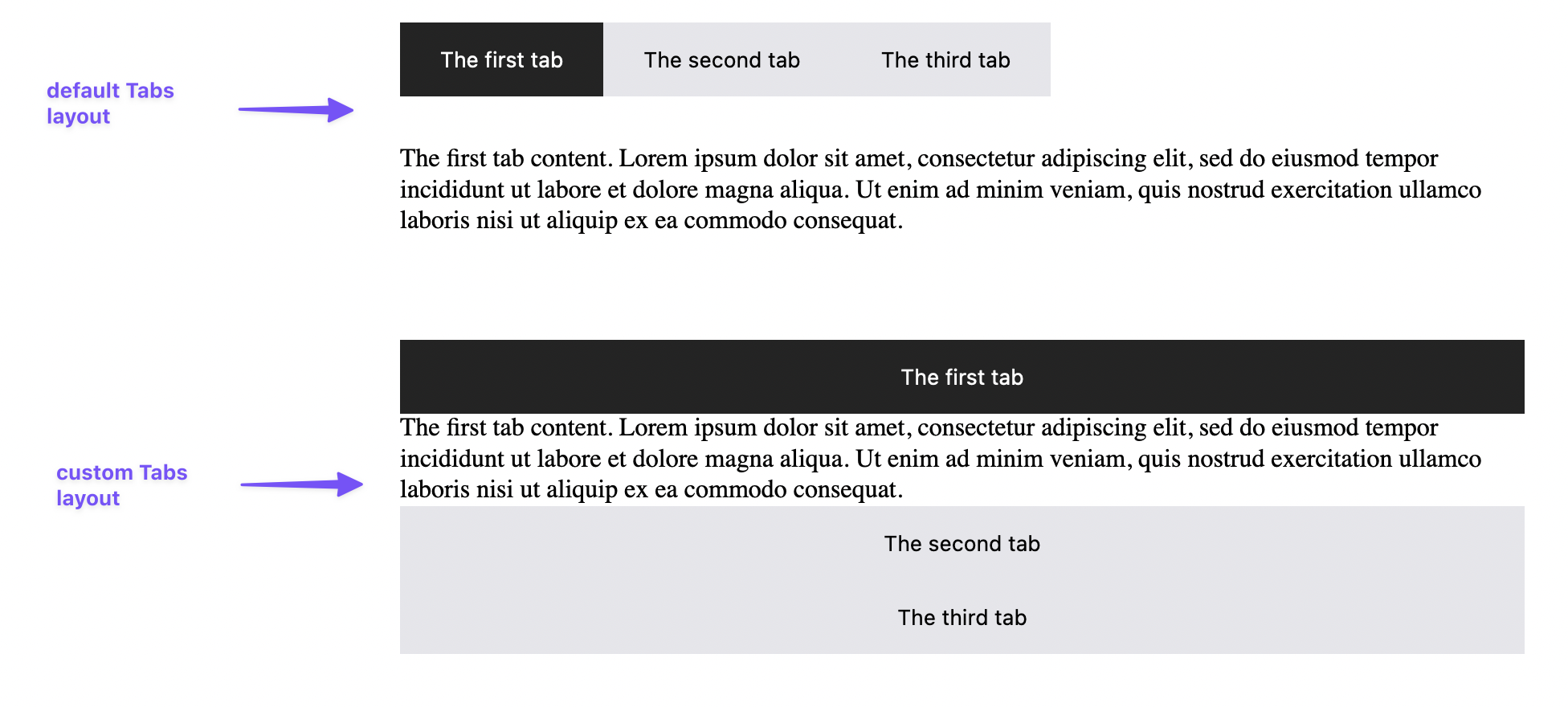
Should it be horizontal, or vertical, or in three columns etc is controlled by CSS and restricted by our creativity only ;) This is now the default layout and a custom one look like:
For developers / API
The "heart" of this functionality is an interactive module "Tabs". The module creates <builderius-tabs>
custom HTML element.
- HTML tag name:
<builderius-tabs> - Implements 3rd-party script: none
- Allowed children modules: any
- Available since:
0.9.7 PRO
Since <builderius-tabs> is a custom HTML element, its default behavior is equal to inline element, not block; it can be changed any time with display CSS property.
API
Attributes for Tabs
data-initial-item
This attribute accepts numeric value. By default, the first tab will be shown initially. If set, this value must be equal to one of data-tab/data-tab-panel attributes.
data-disable-autoclose
This is a boolean attribute, which means it does not require any values. If added, the
previous active panel will not be hidden automatically. It is pretty much the same as accordion
functionality.
data-disable-on-mq
This attribute accepts a string value. It has to be a valid media query.
Example: (min-width: 700px). The whole tabs functionality will be disabled if
the current viewport matches the provided media query string. It turns this module into
a static layout, no interactivity at all!
Attributes for tab/panel elements
data-tab / data-tab-panel (required)
Are used in all modes.
These attributes accept numeric values. At least two different modules must be used - one for tab and one for panel - but the same numeric value must be set for both of them.
Events
ready (scope: element)
builderius-tabs-ready (scope: window)
This event is getting fired every time the component is being initiated/re-initiated. It also passes some data:
{ el }
Where el is the reference to the HTML element
hidden-tab (scope: element)
builderius-tabs-hidden-tab (scope: window)
This event is getting fired every time some tab becomes inactive and its connected panel is getting hidden. It also passes some data:
{ oldTab, oldPanel }
Where oldTab and oldPanel are references to the respective HTML element.
shown-tab (scope: element)
builderius-tabs-shown-tab (scope: window)
This event is getting fired every time some tab becomes active and its connected panel is getting revealed. It also passes some data:
{ newTab, newPanel }
Where newTab and newPanel are references to the respective HTML element.
This same event will be fired after the click on next/prev button in "multi-step form" mode. In this case it passes this data:
{ newPanel }
Methods
reInit
This method resets and initiates the component.