Component Properties
Component properties control what changes between component instances while keeping the design consistent. Instead of hardcoding content into components, properties let you customize text, images, links, and visibility for each use.
The Problem Properties Solve
Without properties, components are rigid. You build a blog card, then copy-paste and manually edit it for products, team members, and testimonials. Each copy becomes disconnected, creating:
- Maintenance: Component changes require hunting down every instance
- Dynamic Data: Over-reliance on dynamic data for content changes in components
- Design inconsistency: Manual edits accumulate into visual chaos
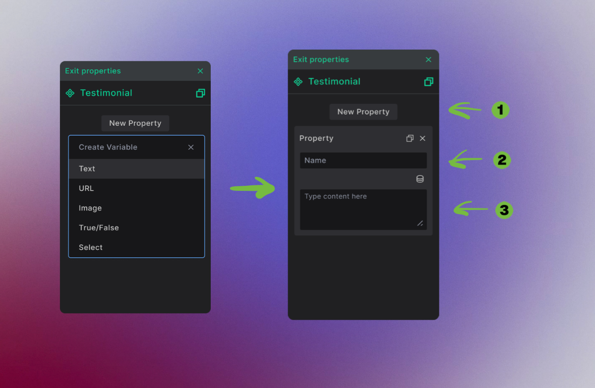
1. Create Property - In component editing mode, unselect all elements and click "New Property." Choose type (Text, Image, URL, True/False, or Select) and set a default value.
2. Bind to Element - Select an element in your component, then click the property binding icon (⊕) next to the field you want to control (content, attributes, or HTML tag).
3. Customize Instance - Place the component in a template. Select it to see the properties panel where you can enter unique values for each instance.
Result: One component design, unlimited content variations. Change the component design to update all instances instantly.
How Properties Fix This
Properties separate content from design. You build one card component with customizable slots for title, image, and link. Each instance pulls different content through these properties while maintaining identical styling and structure.
Result: Change the design once, update everywhere. Let content editors modify text and images without breaking layouts. Keep perfect visual consistency across thousands of pages.
By separating design from content, we do not only mean stlye, editable by CSS, we also mean stucture, HTML. Component can be edited from a single place, both in CSS and HTML.
Getting Started with Properties
When you edit a component, clicking away from all elements reveals the property creation interface. This is where you define properties that will allow customization in each component instance.

- Tabbed interface - Switch between templates, components, and pages
- Green border indicator - Shows you're editing a component, not a template
- Properties panel - Appears when no elements are selected
- New Property button - Start adding customizable options
- Property type menu - Choose what kind of content this property controls
Property Types: What You Can Customize
Each property type handles different content needs, from simple text to complex conditional logic.
Text Properties: Words and Content
Perfect for headlines, descriptions, labels, or any text content that changes between instances.
Setup process:
- Click New Property to add another customizable option
- Name your property - this becomes the label team members see
- Set default content - what shows when the component is first added
Text properties handle everything from simple headlines to complex HTML or JSON content.
URL Properties: Links and Navigation
Control where buttons, links, and navigation elements lead, with smart WordPress integration.

Setup details:
- Previous properties collapse automatically to keep the interface clean
- Descriptive naming helps team members understand what each property controls
- Default URLs can point to WordPress pages, posts, or external sites
URL properties work with WordPress's built-in link picker, making it easy to link to existing content.
Image Properties: Visual Content
Handle photos, icons, backgrounds, and any visual content with Media Library integration.

Configuration options:
- Choose Image type from the property menu
- Name for clarity - "hero_image", "team_photo", "product_shot"
- Media Library integration lets you choose existing images or upload new ones
- Flexible sources accept manual URLs, WordPress media, or dynamic fields
True/False Properties: Show and Hide
Control which elements appear in different component instances through simple on/off toggles.

Perfect for:
- Optional elements - show/hide badges, icons, or secondary content
- Feature toggles - enable/disable animations, special styling, or functionality
- Content variations - different layouts based on content type
True/False properties create component variants without building separate components.
Select Properties: Multiple Choice Options
Provide predefined options for styling, layouts, or content types while preventing invalid entries.
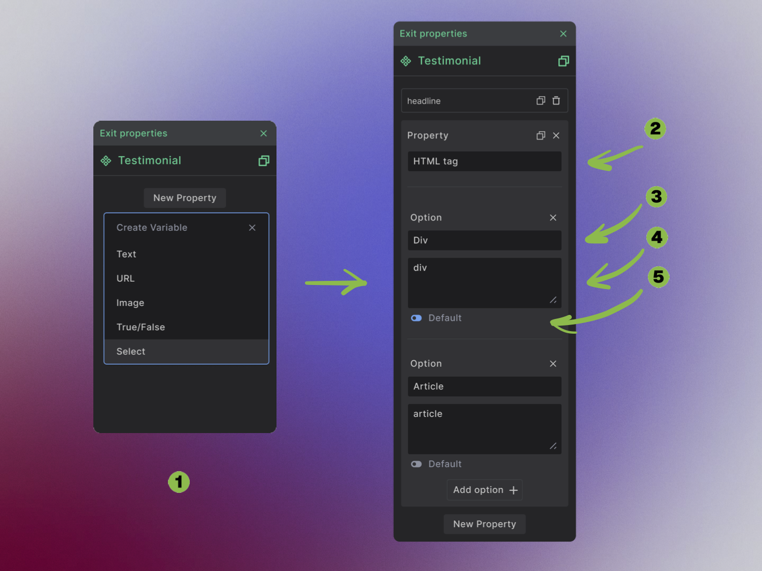
Setup workflow:
- Add Select property for controlled choices
- Name descriptively - "button_style", "card_layout", "color_theme"
- Create option labels - what team members see in the dropdown
- Set option values - what actually gets applied to the design
- Choose default option - which choice appears initially
Connecting Properties to Your Design
Properties become powerful when connected to specific elements. Each binding point controls different aspects of your design.
Making Text Dynamic
Connect text properties to headings, paragraphs, and labels to create flexible content areas.
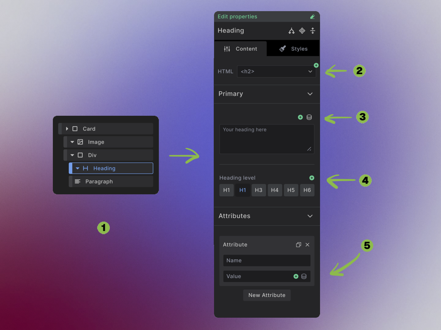
Binding locations:
- Select your element in the Navigator panel
- HTML tag control - let team members change h1 to h2, p to span, etc.
- Content binding - connect property to the actual text that displays
- Attribute control - manage classes, IDs, and accessibility attributes
Controlling Links and Navigation
URL properties connect to link elements to create flexible navigation and call-to-action buttons.

Connection process:
- Select the link element you want to make dynamic
- Bind the URL field to your URL property
This creates smart buttons that can link anywhere while maintaining consistent styling.
Dynamic Images and Media
Image properties control visual content, from hero backgrounds to product photos.

Binding targets:
- Image element selection - choose which image to make dynamic
- Source field binding - connect your image property to the element
- Alt text connection - bind accessibility descriptions to text properties
Conditional Visibility
True/False properties control which elements appear in different component instances.

Setup process:
- Choose the element you want to show/hide conditionally
- Create Dynamic Data condition using Builderius's condition system
- Reference your boolean property to control visibility
This creates components that adapt their layout based on content needs.
Style and Layout Control
Select properties bind to multiple-choice fields to control styling and layout options.

Common uses:
- HTML tag selection - let users choose between div, section, article
- CSS class control - switch between button styles, card layouts, color schemes
Property Binding Flexibility
Properties adapt to different field types, giving you precise control over how they integrate with your content.
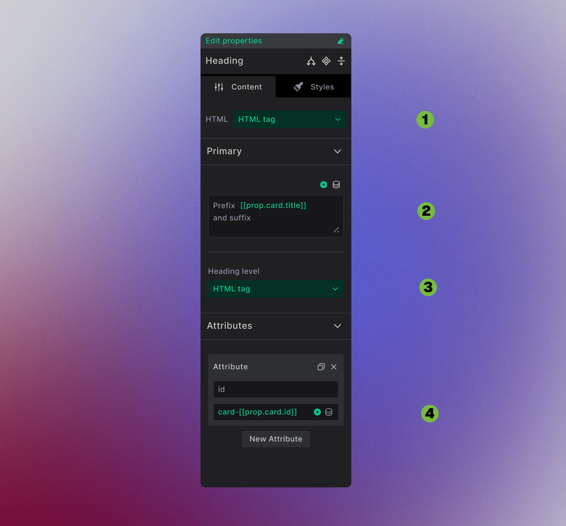
Two binding modes:
- Field replacement - Properties bound to dropdown fields (like HTML tag selection) take over the entire field
- Text insertion - Properties in text areas appear as editable tags like
[[prop.card.title]], letting you combine them with static text - Field replacement - Properties bound to buttons take over
- Attribute building - Create dynamic attributes like
card-[[prop.card.id]]for CSS classes, ID's or custom attributes
This flexibility lets you create sophisticated content patterns where properties blend seamlessly with static text and other dynamic data.
Using Your Flexible Components
Once properties are set up and connected, your components become powerful, customizable building blocks.
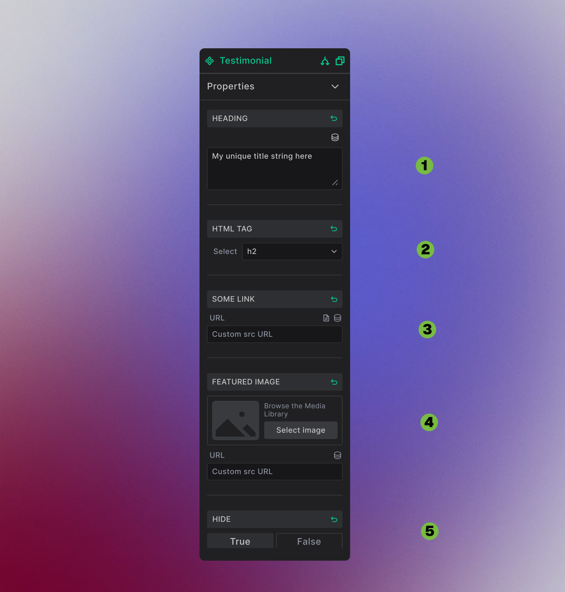
Your property panel displays:
- Text fields for content like headlines and descriptions
- Dropdown menus for select properties with predefined options
- Link pickers for URLs with WordPress integration
- Media selectors for images with library access
- Toggle switches for True/False visibility controls
Advanced Property Capabilities
Component Nesting: Parent components can pass their properties to child components, creating sophisticated design systems where one property controls multiple nested elements.
WordPress Integration: Properties connect seamlessly to WordPress data - post titles, featured images, ACF fields, user information, and more.
Dynamic Conditions: Combine properties with Builderius conditions to create adaptive layouts that respond to content, user roles, or device types.
Properties transform rigid designs into flexible systems that maintain consistency while adapting to any content. Your team gets the freedom to update content without breaking design, while you maintain perfect visual consistency across your entire site.