Introduction
Components are reusable design elements that you build once and use everywhere. Think of them as smart building blocks - headers, footers, cards, buttons, or any custom element you create.
Unlike static elements, components can have properties - customizable settings that let each instance display different content while keeping the same design.
Why Use Components?
Build Once, Use Everywhere - Create a card component once, use it for blog posts, products, team members. Update the design, and every instance updates automatically.
Consistent Design System - Components ensure your design elements look identical throughout your site, even when content changes.
Flexible Content - Properties let you customize each component instance - same design, different content.
Performance and Scalability - Components only load their assets and data on pages where they're actually used, keeping your site fast and manageable as it grows.
How Components Work
Component Hierarchy
- Global Components - Available across all templates and pages
- Nested Components - Components can contain other components
- Component Variants - One component can display differently based on property settings or conditions
Property System
Components become flexible through properties:
- Text properties - headings, descriptions, labels
- Image properties - photos, icons, backgrounds
- URL properties - links, navigation
- Boolean properties - show/hide elements
- Select properties - multiple choice
Editing Components In-Place
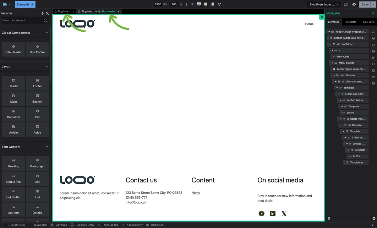
To edit an existing component:
- Right-click on any component instance
- Select Edit Component
- Component opens as new tab above canvas
- Make your changes in component editing mode
- Close tab to return to template editing
Changes apply to all instances of that component across your site.
Creating Components from Elements
In Builderius Community (Free) you can use built-in components (Site header, Site Footer) but for creating custom components you need Builderius Website or Builderius Professional.
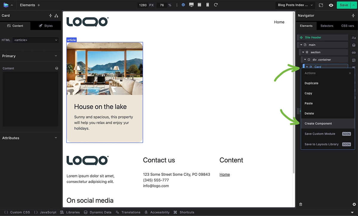
To create a new component from existing elements:
- Build your design using regular elements
- Select the elements you want to convert
- Right-click and choose "Convert to Component"
- Name your component
- Your elements become a reusable component
Working with Properties
1. Create Properties

In component editing mode:
- Unselect any elements by clicking a selected element
- Click New Property
- Select the property type
- Set property name and default value
- Save the property
2. Bind Properties to Elements
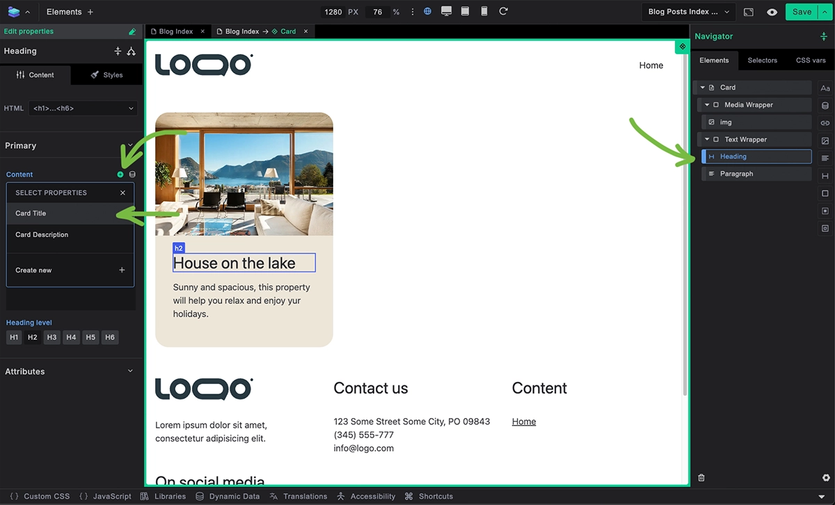
Connect properties to component elements:
- Select element within component
- In element settings, click the property binding + icon
- Choose which property controls this element
- Property now controls element content
3. Use Properties in Instances
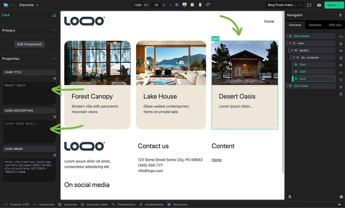
When using component instances:
- Select component instance in template
- Property panel shows customizable fields
- Enter unique values for each instance
- Same design, different content
4. Seeing Changes Propagate

To see how component changes affect all instances:
- Create three card components next to each other in a template
- Edit card component (add new element like a badge)
- See instant update on all instances
- All three cards now have the new element
- Each card can still have unique property values
This demonstrates the power of components - structural changes propagate automatically, while content remains customizable through properties.
5. Removing and Deleting Components
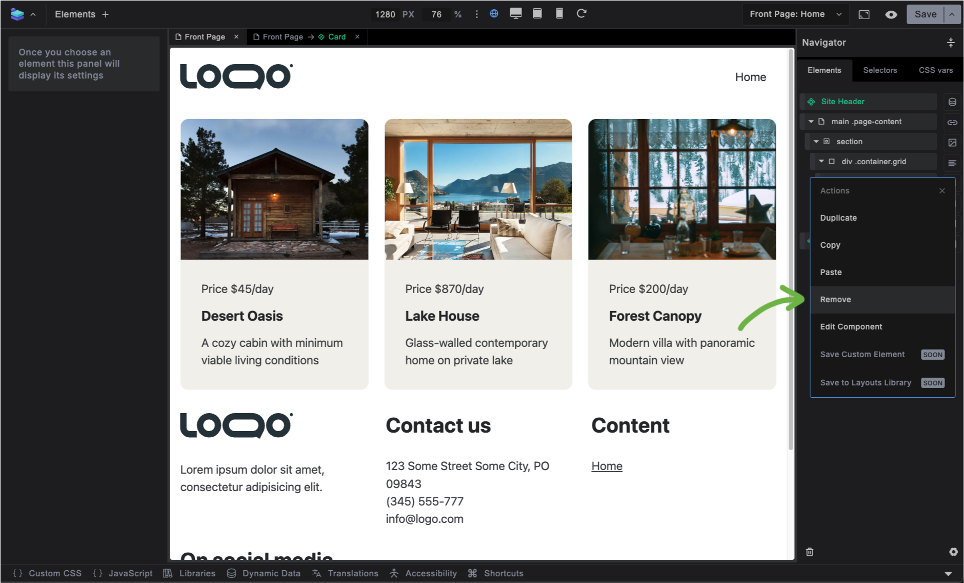
To remove a component instance from the canvas:
- Inside the "Navigator" (right sidebar) Hover over the component instance
- Right Click Select Remove
- Component instance is gone
This action does not remove the component from your system, it just removes the specific instance from the canvas.
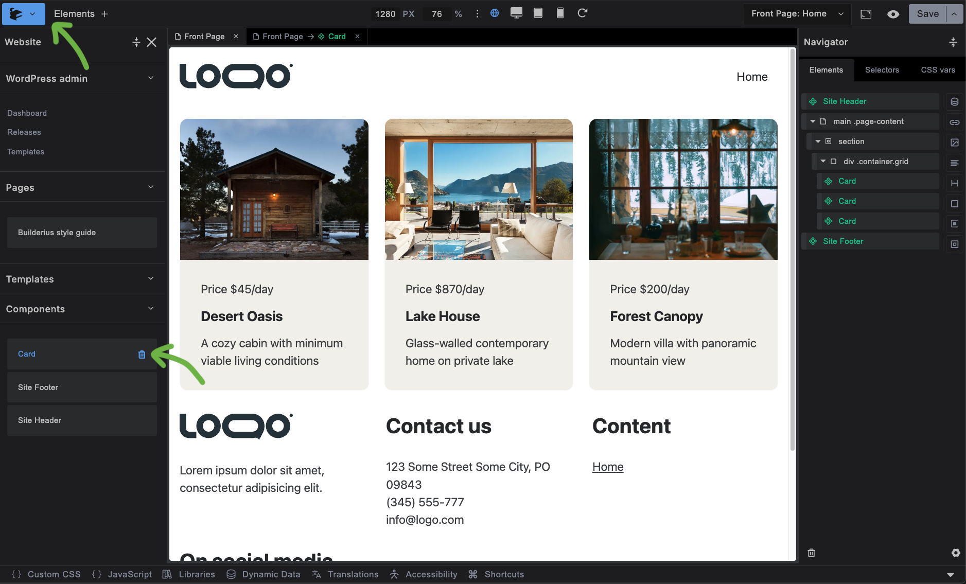
To delete the component completely from the entire site system:
- Open the "Website" sidebar Click the top-left builderius logo
- Go to the components section, and hover over desired component The delete button will appear, click it
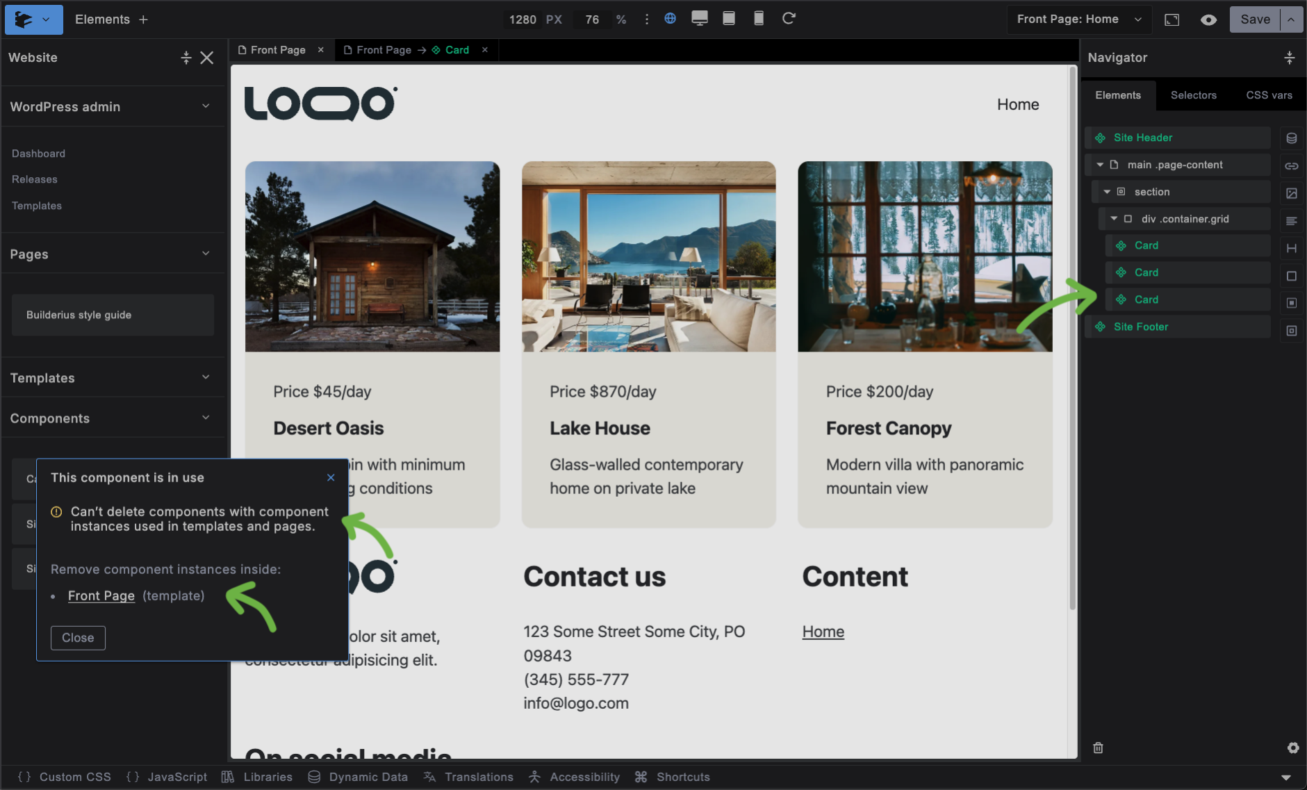
- Case A: component instance do not exists in canvas:
- The modal will appear explaining the situation
- The templates and pages where instances exist will be listed with links that help open them
- You will not be able to delete the component until you have removed all isntances
- Case B: component instance does not exists in canvas:
- The modal will appear asking to confirm the deletion
- Clickicking delete will permanently delete the component
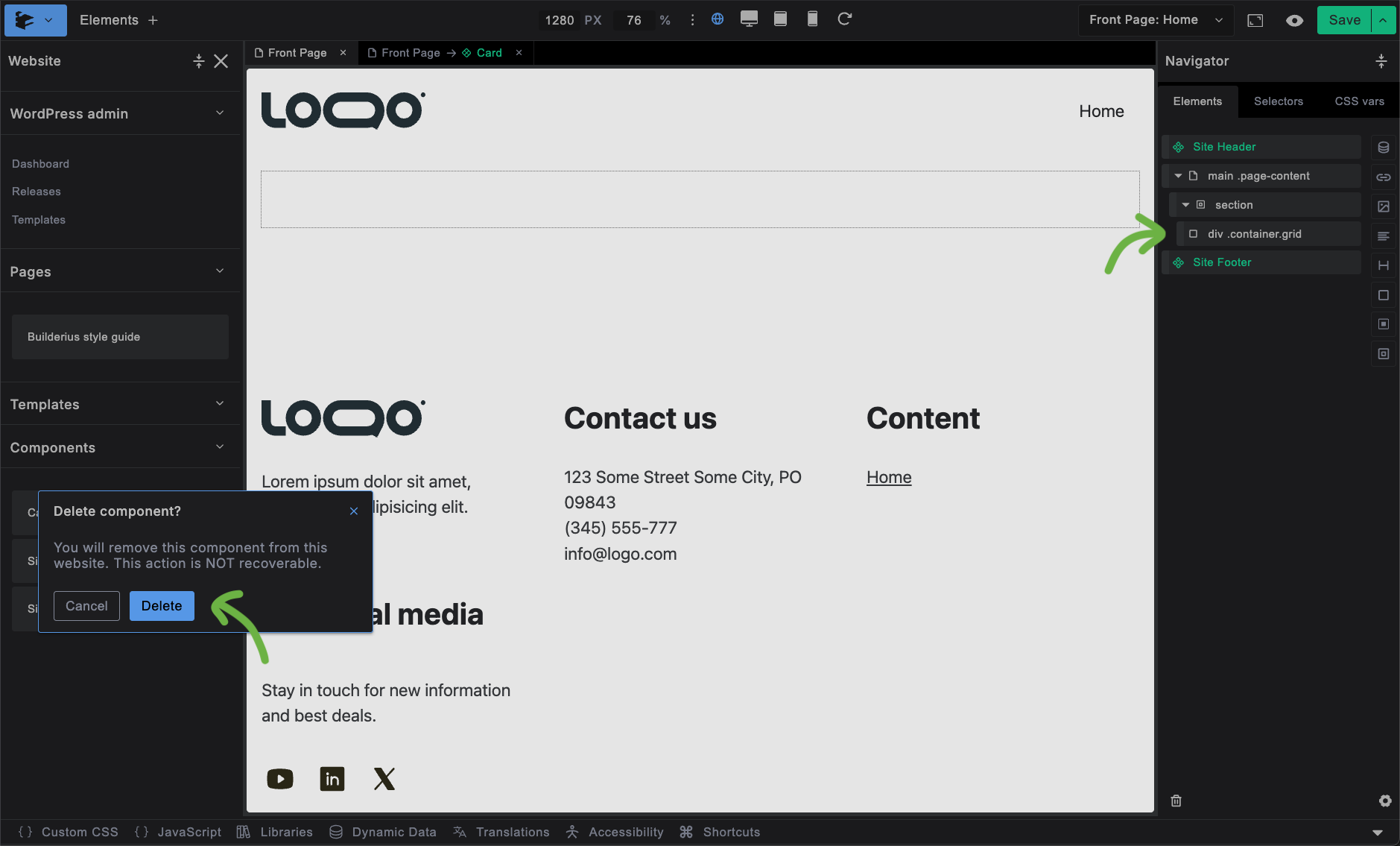
This action is non-reversible, so be sure you want the component truly gone.
Why Components Beat Template Parts
Modern web development has moved to component-based architecture. Webflow modernised visual building with components, Figma transformed design with reusable systems, and enterprise teams at Airbnb and Netflix standardized on components because they scale better and maintain easier.
WordPress has clung to the old template parts approach — separate header.php and footer.php files — since 2003. And many visual builders still follow that paradigm. Components aren't just trendy — they're a fundamentally better way to build maintainable, scalable websites.
Effortless Editing
Template Parts: Leave your current template, find header, edit it separately, then return to your original work.
Components: Right-click the header component, edit in-place with tabs, see changes instantly in context.
Edits propagate to entire site in both cases.
Flexible Usage
Template Parts: Same header everywhere. Want a different header on some pages, or no header? Write conditional code.
Components: Delete the header component from specific templates. Or use properties to show/hide elements without code.
Drag and Drop Freedom
Template Parts: Header stuck at top, footer stuck at bottom, and your page template stuck in between. Want content above the header? Requires theme modification or WordPress action hooks.
Components: Drag components and elements anywhere. Header in the middle? Footer at the top, Sidebar next to main? No problem.
Instance Customization
Template Parts: Different styling requires custom CSS, different content requires conditions or multiple template part files.
Components: Properties let each instance have unique content and styling while sharing the same design structure.
Intelligent Asset Loading
Template Parts: All header assets load site-wide, even on pages that don't use them. Want to avoid this, conditions again.
Components: Assets and styles can be scoped to load only when the component is used, improving performance automatically.
Built for nesting and modularity
Template Parts: You can technically create a logo template part and place it in the header template part, but that's cumbersome.
Components: Components thrive in this. Logo component inside navigation component inside header component. That's how it's done. Reusable, modular, intuitive.
One Mental Model for Everything
Traditional Approach: Headers/footers are template parts, buttons are CSS classes, cards are copy-paste HTML, forms are plugins. Four different systems to learn and maintain.
Components: Everything reusable works the same way. Header component, button component, card component, form component. Right-click → edit component. Learn once, apply everywhere.
Managing Components
Components are managed through Builderius releases like all other changes. When you update a component design, create a release to push changes live across your site.
Best Practices:
- Start with simple components like buttons and cards
- Create properties when you need them, you can add them later at any point
- Test components in different contexts before releasing