Responsive
Responsive
Responsive settings
Builderius has controls for creating custom @media queries. We can create ANY media query, e.g. (max-width: 768px) or screen (min-width: 800px) and (max-width: 1200px) etc. Each of the settings types has these controls. This is how the controls look like in the builder:
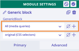
The same as for CSS related styles, @media queries created for any modules are applied for this module only. If we create @media queries in template or global settings, then they will be applied for .builderiusContent element (read more about this element).
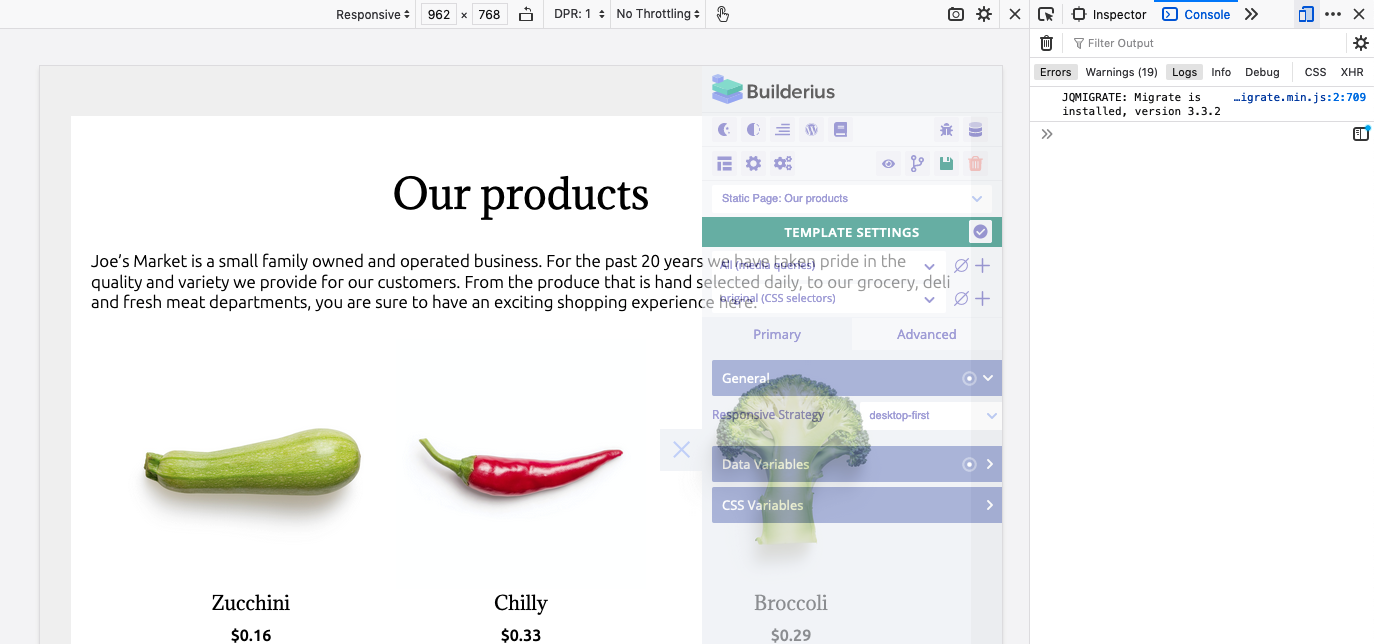
Additionally, template and global settings include "Responsive strategy" setting that defines the sorting method of @media queries created in the builder. By changing the responsive strategy we can achieve desktop-first (default) or mobile-first approach in styling templates.
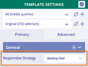
Builderius makes it possible to switch between desktop-first or mobile-first approach in styling templates!
Add/edit media queries
By default, "all" option is created. We cannot delete it. This option means that any styles created will be applied without any media queries.
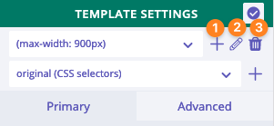
- Create a new media query
- Edit the existing media query
- Remove the existing media query (with all styles added within this query)
How to work with responsive version
Tools
Builderius does not have controls to change the width of the viewport. Builder does not use iframe to render the content inside it, and since there is no effective methods to adjust the width of the viewport by using JS, Builderius simply does not do this. It relies on browsers' built-in methods and tools, e.g. devtools panel.
Since the builder panel stays in the viewport, it partially overlap the page content. With more narrower window it will be harder to see and test elements and styles. The solution could be making the builder panel semi-transparent (there is an icon on the panel for switching its transparency)
Semi-transparent panel is fully functional. We just can see through it and decide which styles to adjust. It is quite convenient.
Workflow
We already know where to check the current active media query. Whenever we change values of any CSS related settings, its value is scoped under the chosen media query. It means, unlike in some other builders, the size of the viewport (also browser window) can be anything and does not impact the scope of CSS settings adjusted.
As an example, it is perfectly fine to switch viewport to, let's say, 420px, but at the same time adjusting settings under (max-width: 768px) media query
Try keeping responsive styles as minimum as possible. For instance, CSS Flexbox model powerful enough to use the right style under "all" and have nice looking responsive version at the same time.
The best responsive styles are no responsive styles at all! ;) Try keeping them as minimum as possible.
Responsive strategy
"Responsive strategy" setting can be found under template and global settings. This settings has two values: 'desktop-first' and 'mobile-first'. The value of 'Responsive strategy' defines how the values of CSS settings are sorted and displayed on the page.
Desktop-first approach
It is set by default. This approach implies creating a layout based on the most wide view first, and add media queries which are targeted to specific narrower windows. This is an example of sorted media queries under "desktop-first" approach:
'screen and (max-width: 1023px)' {}
'screen and (max-width: 767px) and (min-width: 320px)' {}
'screen and (max-height: 767px) and (min-height: 320px)' {}
'screen and (max-width: 639px)' {}
'screen and (min-device-width: 320px) and (max-device-width: 767px)' {}
'screen and (min-width: 320px) and (max-width: 767px)' {}
'screen and (min-height: 480px) and (min-width: 320px)' {}
'screen and (min-height: 480px)' {}
'screen and (min-width: 640px)'  {}
'screen and (min-width: 1024px)'  {}
'screen and (min-width: 1280px)' {}
'screen and (orientation: landscape)' {}
'screen and (orientation: portrait)' {}
'tv' {}
'print' {}
Mobile-first approach
This approach implies creating a layout based on the most narrow view first, and then add media queries that target more and more wider screens. An example of media queries sorted:
'screen and (min-width: 320px) and (max-width: 767px)' {}
'screen and (min-height: 480px)' {}
'screen and (min-height: 480px) and (min-width: 320px)' {}
'screen and (min-width: 640px)' {}
'screen and (min-width: 1024px)' {}
'screen and (min-width: 1280px)' {}
'screen and (min-device-width: 320px) and (max-device-width: 767px)' {}
'screen and (max-width: 1023px)' {}
'screen and (max-height: 767px) and (min-height: 320px)' {}
'screen and (max-width: 767px) and (min-width: 320px)' {}
'screen and (max-width: 639px)' {}
'screen and (orientation: landscape)' {}
'screen and (orientation: portrait)' {}
'tv' {}
'print' {}