Interface Overview
Builderius has two main areas: the WordPress admin for managing your project, pages and templates, and the visual builder where you create designs, work with dynamic data and structure your content.
This overview shows you where to find everything so you can navigate with more confidence.
WordPress Admin Area
Home page
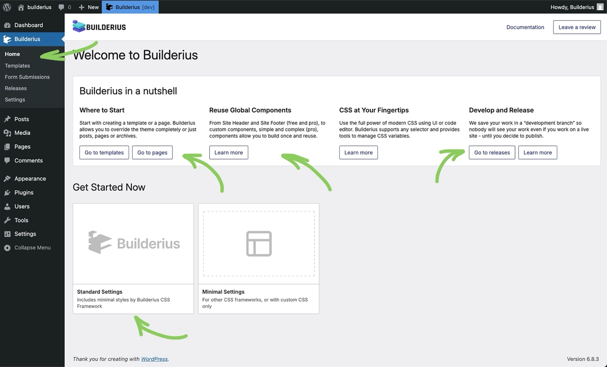 This is your Builderius dashboard, this is where plugin will land you when you click that "activate" button. This page contains several pointers to where you may want to go next, create a template, learn about compoenents and more.
Get started now
This is where you set up your "starter theme" to begin building faster. Choose between standard and minimal settings with more options to come.
Templates
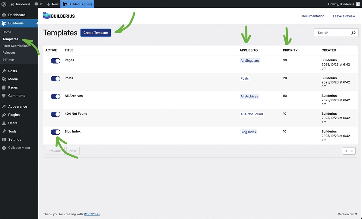 Create templates that apply to multiple pages (like all blog posts, archives or custom post types). Assign templates with simple locations, or intricate conditions, set priority, disable temporarily, or delete permanently. This page is a heart of every site build project.
Template vs Page Editing Modes
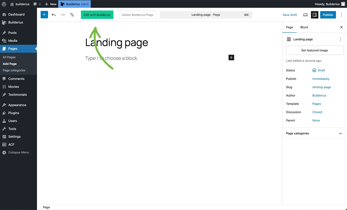
Builderius has two editing modes you'll encounter:
Template editing - Design reusable layouts that apply to multiple pages. This is where you'll spend most of your time and what we cover in Getting Started.
Page editing - Design individual pages directly. You'll see "Edit with Builderius" buttons on pages/posts throughout WordPress. This opens page editing mode for one-off designs.
Both modes use the same visual builder interface below, but serve different purposes. We'll focus on template editing in getting started section, then cover page editing later in the Templates section.
Releases
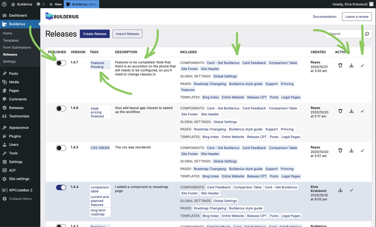 Releases are the backbone of Builderius workflow. Track versions of your work, deploy releases to production, export and import designs, and create custom starter frameworks. It's a unique feature in the builder space.
Settings
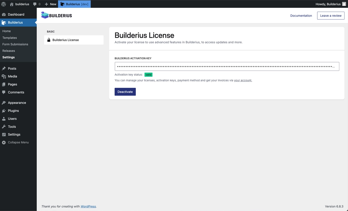 For now this area contains only site key input functionality. Come here to set the site up for feature and maintanance updates and keep your site up to date.
Form Submissions
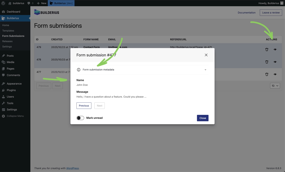 Builderius includes form building capabilities and a ready-to-use contact form. View and manage all form submissions here, or create forms workflows from scratch for your specific needs.
Visual Builder Interface
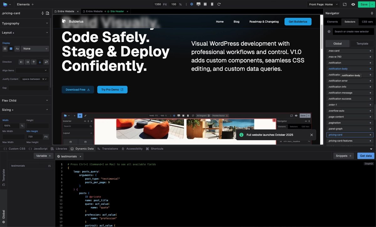 Builderius interface, immediately familiar, but highly optimized for flexibility unlike any other.
Top Bar
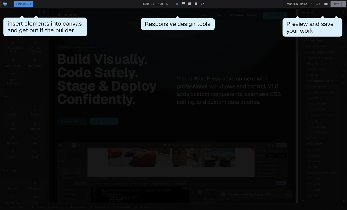 Access frequently needed actions from the top bar. Save your work, switch between preview modes, control responsive breakpoints, and manage canvas settings.
Element Inserter
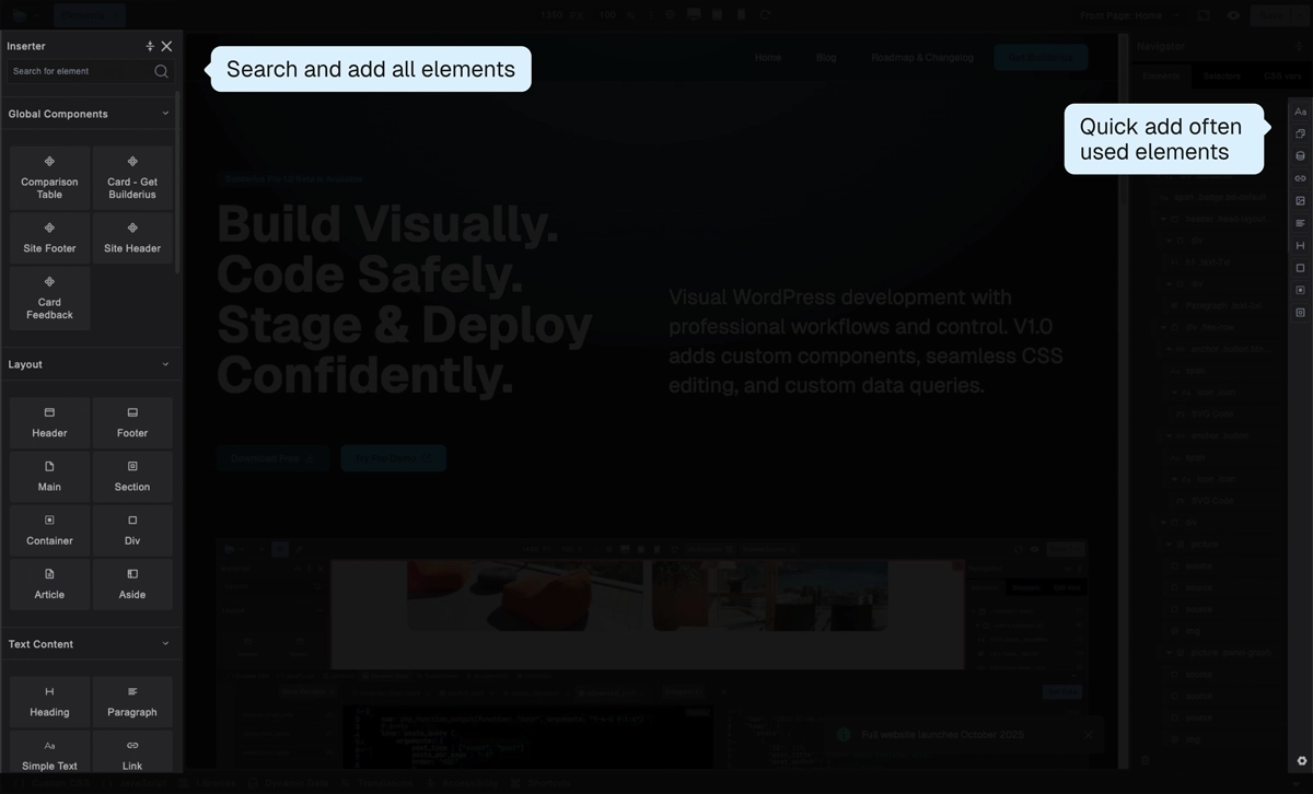 The main inserter on the left provides access to all available elements organized by category. The favorites panel on the right gives you quick access to frequently used elements.
Main Canvas
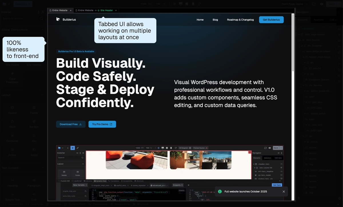 The main canvas shows your page as you build it. Use tabs to switch between different templates, components, or pages. The canvas renders your design accurately across different screen sizes so you can see exactly how it will appear to visitors.
Navigator
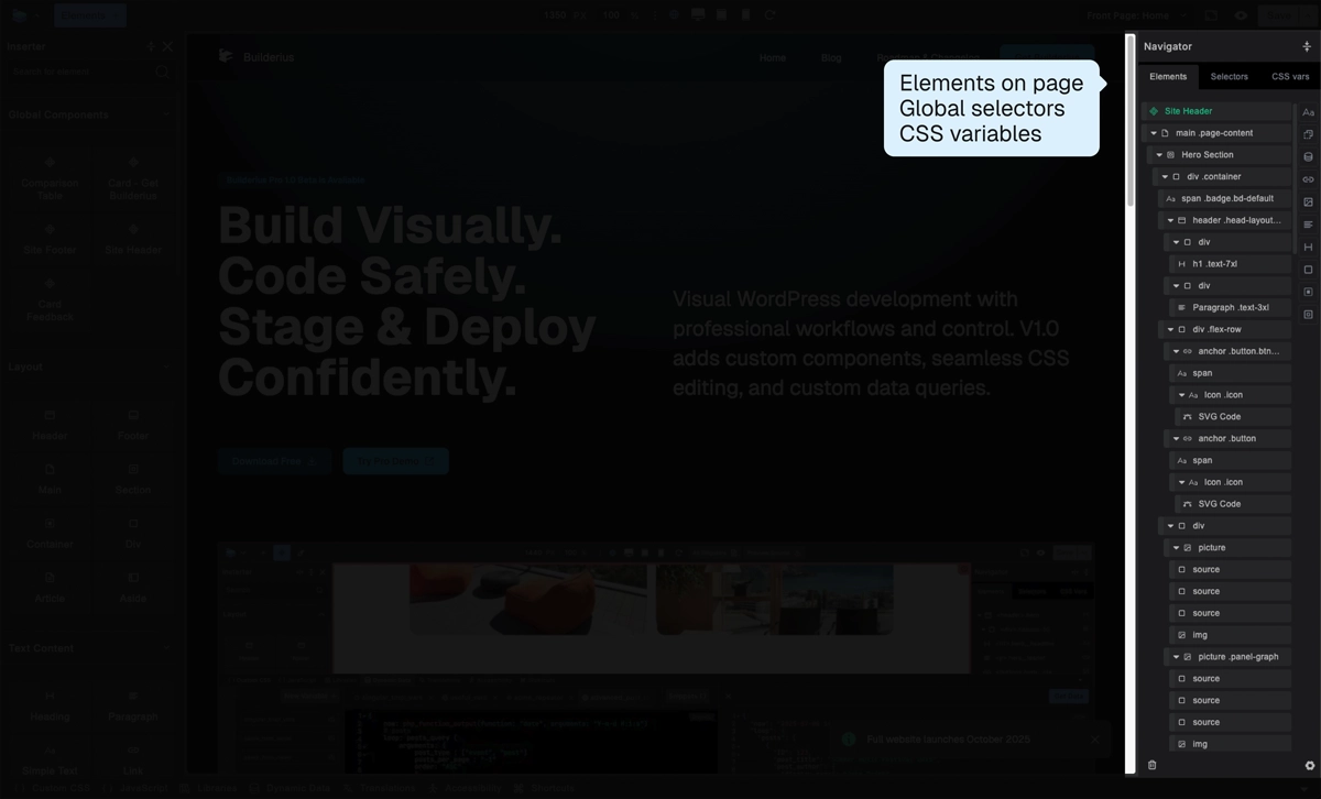
- Three tabs for quick and granular access of all items that make up your page appearance:
- Elements: Tree view of HTML structure - structured representation of content
- Selectors: CSS classes and other styling items applied to elements
- CSS Variables: Global design tokens and their values
Settings
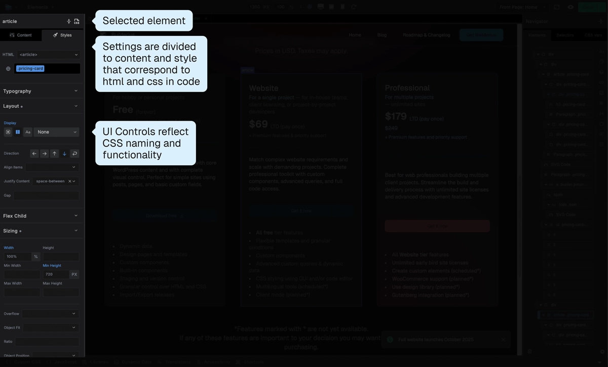 Context-sensitive controls that change based on selected element:
- Content tab: HTML, Content, dynamic data connections
- Style tab: Visual styling controls mapped to CSS properties
CSS IDE
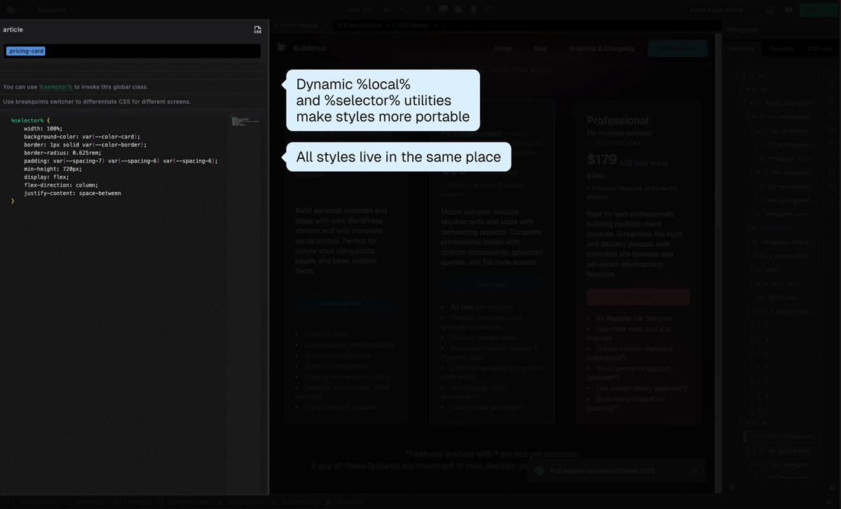 View and edit all your site's CSS in one unified interface. Whether styles come from the visual controls or direct code editing, everything appears here. Full control over every CSS rule without hidden overrides.
Advanced Panel
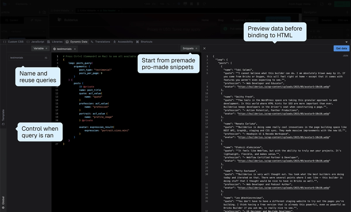 GraphQL IDE: Create custom data queries for dynamic content. Build queries from snippets or write GraphQL from scratch. Test queries and see live data previews.