Container
The Container element is a layout wrapper that constrains content width and centers it horizontally. Unlike the Section element which creates a composite structure, Container is a single element that can be used independently or as part of other composite elements like Section.
This is a container element type that can use any HTML tag. Learn more about element types →
What It Does
The Container element provides:
- Content width constraint - Limits content to readable widths
- Horizontal centering - Centers content within its parent
- Responsive behavior - Adapts to different screen sizes
- Flexible width presets - Multiple width options through CSS variables
Styling Framework Integration
Container functionality is entirely class-based, making it work regardless of the HTML element you use (as long as the element is a container type). In fact you can make other elements behave like container simply by adding a container class to them.
%selector% {
    margin-left: auto;
    margin-right: auto;
    width: 100%;
    max-width: var(--max-width, var(--container--width))
}
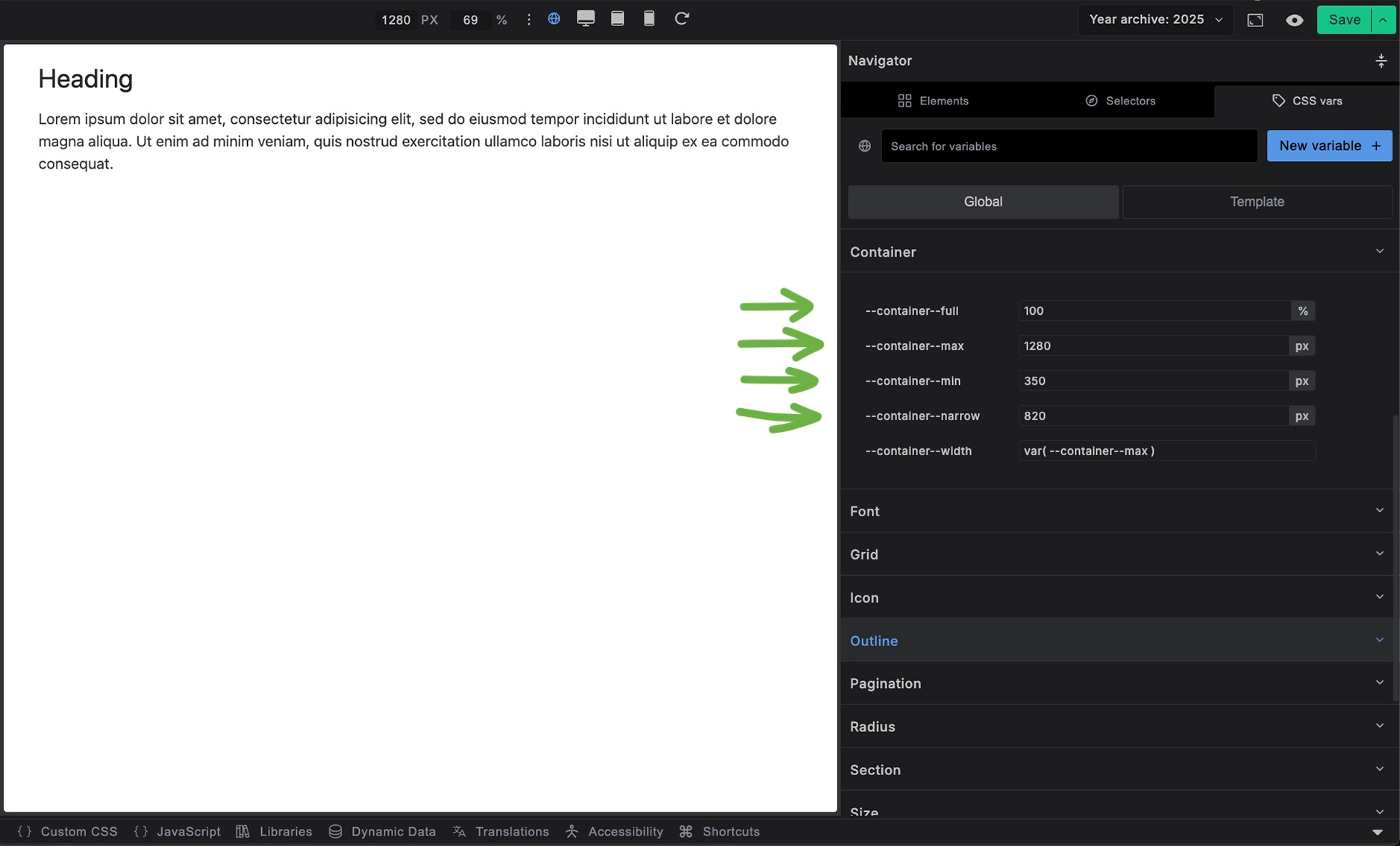
Container Width Variables
Builderius provides several container width presets through CSS variables:
--container--full:100%- Full width of parent--container--max:1280px- Standard maximum width--container--min:350px- Minimum width for mobile--container--narrow:820px- Narrower width for text content--container--width:var(--container--max)- Default width (uses max)
How to Use Container Width Controls
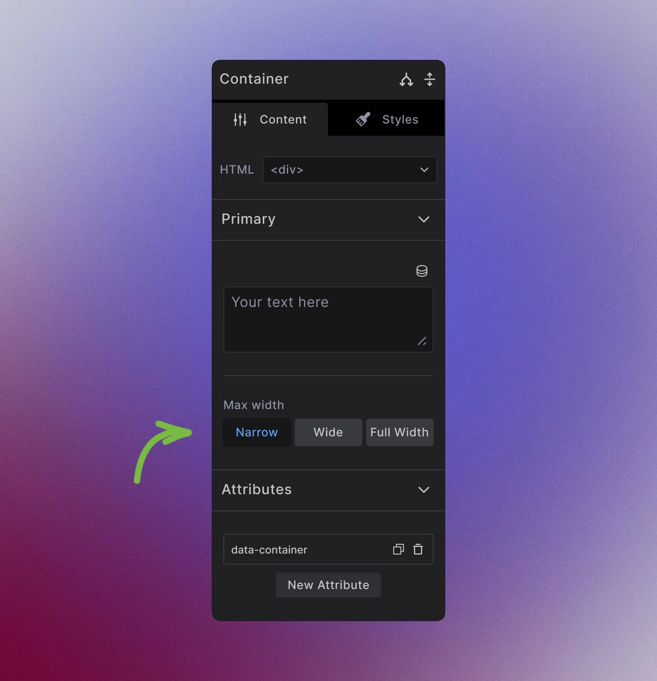
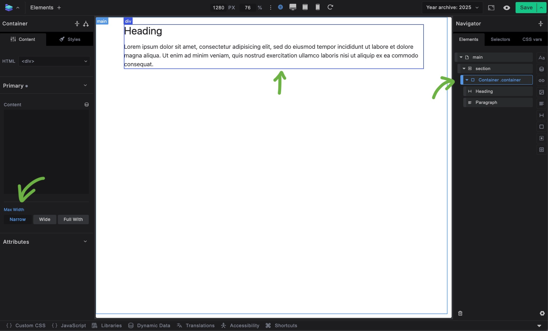
Select the button to set the width of individual container.
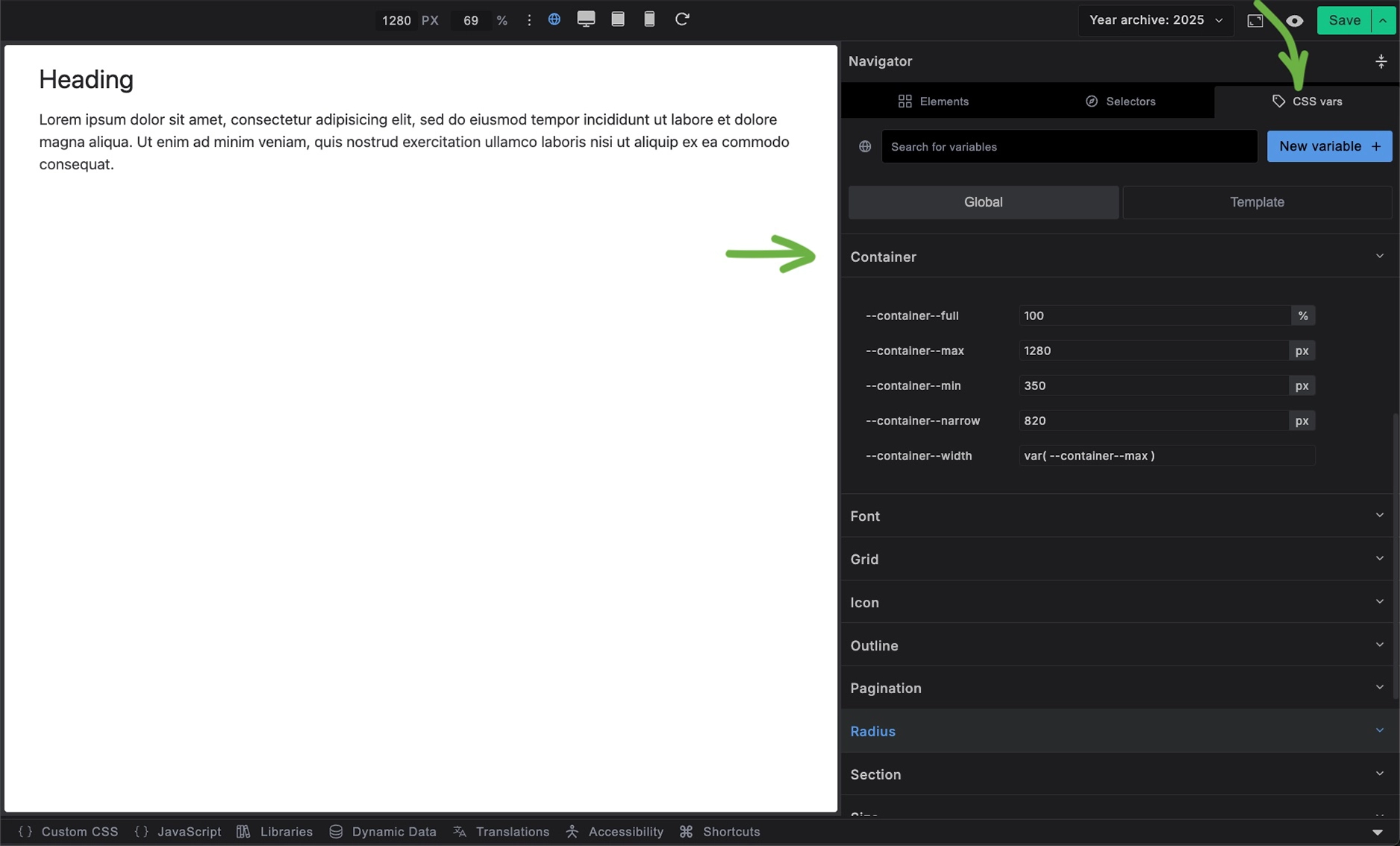
Change the Default container width globaly
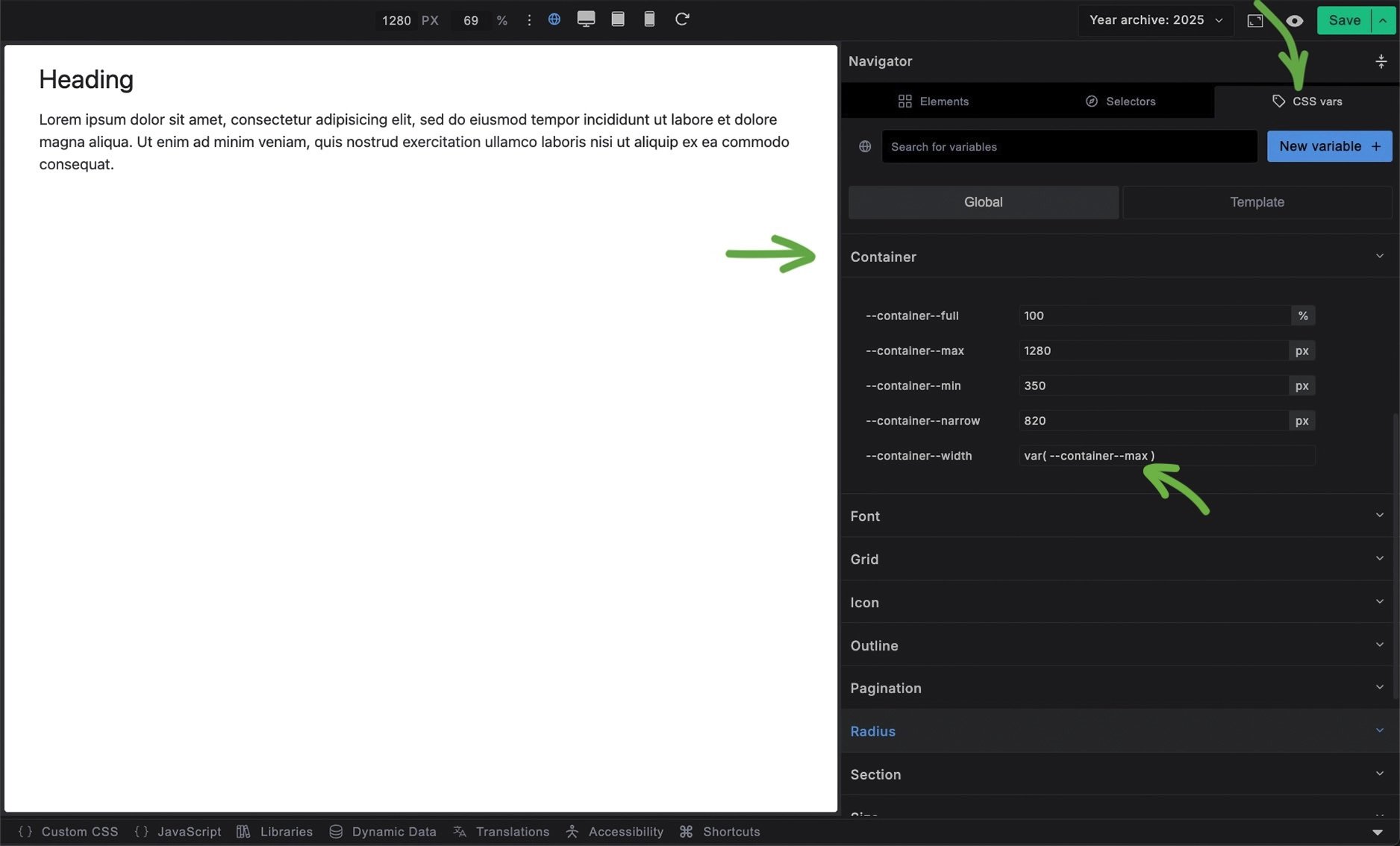
In the CSS vars change the value of --max-width to --container-full for example.
In code this would look like this
:root {
    --container--width: var(--container--full);
}
Changing Container Width Values
In the CSS vars change the values of:
--container--full:100%--container--max:1280px--container--min:350px--container--narrow:820px
To what your design requires.
Markup Flexibility
Since container styling is class-based rather than element-based, you can apply it to any HTML element without losing functionality:
<!-- As a div (default) -->
<div class="container">Content</div>

<!-- As a section -->
<section class="container">Content</section>

<!-- As an article -->
<article class="container">Content</article>
The .container class provides all the functionality regardless of the HTML tag used.
When to Use Container
Use Container when you need:
- Content width constraints without full-width backgrounds
- Horizontal centering of content blocks
- Consistent content widths across different page sections
Use Section instead when you need:
- Full-width backgrounds with constrained content
- Semantic page structure
- Built-in spacing for viewport edges
- The complete layout pattern with both wrapper and container
Best Practices
Choose appropriate widths: Use narrower containers for text-heavy content to maintain readability, and wider containers for complex layouts.
Consistent usage: Stick to the predefined width variables rather than custom pixel values to maintain design consistency.
Semantic markup: Choose the HTML element that best represents your content's meaning, then apply the .container class for styling.
Not Recomended
Do not add horizontal padding to container element. For the container element to have exactly the max width you declared in your max-width variables, it should not have the horizontal padding. Add padding to the outer-wrapper element so the content inside the Container never touches the edge of the browser.
Customization Options
Remove width constraints
Set max-width: var(--container-full) to allow full-width content within the container.
Custom widths
Redefine width variables for specific use cases using Local CSS Variable overrides.
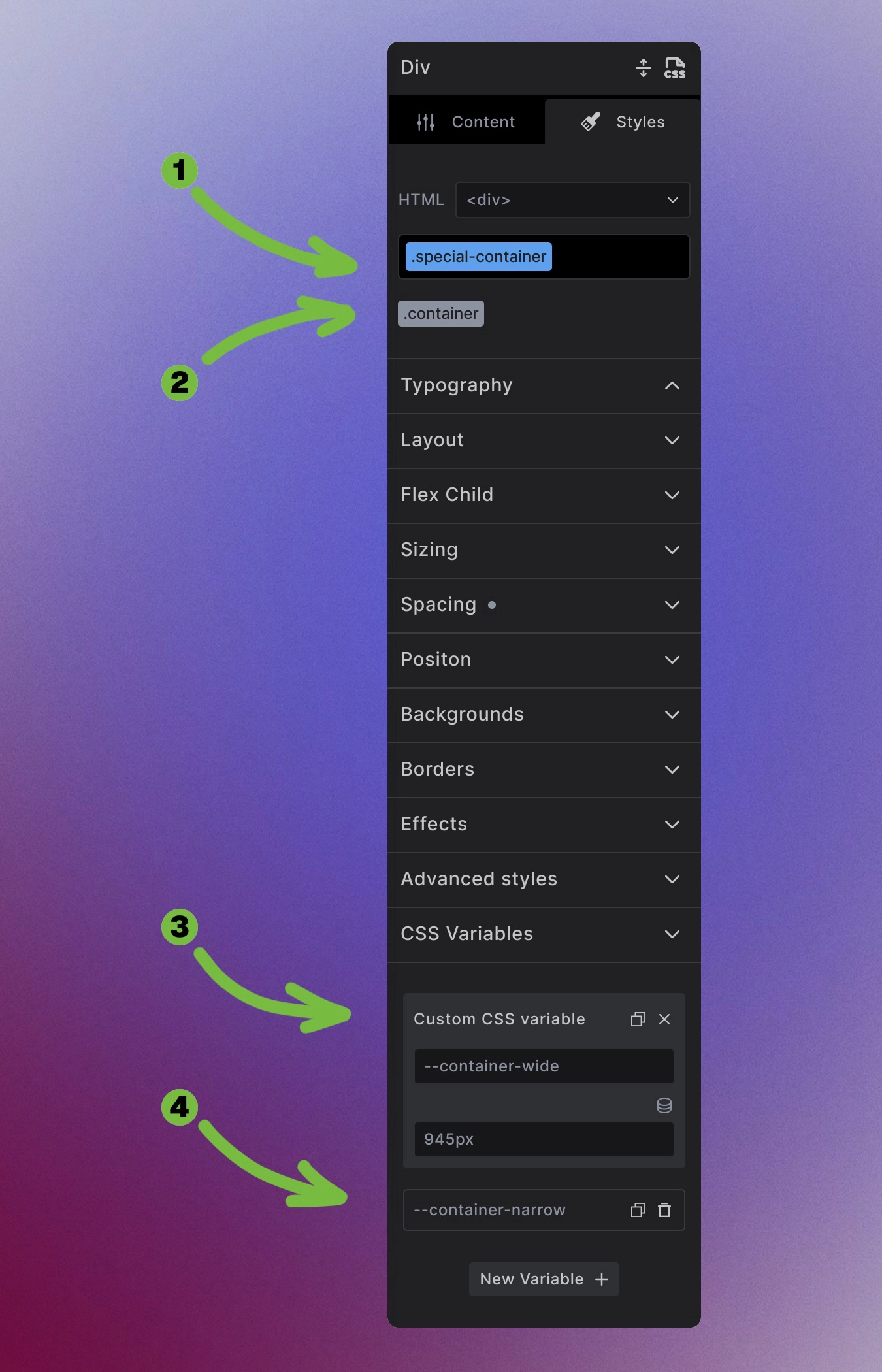
- Add a modifier class
.special-container - Keep the
.containerclass to keep the buttons functionality - Add the new value to
--container-wide - Add the new value to
--container-narrow
.special-container {
    --container-wide: 960px;
    --container-narrow: 960px;
}
The Container element provides a simple but powerful foundation for controlling content width and creating consistent layouts across your site.
Next steps: