Tabs
The Tabs element creates accessible tabbed interfaces using the custom <builderius-tabs> web component. It automatically manages the interactive behavior between tab buttons and content panels, providing a complete tabbed interface solution with built-in accessibility features. The tabs work out of the box, try clicking on a button and see.
This is an interactive element - a custom Builderius web component that provides advanced functionality bridging dynamic data, interactivity, and HTML structure. Learn more about element types →
This element creates multiple nested HTML elements to provide advanced and flexible functionality. Learn more →
What Gets Created
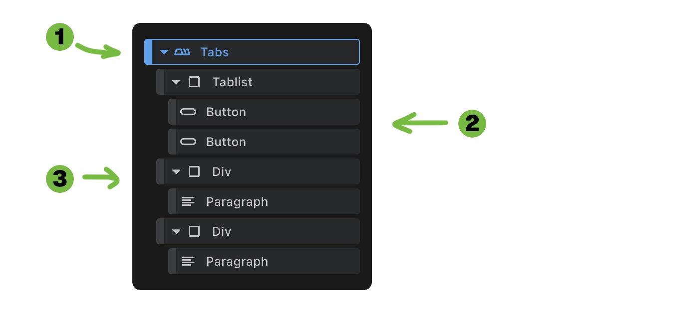
When you add a Tabs element to your canvas, Builderius automatically creates:
- Tabs wrapper - The main
<builderius-tabs>web component container - Button container - A div with
role="tablist"containing tab buttons - Tab panels - Individual content containers for each tab
<builderius-tabs>
  <div role="tablist">
    <button type="button" role="tab" id="tab-1" data-tab="1">Tab 1</button>
    <button type="button" role="tab" id="tab-2" data-tab="2">Tab 2</button>
  </div>
  <div data-tab-panel="1">
    <!-- Content for tab 1 -->
  </div>
  <div data-tab-panel="2">
    <!-- Content for tab 2 -->
  </div>
</builderius-tabs>
This structure provides the foundation for accessible tabbed navigation with automatic JavaScript functionality.
How to Use the Tabs
Step 1: Add to canvas Insert the Tabs element where you want your tabbed interface.
Step 2: Customize button labels Select each tab button and change the content to your desired tab labels.
Step 3: Add tab panel content Select each tab panel and add your content - text, images, other elements, or nested components.
Your basic tabs are now ready! The web component automatically handles the interactive behavior.
Adding More Tabs
If you need additional tabs beyond those created automatically:
Step 1: Duplicate a button
- Right-click on a tab button
- Select duplicate
Step 2: Update button attributes
- Change
data-tabattribute to the next number (e.g.,data-tab="3") - Update
idattribute accordingly (e.g.,id="tab-3") - Update the content of button to have the label you want
Step 3: Duplicate a panel
- Right-click on a tab panel element
- Select duplicate
Step 4: Update panel attributes
- Change
data-tab-panelto match your button (e.g.,data-tab-panel="3")
Step 5: Add content
- Customize the new panel with your content
The data-tab and data-tab-panel values must match exactly for tabs to work properly.
Tab Button Configuration
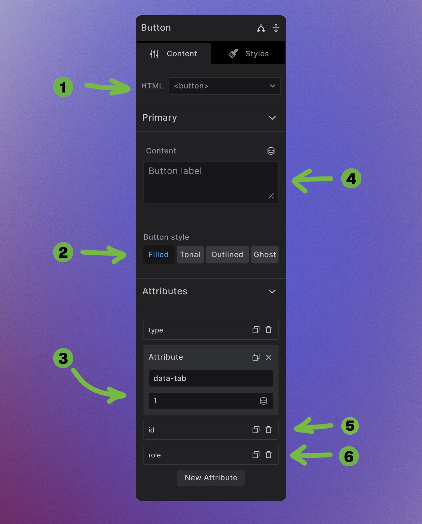
Tab buttons require multiple attributes and settings for proper functionality:
1. HTML tag: is set to <button> for proper button element type
2. Button style: Choose from styling options:
- Filled - Solid background button style
- Tonal - Subtle background tint
- Outlined - Border with transparent background
- Ghost - Minimal styling, hover effects only
3. Custom attributes required:
- data-tab="1" - Links to panel with
data-tab-panel="1" - id="tab-1" - Unique identifier for each tab
- role="tab" - Accessibility role for screen readers
4. Content: The button label text that appears on the tab
<button type="button" role="tab" id="tab-1" data-tab="1">
  Tab Label
</button>
Tab Container Configuration
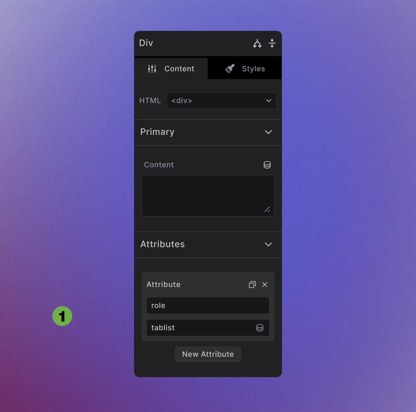
The button container requires accessibility attributes:
1. Role attribute: Set to tablist for screen reader accessibility
<div role="tablist">
  <!-- Tab buttons go here -->
</div>
This ensures proper accessibility structure for assistive technologies to understand the tabbed interface.
Tab Panel Configuration
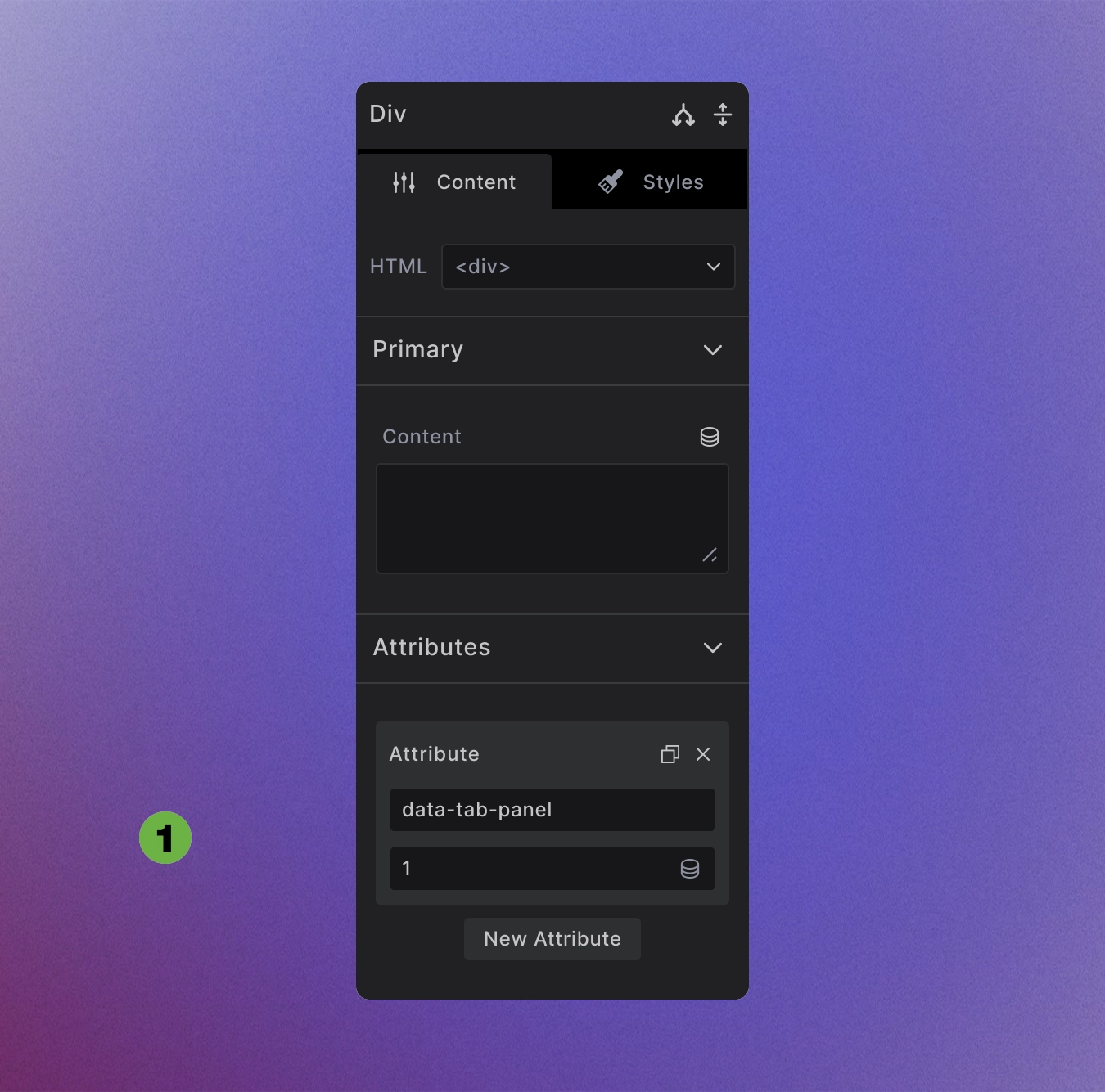
Tab panels require the data-tab-panel attribute to receive content from their corresponding buttons:
1. Custom attribute: Set data-tab-panel="1" to match corresponding button's data-tab="1"
<div data-tab-panel="1">
  <!-- Content for first tab -->
</div>
<div data-tab-panel="2">
  <!-- Content for second tab -->
</div>
Only one panel visible at a time - others are automatically hidden by the web component. Add any content inside panels - text, images, other elements, even nested Collections or interactive components.
Automatic Functionality
JavaScript behavior is built-in:
- Click handling - Switch tabs when buttons are clicked
- Keyboard navigation - Arrow keys move between tab buttons
- Focus management - Proper focus states and tab order
- ARIA attributes - Automatic accessibility markup
- Panel switching - Show/hide content based on active tab
No custom JavaScript required - the web component handles all interactive behavior.
Dynamic Tabs Variation
For data-driven tabs, use the dynamic variation that wraps buttons and panels in Collection elements:
What Gets Created
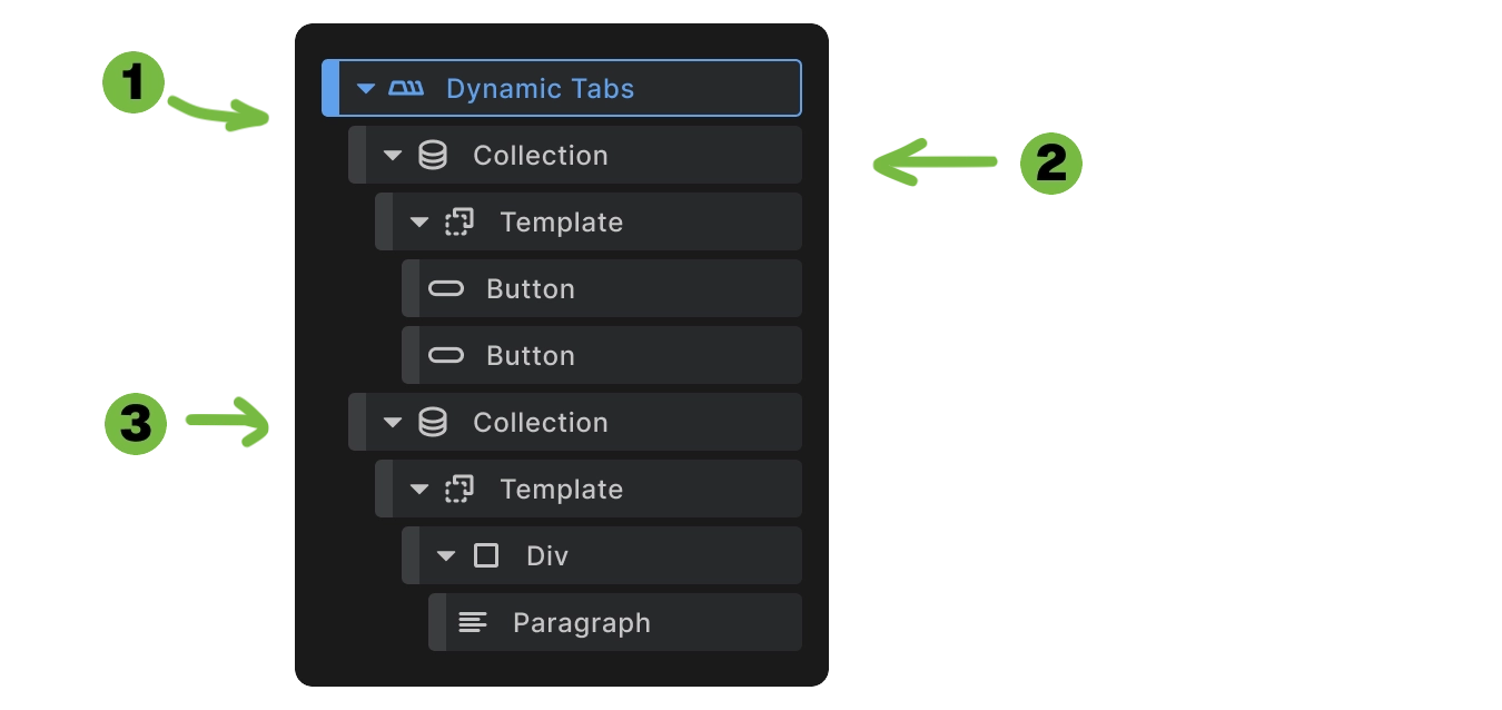
Dynamic tabs automatically create Collection elements with four key attributes:
Collection Attributes:
- data-content - Primary data source for the collection
- data-b-context - Alternative data source (takes priority over data-content)
- data-b-interactive - Context key identifier for data binding
- data-b-bind--data-content - Binds to the data context (must match data-b-interactive value)
<builderius-tabs>
  <builderius-collection role="tablist"
                         data-b-context="[{\"title\":\"Content Marketing\",\"content\":\"...\"},{\"title\":\"Email Marketing\",\"content\":\"...\"}]"
                         data-b-interactive="col_96c3fa3e2"
                         data-b-bind--data-content="col_96c3fa3e2">
    <template>
      <button type="button"
              role="tab"
              data-tab="{{index+1}}">
        {{title}}
      </button>
    </template>
  </builderius-collection>

  <builderius-collection data-b-context="[{\"title\":\"Content Marketing\",\"content\":\"...\"},{\"title\":\"Email Marketing\",\"content\":\"...\"}]"
                         data-b-interactive="col_e787d949e"
                         data-b-bind--data-content="col_e787d949e">
    <template>
      <div data-tab-panel="{{index+1}}">
        <p>{{content}}</p>
      </div>
    </template>
  </builderius-collection>
</builderius-tabs>
Important: Each Collection element must have matching values between data-b-interactive and data-b-bind--data-content within the same collection. Both collections also share the same data-b-context content. These contain unique random strings generated when the dynamic tabs are added to canvas.
How to Use Dynamic Tabs
Step 1: Remove placeholder content
- Select each Collection element and clear the placeholder JSON content from the data source.
Step 2: Connect to dynamic data
- Click the dynamic data icon on each Collection
- Select your data source (ACF repeater, Meta Box repeating content, custom post type loop, REST API source, etc.)
- Both Collections should use the same data source
Step 3: Set button content
- Select the button inside the first Collection
- Click the dynamic data icon
- Choose the field that will serve as the tab label — e.g.,
{{title}},{{name}},{{label}}
Step 4: Set panel content
- Select content elements inside the second Collection's template
- Click the dynamic data icon
- Choose the fields that will populate the tab content — e.g.,
{{content}},{{description}},{{body}}
Your dynamic tabs will now automatically generate from your data source, creating as many tabs as there are items in your array. You will not contol the number of tabs and tab content from the dynamic data provider point and tabs will update as you do that.
Dynamic tabs automatically:
- Generate buttons from array data using your selected label field
- Create matching panels with corresponding content fields
- Maintain proper attribute relationships (
{{index+1}}ensuresdata-tabmatchesdata-tab-panel) - Preserve all accessibility features
- Synchronize data between button and panel collections through the binding system
This enables unlimited tabs generated from WordPress posts, custom fields, API data, or static JSON arrays. Learn more about Collection element functionality →
Accessibility Features
Built-in accessibility includes:
- role="tablist" on button container
- role="tab" on individual buttons
- role="tabpanel" on content panels
- aria-selected states on active tabs
- aria-hidden states on inactive panels
- Keyboard navigation with arrow keys
- Focus indicators for screen readers
The tabs automatically meet WCAG accessibility guidelines without additional configuration.
Element Settings
The Tabs element itself has no special settings - all configuration happens through:
- Button configuration - Set HTML tag, content, styling, and required attributes
- Panel attributes - Set
data-tab-panelvalues to receive tab content - Container attributes - Set
role="tablist"for accessibility - Content design - Add any elements inside panels for tab content
- Collection setup - Configure data sources and binding for dynamic tabs
The web component handles all the interactive behavior automatically.
Use Cases
- Content organization - Group related information into tabbed sections
- Space-saving interfaces - Show multiple content areas without scrolling
- Product information - Separate specs, reviews, and details
- Documentation - Organize help content by topics
- Dynamic content - Display categories, tags, or custom taxonomies as tabs
- User dashboards - Organize different sections of user information
Best Practices
Tab organization:
- Keep tab labels concise and descriptive
- Limit tab count to 5-7 for optimal usability
- Order tabs logically by importance or workflow
- Ensure content length is appropriate for tabbed format
Accessibility considerations:
- Test keyboard navigation to ensure proper tab order
- Provide clear tab labels that describe the content
- Use proper ID attributes for each tab button
- Maintain consistent numbering between
data-tabanddata-tab-panel
Dynamic tabs:
- Ensure data consistency between Collection elements
- Verify attribute matching between
data-b-interactiveanddata-b-bind--data-content - Test with various data sizes to ensure proper scaling
- Validate data-binding when using external data sources
Next steps: