Section
The Section element is a composite element that provides a common layout pattern - full-width backgrounds with constrained content - while using semantic HTML structure. When you add a Section element, Builderius creates both the <section> tag and an inner container, giving you the flexibility to build typical website layouts efficiently.
This is a container element type that can use any HTML tag. Learn more about element types →
This element creates multiple nested HTML elements to provide advanced and flexible functionality. Learn more →
What Gets Created
When you add a Section element to your canvas, Builderius automatically creates:
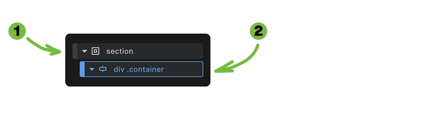
- Section element - The outer
<section>HTML tag - Container element - An inner
<div>with.containerclass anddata-containerattribute
This structure provides the foundation for most website layouts where you need full-width backgrounds but want your content constrained to a readable width.
<section>
  <div class="container" data-container="true">
    <!-- Your content goes here -->
  </div>
</section>
Styling Framework Integration
If you're not using the built-in Builderius framework, you'll need to provide all styling yourself.
Section element styling:
Builderius applies consistent styling to make sections work seamlessly. Section padding is controlled through CSS variables:
%selector% {
    padding: var(--section--padding-block) var(--section--padding-inline)
}
The default values for these variables are:
--section--padding-block: var(--spacing-xl);
--section--padding-inline: var(--spacing-lg);
Container element styling:
.container {
    max-width: var(--content-width);
    margin: 0 auto;
}
The section handles viewport edge spacing through CSS variables, while the container constrains content width and centers it. This separation gives you control over both the full-width background and the contained content.
You can find out more about the inner container element in a dedicated article. Learn more →
Change section element padding globally
To allow easy and consistent changes while maintaining flexibility for local adjustments, we use a tokenized CSS variables approach:
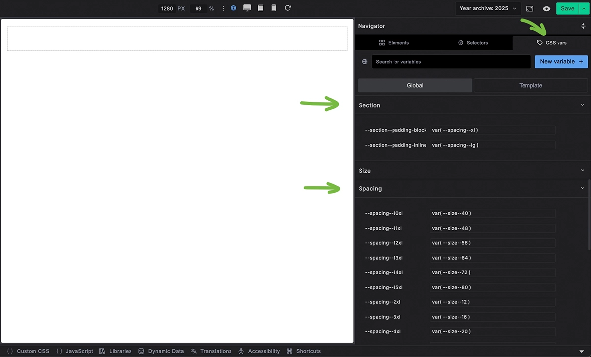
- Go to the CSS vars panel on the right and find the Section heading. You'll see variables for vertical padding
--section--padding-blockand horizontal padding--section--padding-inline - You can change the values from
var(--spacing-xl)andvar(--spacing-lg)to fixed values like48pxand32px - The recommended approach is to use other spacing variables instead. This maintains styling consistency - open the Spacing section in the CSS vars panel to see available options
Using different markup but maintaining section-like appearance
If you change the section's HTML tag from <section> to another element (like <div>), you'll need to add the .outer-wrapper class to maintain the padding behavior:
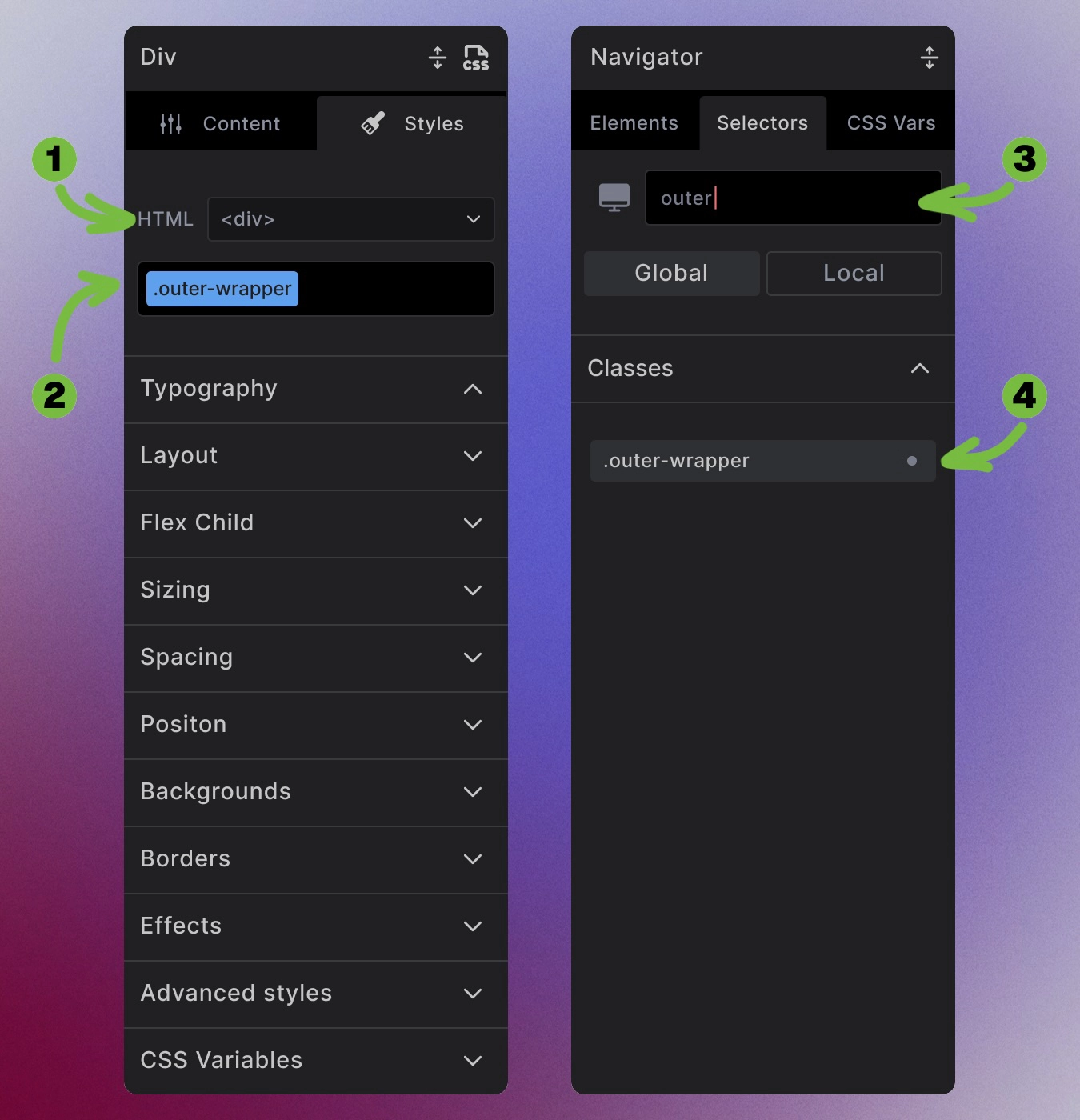
- Change the HTML tag to
div - Add the
.outer-wrapperclass to maintain section-like appearance - Alternatively, go to the Selectors panel and search for "outer" - the
outer-wrapperclass will appear
This class applies the same padding settings as the section element:
.outer-wrapper {
    padding: var(--section--padding-block) var(--section--padding-inline)
}
Semantic Usage Guidelines
The <section> HTML element represents a generic standalone section of a document. According to web standards:
When to use section:
- Content forms a distinct, meaningful part of your page
- No more specific semantic element exists (like
<article>,<aside>, or<nav>) - Section contains a heading that describes its purpose
When to use alternatives:
<main>- For the primary content area of your page<article>- For standalone content that could be syndicated (blog posts, news articles)<aside>- For tangential content (sidebars, related links)<div>- For pure styling wrappers with no semantic meaning
Best Practices
Always include a heading: Sections should contain a heading (<h1> through <h6>) that describes their purpose. This helps with accessibility and SEO.
<section>
  <div class="container" data-container="true">
    <h2>About Our Services</h2>
    <p>Content describing your services...</p>
  </div>
</section>
Keep sections focused: Each section should cover one main topic or purpose. If you're starting a new topic, consider starting a new section.
Accessibility Considerations
For proper accessibility when sections contain headings:
- Unique heading IDs: Give your heading a unique ID
- aria-labelledby: Connect the section to its heading
<section aria-labelledby="services-heading">
  <div class="container" data-container>
    <h2 id="services-heading">Our Services</h2>
    <p>Content about services...</p>
  </div>
</section>
This helps screen readers understand your page structure and navigate between sections.
Customization Flexibility
Remove the container: If you don't need content width constraints, delete the inner container element.
Add multiple containers: Need different content widths in the same section? Add additional container elements.
Change container markup: Transform the container to any HTML element while keeping the .container class for styling.
Modify spacing: Adjust section padding through CSS variables or custom styling.
The composite structure gives you a starting point, but you have complete control to modify it for your specific needs.
Next steps: