Image
The Image element displays images on your page using the HTML <img> tag. It provides a complete image management system with media library integration, responsive sizing options, and accessibility features built-in.
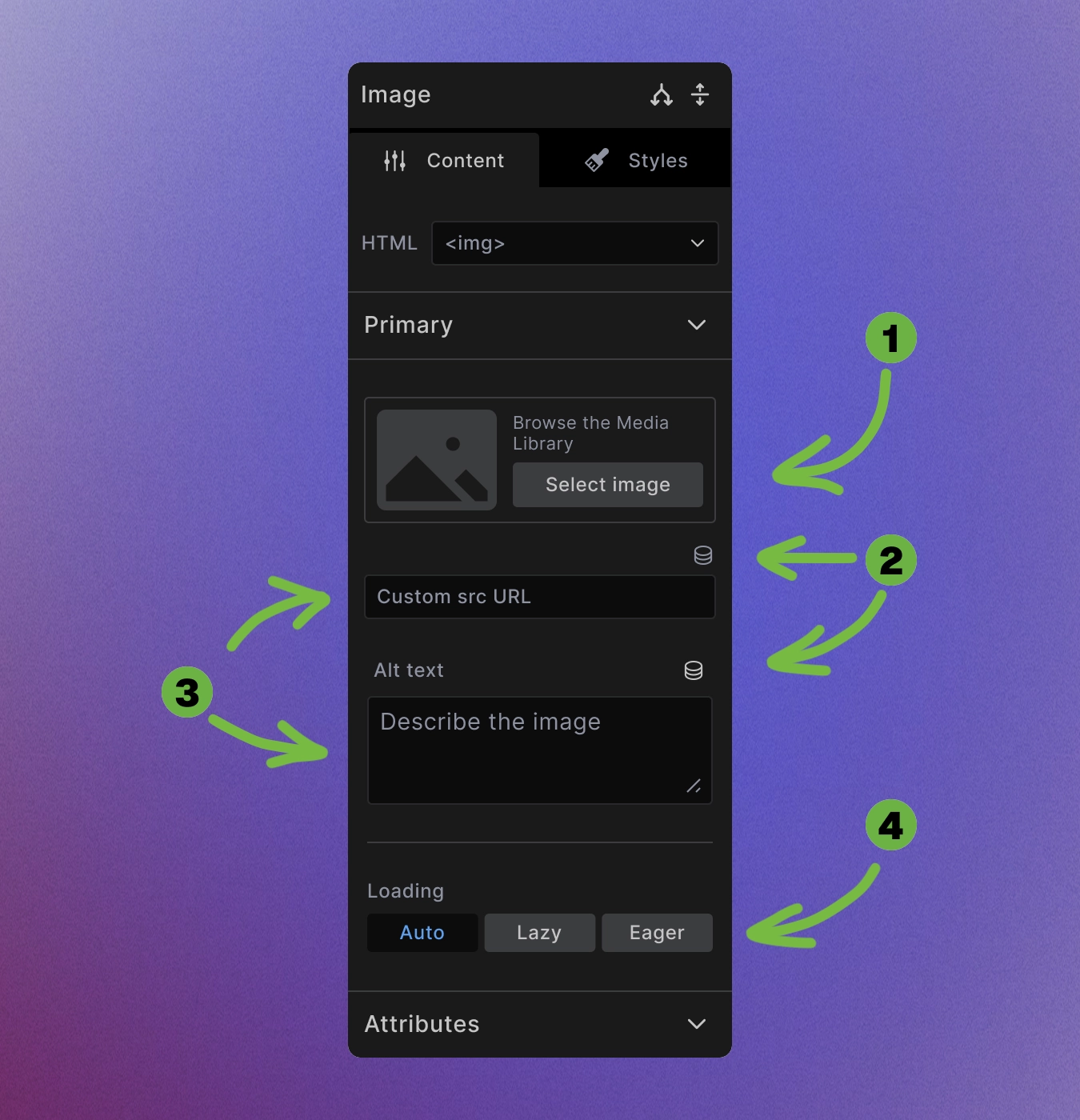
Image Selection Interface
The Image element provides multiple ways to add images:
-
Media Library selection: Click "Select Image" to browse your WordPress media library.
-
Dynamic images: Use dynamic data to pull images from custom fields, featured images, or external sources. Use dynamic source for alt value as well.
-
Direct URL: Enter any image URL directly in the URL field for external images. It's possible to also set alt value directly.
Media Library
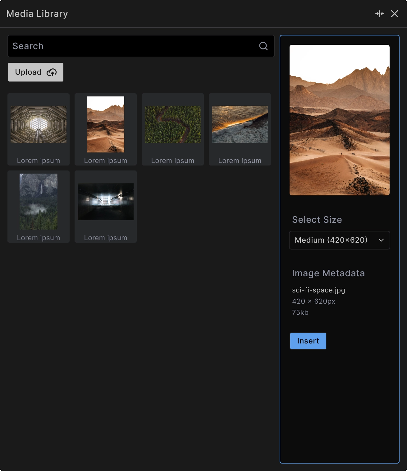
When you click Select Image, the media library modal provides:
Search functionality: Find images quickly using the search field to filter by filename.
Upload capability: Add new images directly through the Upload button without leaving the builder.
Size selection: Choose from available image sizes (thumbnail, medium, large, full) to optimize for different use cases and performance.
Image metadata: View file details including dimensions, file size, and format before selection.
<!-- Example output with selected image -->
<img src="/wp-content/uploads/image.webp"
     alt="Descriptive alt text"
     width="700"
     height="394"
     loading="lazy">
Image Optimization Settings
- Loading behavior: Control when images load for better performance:
- Auto - Browser default behavior
- Lazy - Load when image enters viewport (recommended for below-fold images)
- Eager - Load immediately (recommended for above-fold images)
Alt text: Provide descriptive text for accessibility and SEO. This is crucial for screen readers and appears when images fail to load.
Size optimization: The media library automatically provides different sizes to match your design needs while optimizing file size.
Accessibility Best Practices
Descriptive alt text: Write alt text that describes the image content and purpose:
<!-- Good alt text -->
<img src="team-meeting.jpg" alt="Five team members collaborating around a conference table">

<!-- Avoid -->
<img src="team-meeting.jpg" alt="Image">
Decorative images: For purely decorative images, write "" into the alt text field to create (alt="") and indicate they should be ignored by screen readers.
Informative images: For images that convey important information, ensure the alt text captures that meaning.
Performance Considerations
Lazy loading: Use lazy loading for images below the fold to improve initial page load times.
Appropriate sizing: Select image sizes that match your actual display dimensions to avoid loading unnecessarily large files.
Modern formats: The media library supports modern formats like WebP for better compression and quality.
Responsive images: Builderius automatically handles responsive image delivery based on screen size and device capabilities.
Dynamic Image Sources
Featured images: Pull featured images from posts or pages using dynamic data.
Custom fields: Display images stored in ACF or other custom field plugins.
External APIs: Use images from external sources through dynamic data connections.
<!-- Dynamic image example -->
<img src="[[wp.post.featured_image.file_url]]"
     alt="[[wp.post.featured_image.alt_text]]"
     loading="lazy">
Best Practices
Optimize before upload: Compress images appropriately before uploading to maintain quality while minimizing file size.
Consistent sizing: Use consistent image dimensions within the same content type for visual harmony.
Backup text: Always provide meaningful alt text - it's required for accessibility and helps with SEO.
Loading strategy: Use lazy loading for most images, but set critical above-fold images to eager loading.
When to Use Image Element
Use Image element for:
- Photographs and illustrations
- User interface graphics
- Dynamic content images
- Responsive image display
Consider alternatives for:
- Simple icons (use SVG Code element)
- Complex graphics with text (might need HTML Code for accessibility)
- Background images (use CSS backgrounds in styling)