Element Settings
Every element in Builderius is controlled through two tabs that appear in the sidebar when you select an element: Content and Style. The Content tab handles what goes inside your element and how it behaves, while the Style tab controls how it looks and is positioned. This separation almost completely mirrors the separation to HTML and CSS.
This separation keeps related settings organized and prevents the interface from becoming overwhelming - you can focus on structure first, then styling, or switch between them as needed.
Content Tab
The content area shown above shows controls that exist in all elements except the non-container elements. For elements that have unique features beyond these universal controls, those specialized settings are covered in their individual articles.
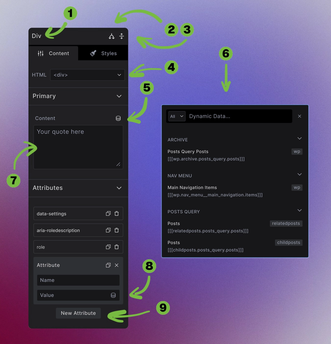
Element name (1): Click to rename your element for better organization (like "Card Wrapper" or "Hero Section"). This doesn't affect the HTML - it's just for your reference in the builder.
Conditions (2): Opens conditions builder to set conditional rendering based on various criteria.
Sidebar Collapse/Expand (3): Collapse or expand sidebar categories toggle to manage your workspace.
HTML Tag Swap (4): Change the HTML tag this element renders as.
Dynamic Data Toggle (5): Opens modal with searchable list of dynamic data sources to insert content.
Dynamic Data Dropdown (6): Insert dynamic data from any source, local or remote.
Content area (7): Main content area where you type content or insert from dynamic data.
Dynamic data toggle (8): Add dynamic data inside Attribute values.
Attributes (9): Create custom attributes.
Style Tab
The Style tab controls how your element looks:
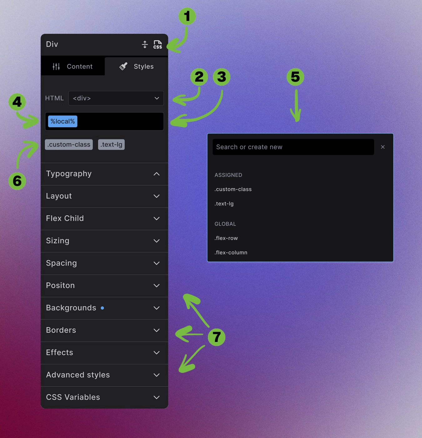
Editor mode (1): Toggle between UI and Code editor modes for styling control. Pro Feature
HTML tag (2): Same HTML tag selector as Content tab.
CSS classes input and search (3): Search for, assign, and create new classes.
Dynamic local (active) class (4): Add unique styles to just this element.
Classes Dropdown (5): Dropdown/modal element with quick access to all global, template or local classes.
Assigned classes (6): Assigned classes to this element, but not currently being edited.
Styling categories (7): Organized sections for different styling properties:
- Typography
- Layout
- Flex Child
- Sizing
- Spacing
- Position
- Backgrounds
- Borders
- Advanced
- CSS Variables
Values and variables: Each styling property accepts static values or CSS variables for reusable design tokens.
Next steps: