Details
The Details element creates collapsible content sections using the native HTML <details> and <summary> elements. It provides accessible accordion functionality with automatic expand/collapse behavior, customizable summary icons, and grouping capabilities for creating accordion-style interfaces.
This is an interactive element - leverages native HTML functionality to provide advanced accordion and disclosure features. Learn more about element types →
This element creates multiple nested HTML elements to provide advanced and flexible functionality. Learn more →
What Gets Created
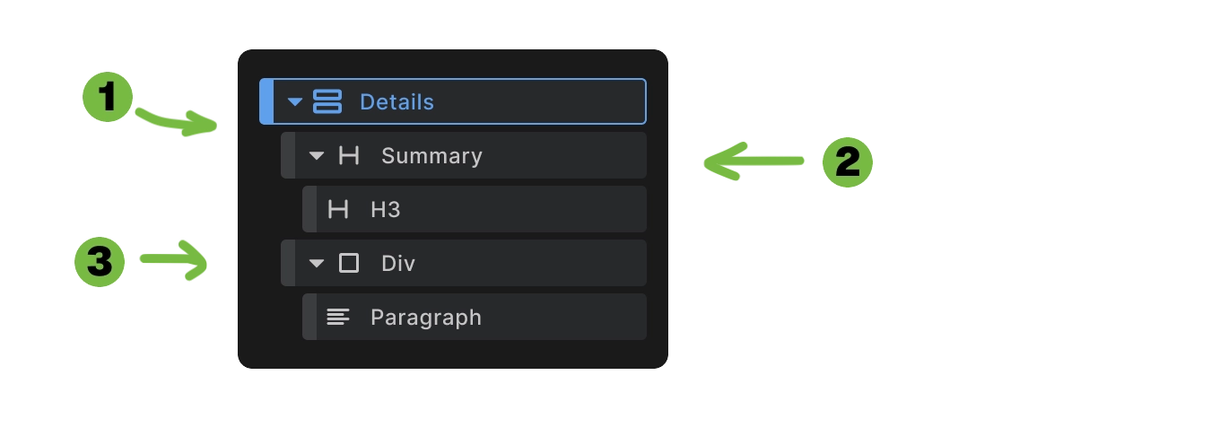
When you add a Details element to your canvas, Builderius automatically creates:
- Details wrapper - The main
<details>element container - Summary element - The clickable header with optional icons
- Content areas - Collapsible content sections (headings, divs, paragraphs, etc.)
<details>
  <summary>
    <!-- Icon (optional) -->
    <h3>Section Title</h3>
  </summary>
  <div>
    <p>Collapsible content goes here...</p>
  </div>
</details>
This structure provides native browser accordion functionality with automatic accessibility features and keyboard navigation.
Details Element Configuration
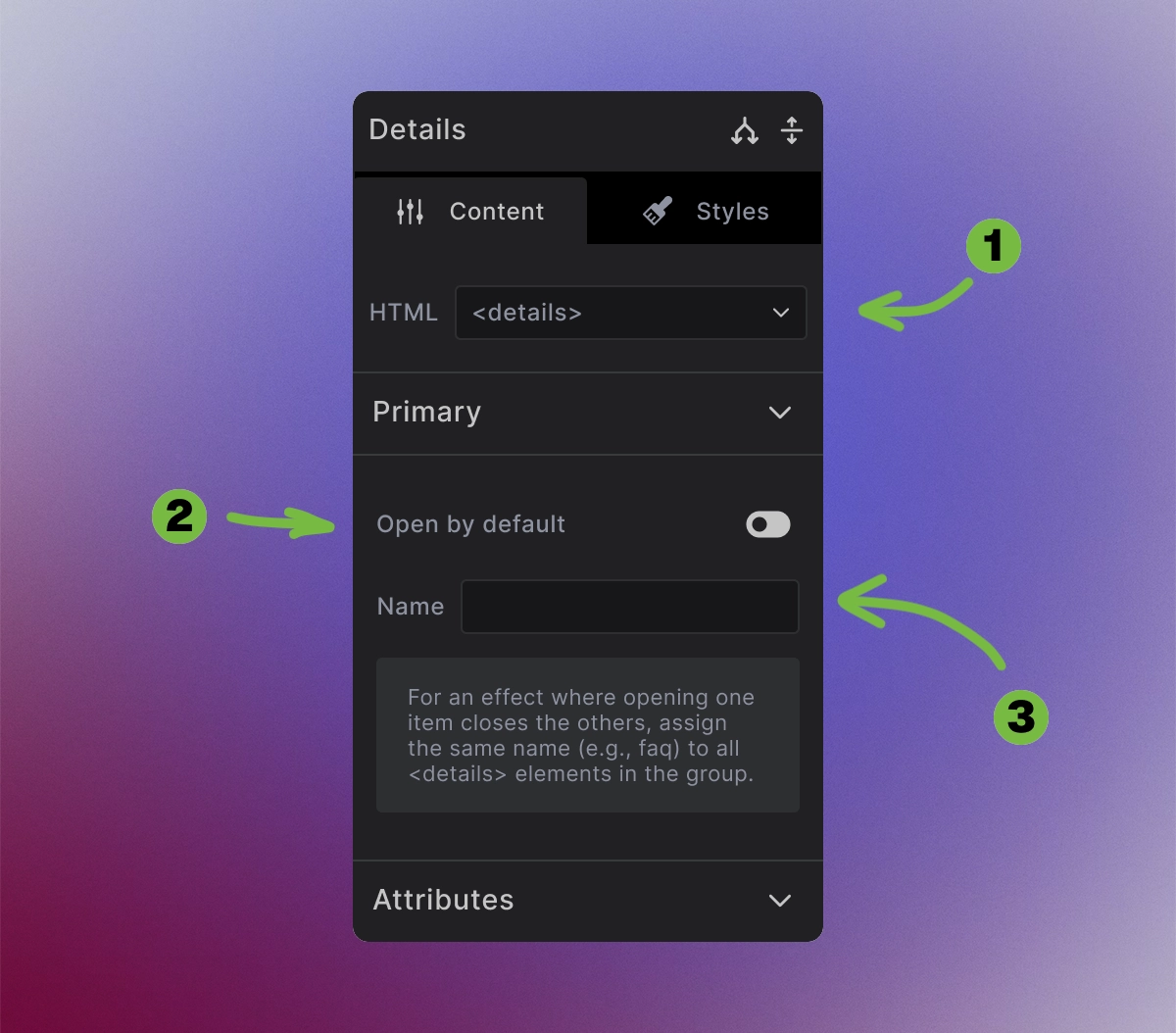
The Details element provides accordion configuration options:
1. HTML tag: Is set to <details> for proper collapsible functionality
2. Open by default: Toggle to control initial state
- Enabled - Content is expanded when page loads
- Disabled - Content is collapsed by default
3. Name field: Assign group names for accordion behavior
- Same name - Only one item open at a time (accordion group)
- Different names - Multiple items can be open simultaneously
- Empty - Independent behavior, no grouping
<!-- Grouped accordion (only one open) -->
<details name="faq">
  <summary>Question 1</summary>
  <p>Answer 1</p>
</details>
<details name="faq">
  <summary>Question 2</summary>
  <p>Answer 2</p>
</details>

<!-- Independent details (multiple can be open) -->
<details>
  <summary>Independent Item 1</summary>
  <p>Content 1</p>
</details>
<details>
  <summary>Independent Item 2</summary>
  <p>Content 2</p>
</details>
Summary Element Configuration
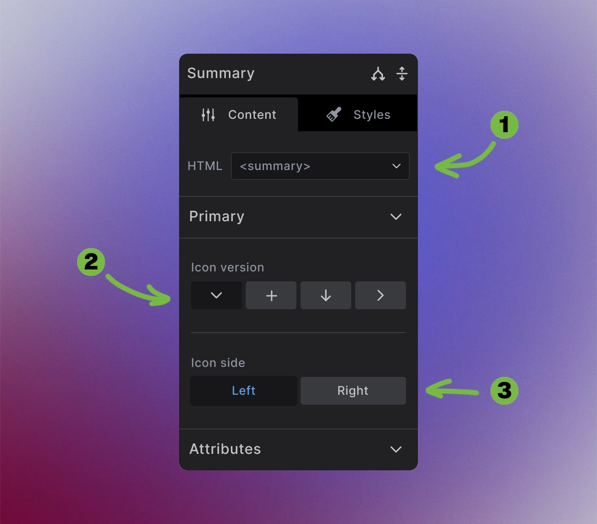
The Summary element provides clickable header configuration:
1. HTML tag:
- Set to
<summary>for proper details functionality
2. Icon version: Choose from visual indicator options:
- Dropdown arrow (▼) - Standard dropdown indicator
- Plus/minus (+/-) - Expand/collapse symbols
- Down arrow (↓) - Simple directional arrow
- Right arrow (→) - Alternative directional indicator
3. Icon side: Position the icon relative to content:
- Left - Icon appears before the summary text
- Right - Icon appears after the summary text
<!-- Left-aligned plus/minus icon -->
<summary>
  <span class="icon-plus-minus"></span>
  Summary Content
</summary>

<!-- Right-aligned dropdown arrow -->
<summary>
  Summary Content
  <span class="icon-dropdown"></span>
</summary>
The icons automatically change state when the details element expands or collapses.
How to Use Details
Step 1: Add to canvas
- Insert the Details element where you want collapsible content.
Step 2: Customize summary
- Edit the summary content (title, headings, text)
- Choose appropriate icon style and position
- Style the summary appearance
Step 3: Add collapsible content
- Place content elements inside the div element (after the Summary) and inside the Details element
- Add text, images, other elements, or nested components
- Content will be hidden/shown automatically
Step 4: Configure behavior
- Set default open state if needed
- Assign group names for accordion behavior
- Test expand/collapse functionality
Creating Accordion Groups
For accordion-style behavior where only one item is open at a time:
Step 1: Set matching names
Give all Details elements in the group the same name value (e.g., "faq", "accordion", "docs").
Step 2: Test grouping Opening one item should automatically close others in the same group.
<details name="product-info">
  <summary>Specifications</summary>
  <div>Technical specifications...</div>
</details>
<details name="product-info" open>
  <summary>Reviews</summary>
  <div>Customer reviews...</div>
</details>
<details name="product-info">
  <summary>Support</summary>
  <div>Support information...</div>
</details>
Dynamic Details Variation
For data-driven accordion content, combine Details elements with Collection elements:
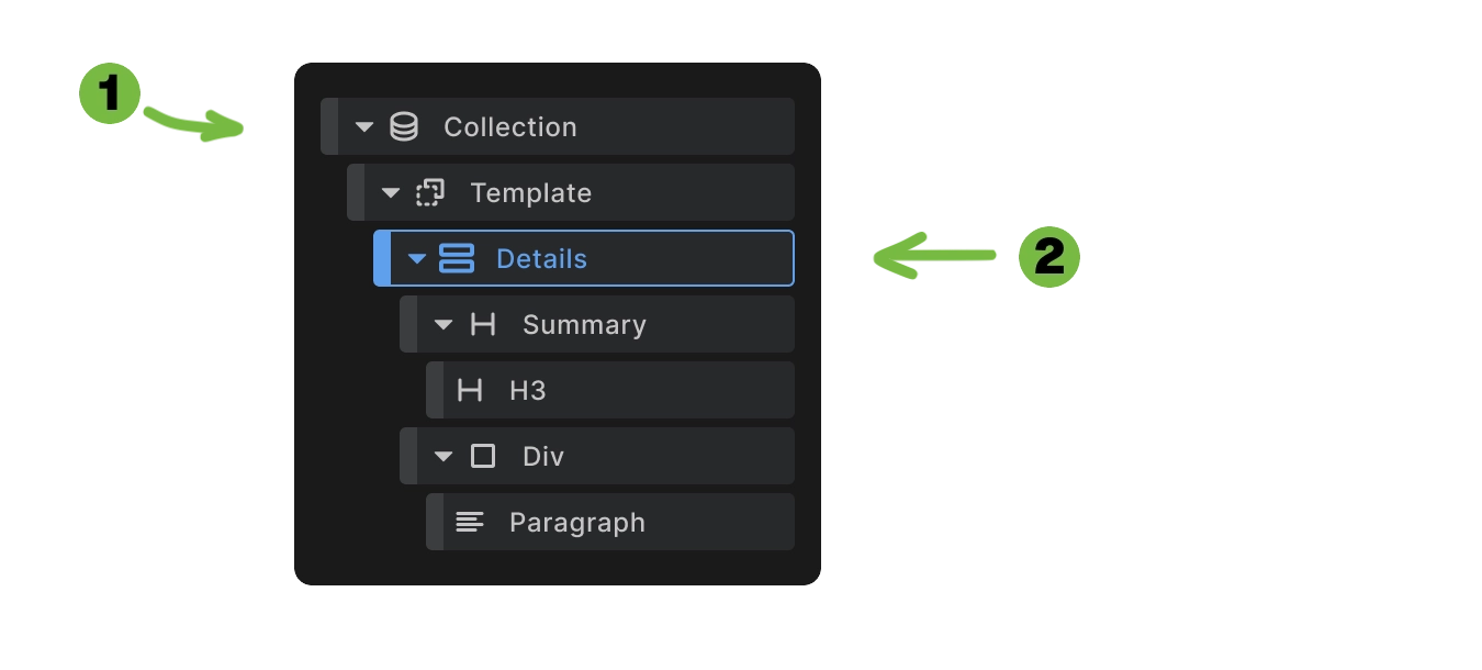
When you add a Details element to your canvas, Builderius automatically creates:
- Collection element, serves as a looping mechanism. Connect it to a Dynamic data source
- Details element - this is what gets repeated
Now connect Summary and Content using dynamic data tags like {{question}} and {{answer}}
<builderius-collection data-content="[{\"question\":\"What is...\",\"answer\":\"...\"},{\"question\":\"How do...\",\"answer\":\"...\"}]">
  <template>
    <details name="dynamic-faq">
      <summary>{{question}}</summary>
      <div>
        <p>{{answer}}</p>
      </div>
    </details>
  </template>
</builderius-collection>
Dynamic Details automatically:
- Generate accordion items from array data
- Maintain grouping behavior through consistent naming
- Preserve accessibility features
- Support unlimited items from any data source
Perfect for FAQ sections, product information, documentation, or any repetitive collapsible content.
Accessibility Features
Built-in accessibility includes:
- Keyboard navigation - Space/Enter to toggle, arrow keys for navigation
- ARIA attributes - Automatic
aria-expandedstates - Focus management - Proper focus indicators and tab order
- Screen reader support - Clear announcement of expand/collapse states
- Semantic structure - Native HTML elements provide meaning
The Details element meets WCAG accessibility guidelines automatically without additional configuration.
Use Cases
- FAQ sections - Collapsible question and answer pairs
- Product information - Specs, reviews, support in expandable sections
- Documentation - Organized help content with expandable topics
- Content organization - Long-form content broken into digestible sections
- Space-saving interfaces - Hide secondary information until needed
- Progressive disclosure - Reveal information based on user interest
Best Practices
Content organization:
- Group related information logically within each details section
- Write clear summary labels that accurately describe the content
- Keep summary text concise but descriptive
- Order items by importance or logical flow
User experience:
- Consider default states - open important items by default
- Use consistent grouping for related content sets
- Test on mobile devices where space is limited
- Provide visual feedback through icons and styling
Performance considerations:
- Lazy load heavy content inside collapsed sections when possible
- Optimize for accessibility with proper heading hierarchy
- Test with screen readers to ensure proper announcement
Next steps: