Breakpoints
Breakpoints let you change styles for different screen sizes. Builderius comes with three, and you can add as many of your own as you like.
Each breakpoint has a variable name. The defaults are:
| Breakpoint | Variable |
|---|---|
| Desktop | --desktop |
| Tablet | --tablet |
| Mobile | --mobile |
You can add more, such as --laptop or --my-breakpoint. In the builder you work with these names. On the front end Builderius turns them into normal CSS media queries, so the published page contains standard CSS and nothing else.
Switching Breakpoints
Use the device icons in the top bar. The canvas resizes to that screen size, and any style you add now applies from that breakpoint on.
Styles inherit. With the default setup you design for desktop first: what you set on Desktop applies everywhere, and each smaller breakpoint only holds what should be different there. A field that inherits its value from a larger breakpoint shows that value as inherited.
Managing Breakpoints
Open Media Queries from the breakpoint controls in the top bar.
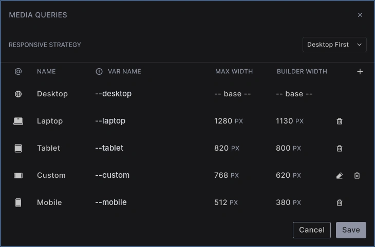
Each row is one breakpoint:
- Icon - the icon shown in the top bar
- Name - the label you see in the builder
- Var name - the variable name, such as
--tablet - Max width - the screen width where the breakpoint takes over
- Builder width - the width the canvas switches to when you pick this breakpoint
Desktop is the base. It has no width of its own, because it is the starting point for everything else.
Adding a Breakpoint
- Click + at the top of the list
- Pick an icon and type a name
- Type the var name, for example
--laptop - Set the max width and the builder width
- Click Save
The new breakpoint appears in the top bar, in order of its width. To remove one you created, click its trash icon. The three default breakpoints stay.
Responsive Strategy
The Responsive strategy setting at the top of the window decides which way your styles flow:
- Desktop first (the default) - you design the large screen first and adjust downward. Breakpoints use a max width
- Mobile first - you design the small screen first and adjust upward. Breakpoints use a min width
Mobile first is available in Builderius Website, Professional and Studio. Builderius Community (Free) uses Desktop first.
Choose the strategy at the start of a project. Switching later changes how every existing breakpoint style applies.
Breakpoints in Code Mode
In Code mode, the Breakpoints button in the editor inserts a breakpoint for you. Styles inside it apply from that breakpoint:
.card {
  padding: var(--space-lg);
}

@media (--tablet) {
  .card {
    padding: var(--space-md);
  }
}
Best Practices
Add a breakpoint when the design breaks: Not for every device. Three or four are enough for most sites.
Name them by purpose: --laptop or --wide says more than a number.
Let content adapt first: Fluid sizes with clamp() and layouts that wrap need fewer breakpoints.
Common Issues
- A style shows on all sizes: It was added on Desktop. Switch to the breakpoint first, then change the value
- The field shows a value I did not set here: It is inherited from a larger breakpoint
- I cannot choose Mobile first: It is not part of Builderius Community (Free)
- I cannot delete Tablet or Mobile: The default breakpoints cannot be removed
Next steps: