Style Settings
The Styles tab groups its visual controls into sections: Typography, Layout, Sizing and so on. Every control writes a normal CSS property for the selector you are styling, so this page is short on purpose: if you know the CSS property, you already know the control.
The first part explains how the controls work in general. The second part lists the sections and what each one covers.
How the Controls Work
Open and close sections. Click a section name to open it, and click again to close it. Several sections can be open at once. The arrows at the top of the sidebar expand or collapse them all.
Find a control. Use Search styles at the bottom of the sidebar to find a control by name.
Type any value. Number fields take a value and a unit. The unit sits at the end of the field: click it to change it. You can also type any valid CSS value, such as auto, calc(100% - 2rem) or clamp(1rem, 2vw, 2rem).
Use a variable. Any field accepts a CSS variable. Type var(--space-md), or start typing two dashes and pick from the list.
See what is set. A dot next to a section name means that section has values for the current selector. Inside a section, the label of a property you have set is highlighted. A value that comes from a larger breakpoint is shown as inherited.
Remember what you are styling. Controls always write to the selector in the selector input, in the scope and breakpoint you are on. Check those three before you change a value.
The Sections
Typography
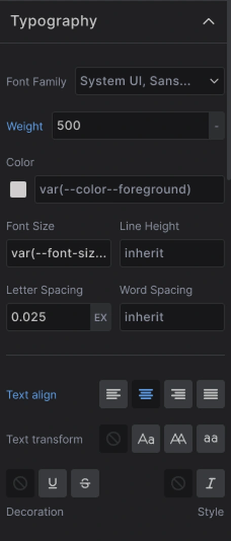
Everything about text: font family, weight, color, size, line height, letter and word spacing, alignment, transform, decoration and style.
Layout
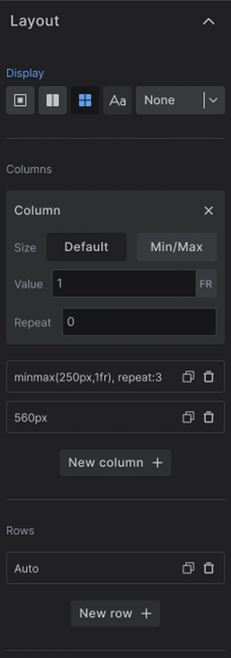
Sets display and, depending on your choice, the controls that go with it:
- Flexbox - direction, alignment, gap and wrapping
- Grid - columns, rows, alignment and gap
- Block, Inline or None - no further settings, apart from vertical alignment for inline
Flex Child

For an element inside a flex container: how it grows and shrinks (flex-basis, flex-grow, flex-shrink) and its order.
Grid Child
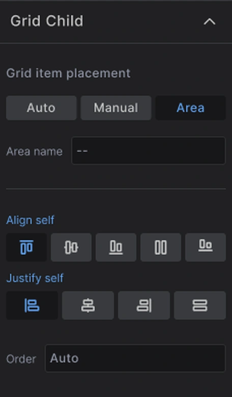
For an element inside a grid: where it is placed (automatically, by span, or in a named area), how it aligns in its cell, and its order.
Sizing
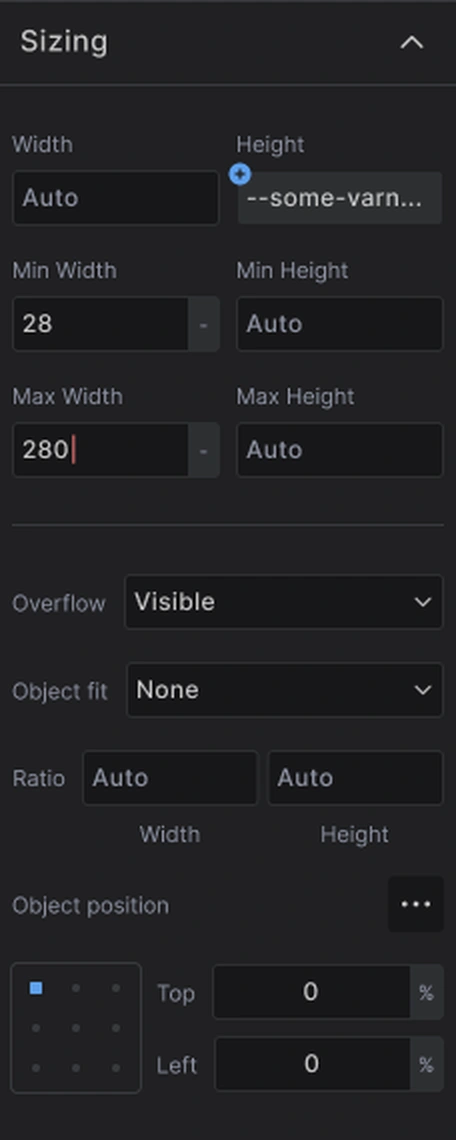
Width and height with their minimum and maximum, overflow, and for images and video object-fit, aspect-ratio and object-position.
Spacing
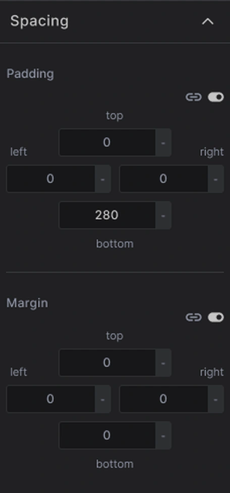
Padding and margin, each with four sides. Use the link icon to set all four sides at once.
Position
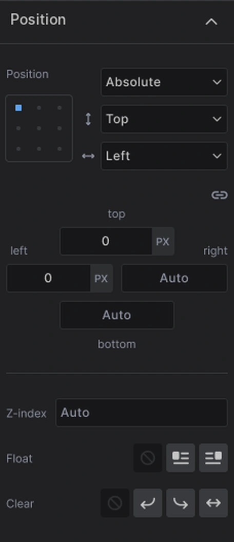
position with its top, right, bottom and left offsets, z-index, float and clear.
Backgrounds
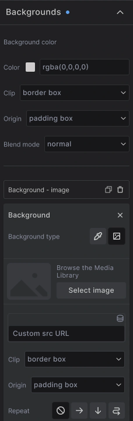
Background color with its clip, origin and blend mode, and background images. An element can have several backgrounds, each with its own image, repeat, size and position.
Borders
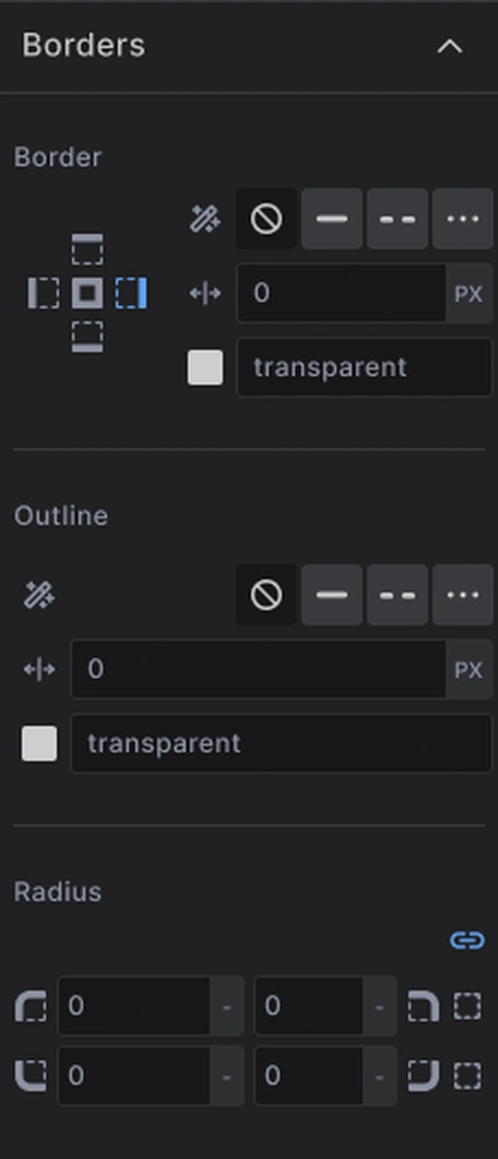
Border style, width and color, for all sides or one side at a time, outline, and radius per corner.
Advanced styles
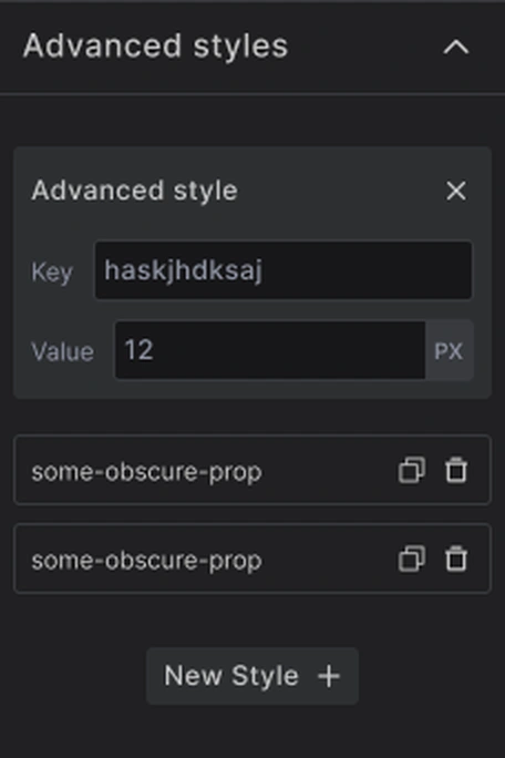
Any CSS property that has no control of its own. Click New Style, type the property name and its value. Use it for things like opacity, filter, transform, transition or box-shadow.
The same section holds custom CSS variables for the selector you are styling. Click New Variable, and give it a name and a value. See variables on a single selector.

When a Control Is Missing
The sections cover the properties you use every day, not every property CSS has. For anything else you have two options:
- Add it in the Advanced styles section, as a property and a value
- Switch to Code mode and write it as CSS
Both end up in the same place, and both stay in sync with the controls.
Next steps: