Link
The Link element creates hyperlinks for navigation and user interaction, using the HTML <a> tag. Links can point to external URLs, internal pages, email addresses, or any other web resource, with options for both text and button-style appearances.
This is a container element that can use any HTML tag. Learn more about element types →
Link Settings
<!-- Static external link -->
<a href="https://example.com">Visit Example</a>

<!-- Static internal link -->
<a href="/sample-page">Visit Sample Page</a>

<!-- Static in-page anchor -->
<a href="#services">Scroll to Services</a>

<!-- Email link -->
<a href="mailto:[email protected]">Contact Us</a>

<!-- Dynamic link from custom field -->
<a href="{{dynamic-url-field}}">Dynamic Link</a>
-
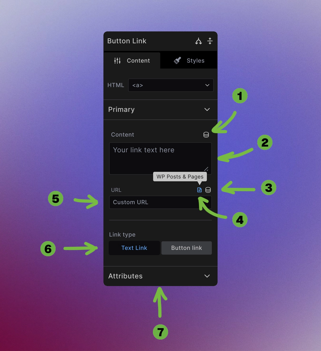
Dynamic data toggle: Use dynamic data to create link text from custom fields, post titles, or any other dynamic source.
-
Manual link text entry: Type or paste any text directly into the textarea field.
-
Dynamic data toggle: Use dynamic data to create link URLs from custom fields, post URLS, or any other dynamic source.
-
WordPress internal links: Toggle on to browse and select internal pages, posts, or media from your WordPress site through a searchable interface.
-
Manual URL entry: Type or paste any URL directly into the URL field for external links, email addresses (
mailto:), or phone numbers (tel:). -
Link type toggle: Choose if the link should be a traditional text link or should it have a button appearance.
-
Link Attributes: Some of the attributes you can set for your links:
Attributes
Target options:
- Same window (
_self) - Default behavior - New window (
_blank) - Opens in new tab/window
Rel attributes: Control link relationships and security
- nofollow - Don't pass SEO authority
- noopener - Security for new window links
- noreferrer - Don't send referrer information
- Title - Tooltip text on hover
Button Styling Options

Transform any link into a button-style element with the button toggle:
Button style variations:
- Fill - Solid background with contrasting text
- Outline - Border with transparent background
- Tonal - Subtle background tint
- Ghost - Minimal styling, hover effects only
/* Button style classes */
.button {
    ...
}

.btn-fill {
   ...
}

.btn-tonal {
    ...
}

.btn-outline {
    ...
}

.btn-ghost {
    ...
}
Button styling integrates with your design system through CSS variables for consistent appearance across your site.
Accessibility Best Practices
Descriptive link text: Use clear, meaningful text that describes the destination or action:
<!-- Good -->
<a href="/services">View our services</a>

<!-- Avoid -->
<a href="/services">Click here</a>
External link indicators: Consider indicating external links visually or with text for clarity.
Keyboard navigation: Links are automatically keyboard accessible with proper focus styling.
Screen reader support: Use alt text for additional context when link text alone isn't descriptive enough.
Visual disctinction: Do not rely only on color to signify some text is a link. Use underlines or other elements.
Best Practices
Clear destinations: Make it obvious where links will take users, especially for external sites.
Consistent styling: Use button styles consistently - don't mix button and text link styles randomly for the same action types.
Loading states: For dynamic links, ensure proper fallbacks when data isn't available.
What to Avoid
Using empty links: Avoid using only # in your href property. Links should point to actual web resources - web pages, images, PDFs, or in-page sections using #section-id.
Don't use links for other interactions: Links should not be used to open popups like <a href="#">Open Modal</a> or dropdown menus. Use the proper <button> element instead: <button>Open modal</button>. Button elements provide accessibility features out of the box that you otherwise have to implement yourself.
Next steps: