List
The List element creates structured lists using HTML <ul> (unordered) or <ol> (ordered) tags. Lists are essential for organizing related items, navigation menus, and presenting sequential or grouped information in an accessible format.
This is a container element that can be changed into any HTML tag. Learn more about element types →
This element creates multiple nested HTML elements to provide advanced and flexible functionality. Learn more →
What Gets Created
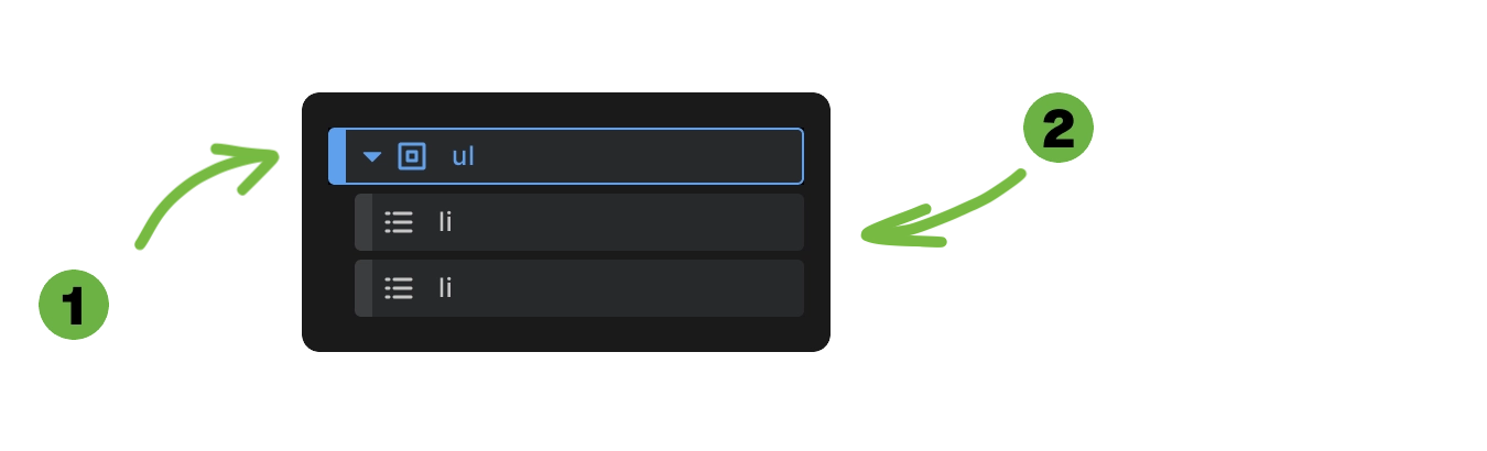
When you add a List element to your canvas, Builderius automatically creates:
- List container - Either
<ul>or<ol>element - Two list items -
<li>elements where you add your content
This structure follows proper HTML semantics where list containers cannot contain direct text content - only list items.
<ul>
  <li>List item 1</li>
  <li>List item 2</li>
</ul>
List Type Controls
Unordered List
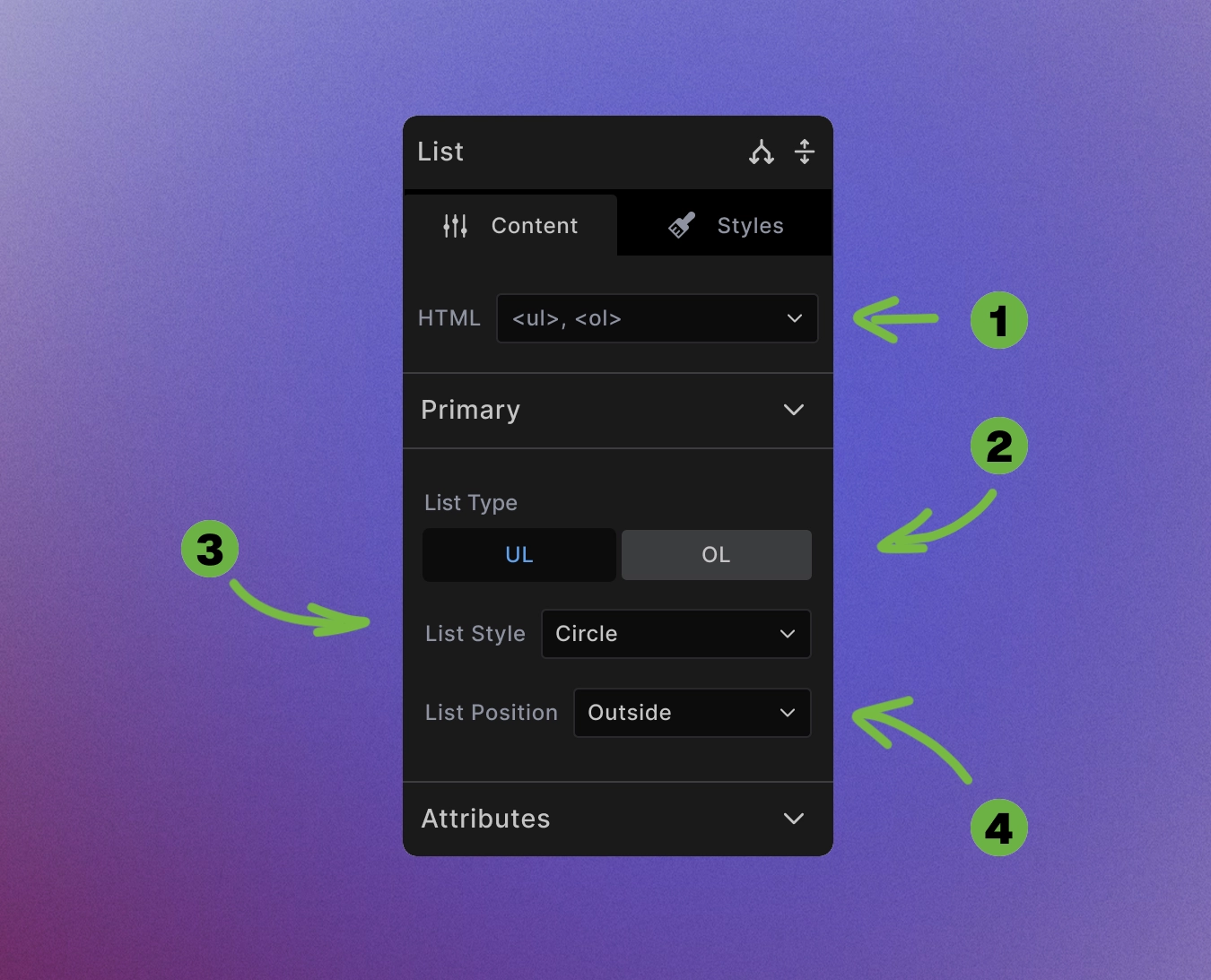
-
HTML swap control: Change to any non-list element.
-
List type switch: Toggle between unordered (
<ul>) and ordered (<ol>) lists using the switch buttons. -
List style options: Choose from various bullet styles:
- Unordered lists: disc, circle, square, none
-
List position: Control marker alignment:
- Outside - Markers appear outside the content area (default)
- Inside - Markers appear inside the content area
/* List styling examples */
ul {
    list-style-type: square;
    list-style-position: inside;
}

ol {
    list-style-type: upper-roman;
    list-style-position: outside;
}
Ordered List
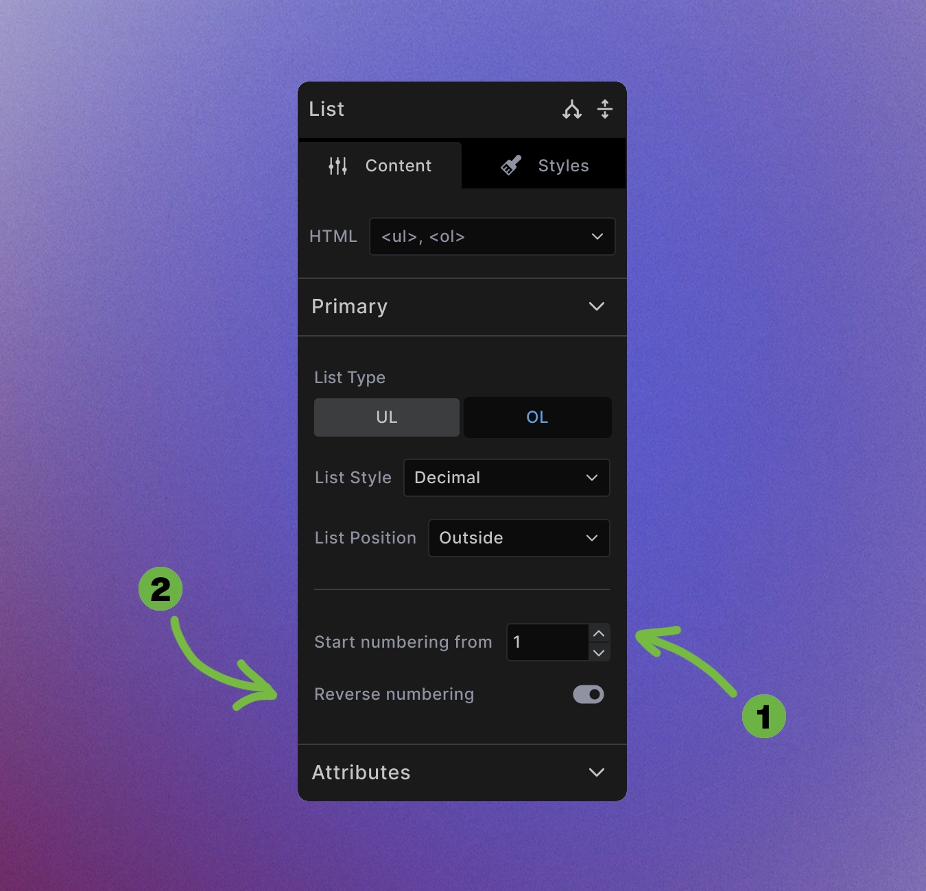
In addition to the settings that the unordered list version has, ordered lists also have:
- Start numbering from: Change what number you want your numbering to start from.
<!-- Start numbering from 5 -->
<ol start="5">
  <li>This will be item 5</li>
  <li>This will be item 6</li>
  <li>This will be item 7</li>
</ol>
- Reverse numbering: Make the numbers go in reverse, from biggest to smallest.
<!-- Reverse numbering with 3 items -->
<ol reversed>
  <li>This will be item 3</li>
  <li>This will be item 2</li>
  <li>This will be item 1</li>
</ol>
Combined example:
<!-- Start from 10 and count down -->
<ol start="10" reversed>
  <li>This will be item 10</li>
  <li>This will be item 9</li>
  <li>This will be item 8</li>
</ol>
List Management
No direct content: The list container itself cannot contain any content. The only valid content directly inside <ul> or <ol> is <li>. Add your content to the individual list items instead.
Adding items: Insert list items in the list element or duplicate existing list items to expand your list.
Removing items: Delete list items you don't need - lists can contain any number of items.
Nested lists: Add child lists inside list items for hierarchical structures.
Accessibility Best Practices
Semantic structure: Lists provide important navigation landmarks for screen readers.
Descriptive content: Make list items self-contained and meaningful.
Proper nesting: Use nested lists for hierarchical relationships:
<ul>
  <li>Main category
    <ul>
      <li>Subcategory 1</li>
      <li>Subcategory 2</li>
    </ul>
  </li>
  <li>Another main category</li>
</ul>
Avoid empty items: Don't include empty <li> elements.
When to Use Lists
Use lists for:
- Related items that belong together
- Navigation menus
- Step-by-step instructions
- Feature comparisons
- Table of contents
Don't use lists for:
- Pure visual alignment (use CSS Grid or Flexbox)
- Single items that aren't part of a group
- Layout structure unrelated to content relationships
Styling Framework Integration
Lists inherit standard element styling plus list-specific properties. The framework provides sensible defaults:
ul, ol {
    padding-inline-start: 1em
}

ul, ol {
    margin-top: 0;
    margin-bottom: var(--spacing--block-end, var(--spacing--block));
}
Customize through the styling interface or create custom CSS classes for specific list designs.
Advanced List Patterns
Definition lists: For term-definition pairs, change the HTML tag to <dl> and use <dt> and <dd> elements.
Dynamic lists: For dynamic lists, to create lists from WordPress posts, custom fields, or external APIs, use Collection element.
Custom markers: Use CSS to create completely custom list markers with images or icons.
Horizontal lists: Transform vertical lists into horizontal navigation or feature rows using CSS flexbox.
Best Practices
Consistent structure: Keep list items at similar levels of detail and importance.
Logical order: For ordered lists, ensure the sequence makes sense.
Reasonable length: Very long lists might benefit from grouping or pagination.
Responsive design: Consider how lists will appear on mobile devices.
Next steps: