Picture
The Picture element provides responsive image delivery using the HTML <picture> tag. It serves as a container for multiple image sources, allowing browsers to select the most appropriate image based on screen size, device capabilities, or format support. This element has no special settings of its own - its power comes from the Source and Image elements it contains.
This is a container element that can be changed into any HTML tag. Learn more about element types →
This element creates multiple nested HTML elements to provide advanced and flexible functionality. Learn more →
What Gets Created
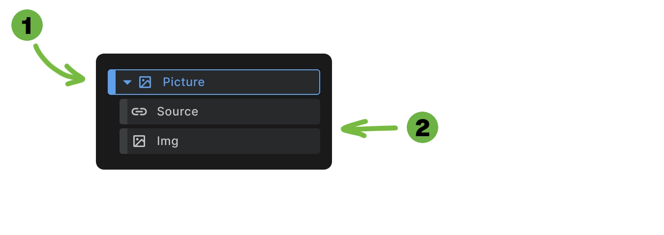
When you add a Picture element to your canvas, Builderius automatically creates:
- Picture container - The outer
<picture>element - Source element - For responsive image delivery
- Image element - The fallback img tag
This structure follows HTML standards where the picture element contains source elements for different conditions and a fallback img element.
<picture>
  <source srcset="small-image.webp" type="image/webp">
  <source media="(max-width: 768px)" srcset="large-image.webp" type="image/webp">
  <img src="fallback-image.jpg" alt="Responsive image">
</picture>
How Picture Elements Work
Source evaluation: Browsers evaluate source elements from top to bottom, using the first one that matches the specified conditions. Once a match is found, the browser stops checking remaining sources.
Ordering with max-width (Builderius default): Since Builderius uses max-width by default, you must order sources from smallest breakpoint to largest breakpoint:
<picture>
  <!-- Mobile first: smallest max-width -->
  <source media="(max-width: 400px)" srcset="mobile.jpg">
  <!-- Tablet next: medium max-width -->
  <source media="(max-width: 800px)" srcset="tablet.jpg">
  <!-- Desktop last: largest max-width -->
  <source media="(max-width: 1200px)" srcset="desktop.jpg">
  <!-- Fallback for anything larger -->
  <img src="fallback.jpg" alt="Image">
</picture>
Why this order matters: A 300px screen matches (max-width: 400px), (max-width: 800px), AND (max-width: 1200px). Since browsers use the first match, placing the smallest breakpoint first ensures mobile devices get mobile-optimized images.
Fallback support: The img element serves as a fallback for browsers that don't support the picture element or when no source matches.
Format selection: Combine multiple sources to provide modern image formats with fallbacks for older browsers.
Responsive delivery: Each source can target different screen sizes, delivering appropriately sized images.
Responsive Image Delivery
Art direction: Show different image compositions at different screen sizes:
<picture>
  <source media="(max-width: 768px)" srcset="medium-crop.jpg">
  <source media="(max-width: 1024px)" srcset="wide-landscape.jpg">
  <img src="mobile-portrait.jpg" alt="Responsive composition">
</picture>
Performance optimization: Deliver smaller images to mobile devices:
<picture>
  <source media="(max-width: 400px)" srcset="hero-400w.jpg">
  <source media="(max-width: 800px)" srcset="hero-800w.jpg">
  <source media="(max-width: 1200px)" srcset="hero-1200w.jpg">
  <img src="hero-fallback.jpg" alt="Hero image">
</picture>
Format Optimization
Modern format support: Provide WebP or AVIF with JPEG fallbacks:
<picture>
  <source srcset="image.avif" type="image/avif">
  <source srcset="image.webp" type="image/webp">
  <img src="image.jpg" alt="Optimized image">
</picture>
Progressive enhancement: Browsers automatically select the best format they support, falling back to universally supported formats.
Managing Multiple Sources
- Adding sources: Insert additional Source elements to create more breakpoint options or format variations.
- Removing sources: Delete source elements you don't need - the Picture element works with any number of sources.
- Reordering: Arrange source elements in the correct order - with max-width queries, place smallest breakpoints first, largest breakpoints last.
- Source configuration: Each Source element has its own breakpoint and media settings for precise control.
Use Cases
- Responsive hero images: Deliver different compositions and sizes for optimal viewing on each device.
- Performance-critical images: Reduce bandwidth usage by serving appropriately sized images.
- Modern format adoption: Use cutting-edge formats while maintaining compatibility.
- Art direction: Show different crops or compositions that work better at specific sizes.
Best Practices
- Order sources correctly: With max-width queries (Builderius default), place smallest breakpoints first, largest breakpoints last.
- Include alt text: Always provide meaningful alt text on the img element for accessibility.
- Test across devices: Verify that appropriate images load on different screen sizes and browsers.
- Optimize all versions: Ensure each source image is optimized for its intended use case.
- Consider loading performance: Use appropriate loading strategies (lazy vs eager) based on image placement.
Browser Support
- Universal fallback: The img element ensures images display even in older browsers that don't support picture.
- Progressive enhancement: Modern browsers get optimized delivery while older browsers get reliable fallbacks.
- Format detection: Browsers automatically detect which formats they support and select accordingly.
When to Use Picture Elements
Use Picture elements for:
- Responsive images with different sizes or compositions
- Modern format optimization with fallbacks
- Performance-critical image delivery
- Art direction changes across breakpoints
Use regular Image elements for:
- Simple images that work at all sizes
- Cases where responsive behavior isn't needed
- Dynamic images from CMS content
Next steps: