Source
The Source element provides responsive media delivery using the HTML <source> tag. It defines multiple media resources for parent elements like Picture, Video, or Audio, allowing browsers to select the most appropriate source based on device capabilities, screen size, or media query conditions.
This is a non-container element - it doesn't wrap content and has no styling controls. It provides metadata for media selection within parent media elements. Learn more about element types →
Source Element Settings
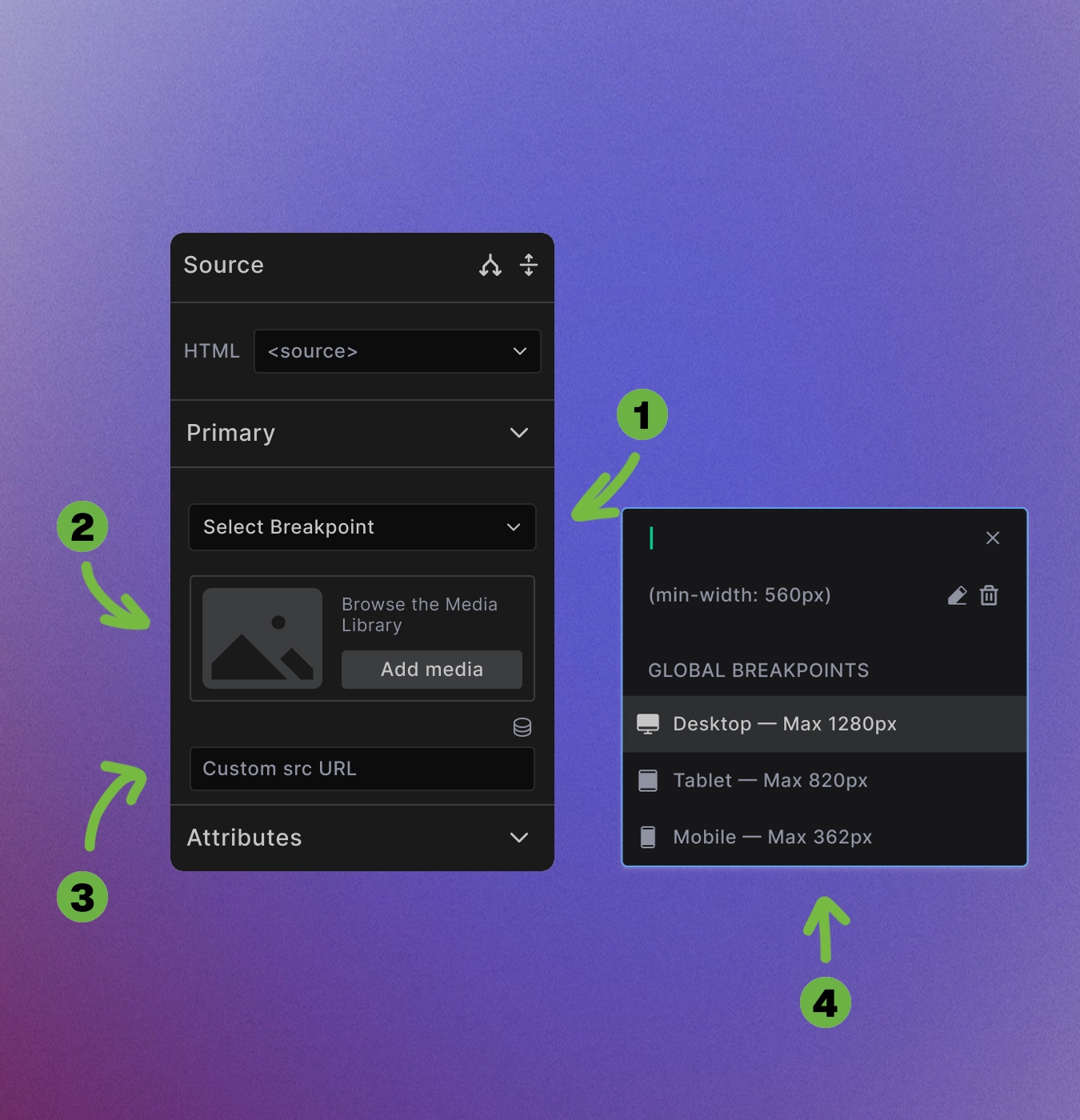
The Source element configuration includes several key settings:
-
Breakpoint selection: Click "Select Breakpoint" to choose when this source should be used. The modal shows both global breakpoints and allows custom media queries.
-
Media selection: Use Add Media to browse the Media Library or upload new files directly.
-
Custom URL option: Enter direct URLs for external media sources or specific file paths in the "Custom src URL" field.
-
Global breakpoints: Choose from predefined responsive breakpoints:
- Desktop
- Tablet
- Mobile
Media Library Integration
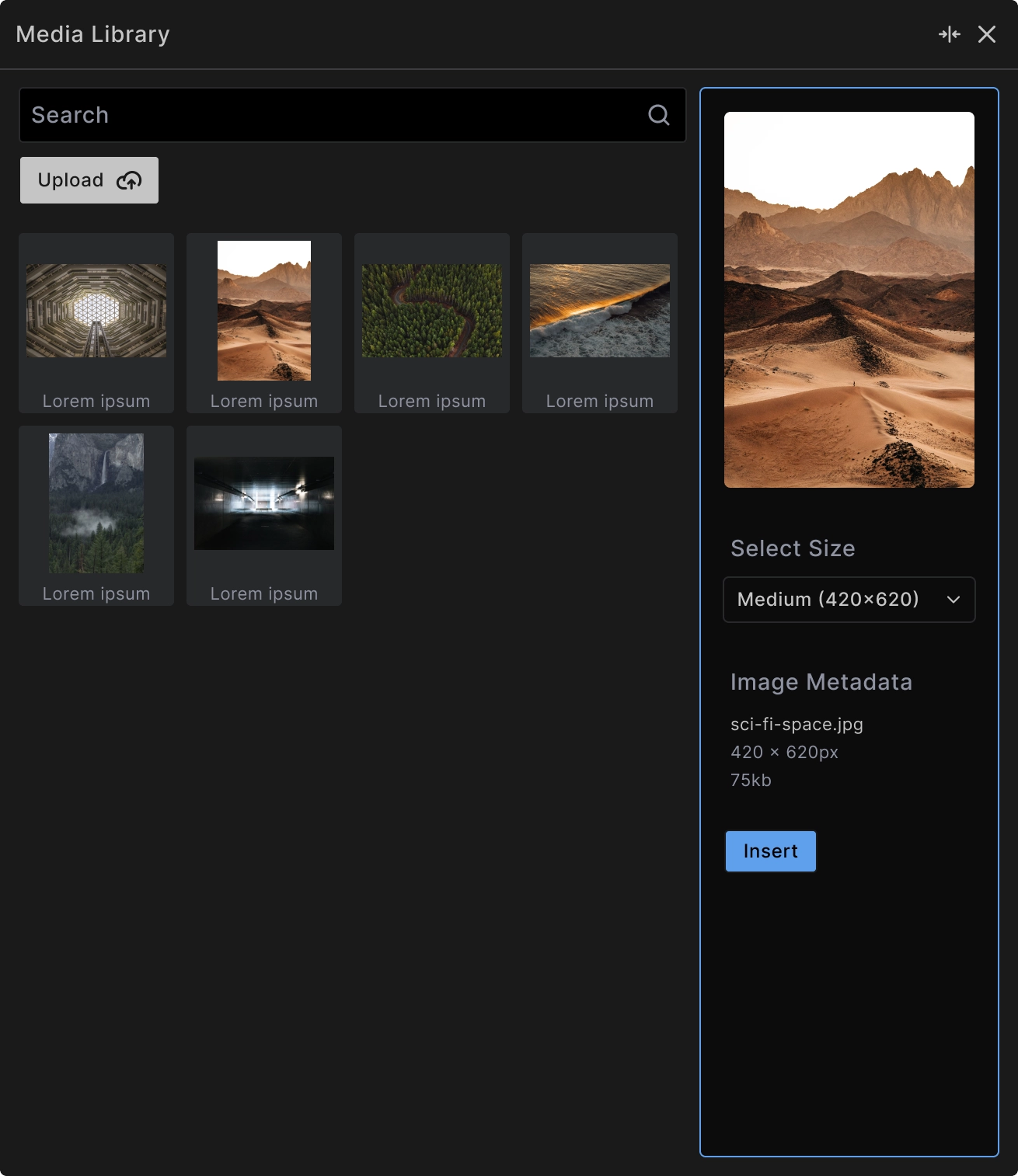
When browsing the Media Library:
Search functionality: Find images quickly using the search field to filter by filename or metadata.
Upload capability: Add new images directly through the "Upload" button without leaving the builder.
Size selection: Choose from available image sizes to optimize for different use cases and performance.
Format support: Select different file formats (WebP, JPEG, PNG) for optimal browser compatibility.
Breakpoint-Based Media Selection
The Source element uses breakpoints to determine when specific media should be displayed:
Media query logic: Sources are evaluated in order - the first matching condition is used by the browser.
Custom breakpoints: Create specific media queries like (min-width: 560px) for precise control over when sources are used.
Responsive strategy: Combine multiple source elements to deliver the right media for each screen size.
<!-- Example: Responsive image sources -->
<picture>
  <source media="(min-width: 1280px)" srcset="large-image.webp" type="image/webp">
  <source media="(min-width: 820px)" srcset="medium-image.webp" type="image/webp">
  <source media="(min-width: 362px)" srcset="small-image.webp" type="image/webp">
  <img src="fallback-image.jpg" alt="Responsive image">
</picture>
Media Query Applications
Screen size targeting: Deliver appropriately sized images for different devices:
<picture>
  <source media="(min-width: 1200px)" srcset="hero-desktop.jpg">
  <source media="(min-width: 768px)" srcset="hero-tablet.jpg">
  <source srcset="hero-mobile.jpg">
  <img src="hero-fallback.jpg" alt="Hero image">
</picture>
Format optimization: Provide modern formats with fallbacks:
<picture>
  <source srcset="image.avif" type="image/avif">
  <source srcset="image.webp" type="image/webp">
  <img src="image.jpg" alt="Optimized image">
</picture>
Art direction: Show different compositions at different sizes:
<picture>
  <source media="(min-width: 800px)" srcset="landscape-composition.jpg">
  <source srcset="portrait-composition.jpg">
  <img src="default-composition.jpg" alt="Responsive composition">
</picture>
Video and Audio Sources
Video format delivery: Provide multiple video formats for browser compatibility:
<video controls>
  <source src="video.webm" type="video/webm">
  <source src="video.mp4" type="video/mp4">
  Your browser doesn't support video.
</video>
Audio format options: Ensure audio plays across all browsers:
<audio controls>
  <source src="audio.ogg" type="audio/ogg">
  <source src="audio.mp3" type="audio/mpeg">
  Your browser doesn't support audio.
</audio>
Best Practices
Order matters: Place sources in order of preference - browsers use the first compatible source they encounter.
Include fallbacks: Always provide fallback content (img, video, audio elements) for browsers that don't support source elements.
Test across devices: Verify that appropriate sources load on different screen sizes and browsers.
Optimize file sizes: Ensure each source is optimized for its target use case and device capabilities.
Performance Benefits
Bandwidth optimization: Deliver appropriately sized media to avoid wasting bandwidth on mobile devices.
Format efficiency: Use modern formats like WebP or AVIF when supported, with JPEG/PNG fallbacks.
Faster loading: Smaller files for mobile devices improve page load times significantly.
When to Use Source Elements
Use Source elements for:
- Responsive image delivery with different sizes
- Modern format optimization with fallbacks
- Art direction changes across breakpoints
- Video/audio format compatibility
The Source element works only within Picture, Video, or Audio parent elements - it cannot be used standalone.
Next steps: